Alright, before you see the images on this post remember this is all just a CONCEPT and in no way
represents the final work on the app.
Even when I think the app looks intuitive enough, some images show the way the app would work
with certain things and I will explain each image/mode anyways.
Spoiler Warning: Light spoilers for gamers who have not get past the middle of the game.
Note: Images have been reduced 50% of their original resolution for this presentation.
Main "Look"
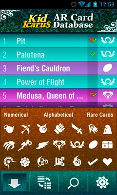
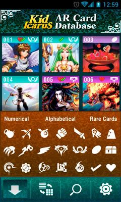
List Sorting Options
Search
Options
Card View
And thats about it. Theres still a lot of work to do, so dont expect this so soon.
We are thinking on making special graphics and layouts for the landscape mode and tablets
so the images dont stretch, It would look ugly. We are aiming for functionality and looks with
this app.
Theres a lot of ideas I would like Elisherer to implement in future versions, like a "Info" button
that shows the In-game Idol description and the stats of the card's battle mode.
Maybe a button to send via email or print cards. And the battle mode so you can choose
2 cards to display at once (only for tablets tho, phones screens are too small to properly
show two cards at the same time). I have not talked to him about this tho, hopefully he will
read this and share with me his thoughts.")
represents the final work on the app.
Even when I think the app looks intuitive enough, some images show the way the app would work
with certain things and I will explain each image/mode anyways.
Spoiler Warning: Light spoilers for gamers who have not get past the middle of the game.
Note: Images have been reduced 50% of their original resolution for this presentation.
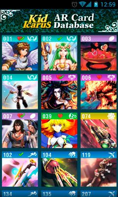
Main "Look"
This is how the app will look when opened, there's two ways and you can choose which way you want it
by touching the "Look Switcher" icon, after opening the app menu (with your Android button).
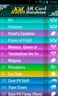
Look 1: Text Mode; This will be the main look of the app when you first start it. The main difference with the
other mode is that you can see the name (albeit not complete when its too long). The heart and the green checked thingie
stand for "Like" and "Have", Likes are your favorite cards, and Haves are for the cards you phisically own, like a Cheklist.
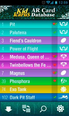
Look 2: Thumbnail Mode; The main difference is obvious, but I had to sacrifice the name to balance things out (so there
is a point in using both modes, Text mode shows the name, Thumbnail mode shows a small preview of the card's image).
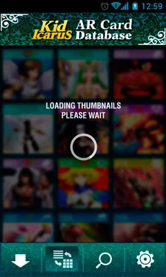
I dont know how it will exactly work, but I would be nice to have a "Loading" overlay in case it takes too long to load.
by touching the "Look Switcher" icon, after opening the app menu (with your Android button).
Look 1: Text Mode; This will be the main look of the app when you first start it. The main difference with the
other mode is that you can see the name (albeit not complete when its too long). The heart and the green checked thingie
stand for "Like" and "Have", Likes are your favorite cards, and Haves are for the cards you phisically own, like a Cheklist.
Look 2: Thumbnail Mode; The main difference is obvious, but I had to sacrifice the name to balance things out (so there
is a point in using both modes, Text mode shows the name, Thumbnail mode shows a small preview of the card's image).
I dont know how it will exactly work, but I would be nice to have a "Loading" overlay in case it takes too long to load.
List Sorting Options
These will be the options to filter or sort out the cards shown on the list.
You can choose to look only cards of certain type or types, and organize by number or
alphabetically. Theres another option that maybe will proove useful later, and is
to view the "Rare" cards (Dark Pit Flying, Palutena, etc), you can also choose to
view your "Liked" and/or owned cards.
The images show how it would look then opened in both list modes.
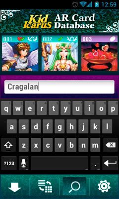
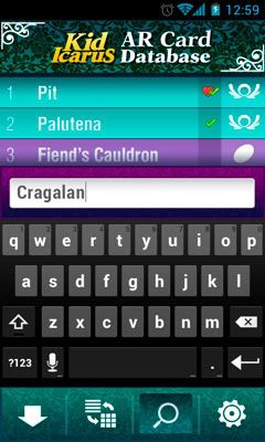
Search
Self explanatory, with this option you can search any specific card or cards you want.
The input will be numerical and textual so you can search both by name and number.
The idea is that, if you were specific ennough it jumps straight to the card you wanted, if
not It will just show on the list the results.
The images show how it would look then opened in both list modes.
The input will be numerical and textual so you can search both by name and number.
The idea is that, if you were specific ennough it jumps straight to the card you wanted, if
not It will just show on the list the results.
The images show how it would look then opened in both list modes.
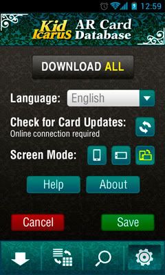
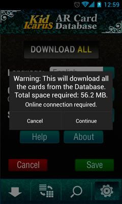
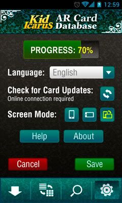
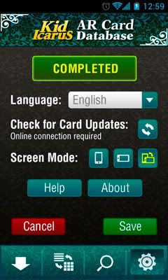
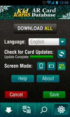
Options
This will fill the screen with the options window, here you can Download all the cards from the database
directly to your phone, update the cards, choose your preferred viewing method (portrait, landscape,
auto-rotate), and shorcuts to Help and About. In Help it will explain how the app works and the meaning
of the icons, etc... and about will show info about the makers of the app as well as proper credits and
copyright notices. About the languages, I will be offering the spanish translation, the app itself is short on
words, so we were thinking on making it open to users to submit their language files so we can add them
to the app.
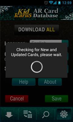
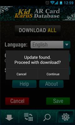
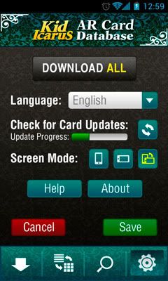
The following images show the options menu with their respective processes of download and update.
directly to your phone, update the cards, choose your preferred viewing method (portrait, landscape,
auto-rotate), and shorcuts to Help and About. In Help it will explain how the app works and the meaning
of the icons, etc... and about will show info about the makers of the app as well as proper credits and
copyright notices. About the languages, I will be offering the spanish translation, the app itself is short on
words, so we were thinking on making it open to users to submit their language files so we can add them
to the app.
The following images show the options menu with their respective processes of download and update.
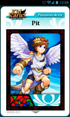
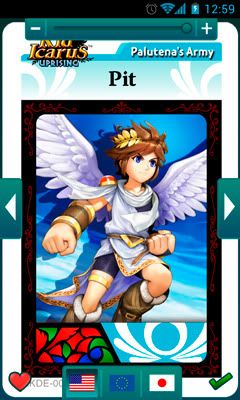
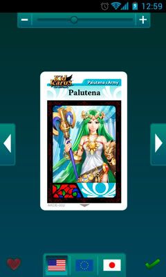
Card View
This is how it may look when you have a card selected for viewing. It will just plain show the image
but if you press your android button or single touch the image a menu will pop up.
In this menu you can choose to Like or mark as owned a card, zoom in and out, change to the
next or previous card, and choose the card's region (when available).
Touch gesture controls will still be activated so you can pinch to zoom or swipe to the next card.
And thats about it. Theres still a lot of work to do, so dont expect this so soon.
We are thinking on making special graphics and layouts for the landscape mode and tablets
so the images dont stretch, It would look ugly. We are aiming for functionality and looks with
this app.
Theres a lot of ideas I would like Elisherer to implement in future versions, like a "Info" button
that shows the In-game Idol description and the stats of the card's battle mode.
Maybe a button to send via email or print cards. And the battle mode so you can choose
2 cards to display at once (only for tablets tho, phones screens are too small to properly
show two cards at the same time). I have not talked to him about this tho, hopefully he will
read this and share with me his thoughts.