Homebrew Minecraft DS (in 3D !)

lucasade

m1cr0man
Member
Joined
Jul 25, 2011
Messages
140
Trophies
0
Location
Ireland
XP
88
Country
CannonFoddr said:
smealum said:
Once that's done I think I'll try to make a better bottom screen interface. Any suggestions on what should be down there ? Basically, what I'm thinking so far :
- item bar (like 9 icons to select a block/item)
- button(s) to switch between placing and removing blocks
- save button
- button to access inventory (will be useful even in classic since there are more blocks then can fit in the item bar)
- probably some "zoomed" version of the selected block somwhere since they're so small
- a compass ? (I think it'd be neat AND useful; I know minecraft lets you craft those, but since this is Classic version for now you won't be able to craft them)
- a clock, or at least some indicator of what time it is (same thing) (also, I have an idea of what it could look like so that it could be nicer then a regular clock, but... not sure how to describe it
tongue.gif
)

torch.png
From what I can see of the bottom screen - I think you will definitely need a way to toggle between the inventory / crafting / item bar / saving etc.
Trying to get them all on the one screen would be to cluttered

Here's my suggestion... have different screens for different 'modes'

In the 'Classic' mode - just have the Icon bar & a larger picture with description of the selected icon (perhaps even have a 'Quick Save' button), along with the Compass/Clock as well
5997826647_0576d4ec34.jpg
In case you can't guess - the two icons lower right are meant for the Clock and Compass, couldn't be a**sed to make any proper icons up)
then have the controls set up like....
  • Use 'D-pad' to move around
    Use [ A ] to 'jump'
    Use Left/Right shoulder buttons to move left/right across Icon bar (Or also have 'touch screen' control)
    Use [ Y ] to place a block
    Use [ X ] to remove a block
    Use the [ Select ] button to show up your 'Inventory' on the lower screen (with touch screen drag-&-Drop' to move things around)
    Use the [ Start ] to bring up a new lower screen with 'Save','Load','Options' on it
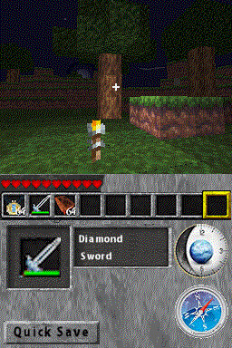
The [ B ] button can be a 'Cancel'/'exit' button when in the 'Save' or 'Inventory' screen mode

EDIT: Just seen 'Bmcs' mockup, & 'lucasade' idea AFTER I was doing this post - dam it there goes my ideas....
..... Hang on
unsure.gif
QUOTE@Smealum: I was playing the game last night.
There's a Download for this ???? - or is 'lucasade' a Beta tester ??
Oh, no! I am not a beta tester, but I do have version 280711. I am kind of reluctant to give it away, because smealum doesn't want to be publishsing the unfinished versions. If you want it (you only, for now), PM me.
As for the interface, that does look good
smile.gif
Very different, which is what I like..but I'm a bit of a mac hater and that safari compass must burn
biggrin.gif


@Bmcs, you are right about a separate movement interface. It should include the buttons to switch interface, along with the compass and clock. The rest of the space should be empty to allow movement. You should make a mock-up movement interface so that we can debate more, I might try a mock-up of an interface too
biggrin.gif


PS: For those talking about TNT...please stay on topic for now. Debate the interface. The time will come when new features will be asked for, and you can suggest it then. I'm just saying.
 

CannonFoddr

Regular GBATemp Lurker
Member
Joined
Sep 23, 2006
Messages
4,134
Trophies
1
Age
56
Location
Sitting by computer
Website
www.youtube.com
XP
1,287
Country
Bmcs said:
lucasade said:
Maybe seperate interfaces for movement, mining and crafting (which has been made), 1 for other stuff like the clock and compass, and a main menu for save/load.

Now i'm confused, because, now that i think about it, i realize that, i'm not quite understanding how this is going to be. Now, let me see if i understood, we need a Bottom screen interface, right? But, don't we also need a Blank screen for movement? I mean, we're not going to use the screen interface for movement, are we? I'm just asking this because, there's too many items on screen...there's not a lot of room to movement...
I think he got a little carried away with screen suggestions...
IMHO I think he meant is that we have a 'Status' screen when moving around (Contains Clock/Compass/Health), An 'Inventory' screen, a 'Crafting' Screen and a 'Option' Screen (with Save/load etc on it) - other screens that will be needed would be a 'Chest'/'Inventory' screen (so that you can drag from a 'chest' into your 'inventory')

As far as I know there's no such thing as a 'Mining' screen
laugh.gif
!!!

EDIT: lucasade beat me AGAIN !!!! - I can see what he mean nows... although I prefer my method of 'screen changes' using actual buttons on the DS - having 'buttons' on screen may be a good idea as well
 

lucasade

m1cr0man
Member
Joined
Jul 25, 2011
Messages
140
Trophies
0
Location
Ireland
XP
88
Country
CannonFoddr said:
Bmcs said:
lucasade said:
Maybe seperate interfaces for movement, mining and crafting (which has been made), 1 for other stuff like the clock and compass, and a main menu for save/load.

Now i'm confused, because, now that i think about it, i realize that, i'm not quite understanding how this is going to be. Now, let me see if i understood, we need a Bottom screen interface, right? But, don't we also need a Blank screen for movement? I mean, we're not going to use the screen interface for movement, are we? I'm just asking this because, there's too many items on screen...there's not a lot of room to movement...
I think he got a little carried away with screen suggestions...
IMHO I think he meant is that we have a 'Status' screen when moving around (Contains Clock/Compass/Health), An 'Inventory' screen, a 'Crafting' Screen and a 'Option' Screen (with Save/load etc on it) - other screens that will be needed would be a 'Chest'/'Inventory' screen (so that you can drag from a 'chest' into your 'inventory')

As far as I know there's no such thing as a 'Mining' screen
laugh.gif
!!!
laugh.gif
what I meant was one for add/remove blocks, and select block/torch to place. And yes, Status, inventory, crafting and option screens are what I meant
smile.gif
I was trying to reply ASAP before anyone else said something
biggrin.gif
 

Bmcs

Well-Known Member
Member
Joined
Sep 1, 2009
Messages
223
Trophies
0
XP
152
Country
lucasade said:
@Bmcs, you are right about a separate movement interface. It should include the buttons to switch interface, along with the compass and clock. The rest of the space should be empty to allow movement. You should make a mock-up movement interface so that we can debate more, I might try a mock-up of an interface too
biggrin.gif


PS: For those talking about TNT...please stay on topic for now. Debate the interface. The time will come when new features will be asked for, and you can suggest it then. I'm just saying.

I too think that separate interfaces is the best option...i'm going to make some more ideas

We should put only the important things in the movement interface...i'll use some examples from FPS on the DS...
 

jjbeest

Member
Newcomer
Joined
Aug 1, 2011
Messages
17
Trophies
0
XP
3
Country
Netherlands
if you decide to make a survival version how about the minecraft 1.8 update are you gonna put all of the same features in minecraft ds

and i see that this topic has a lot of attention everytime i look at this (a lot) it has like 20 people reading
 

CannonFoddr

Regular GBATemp Lurker
Member
Joined
Sep 23, 2006
Messages
4,134
Trophies
1
Age
56
Location
Sitting by computer
Website
www.youtube.com
XP
1,287
Country
jjbeest said:
if you decide to make a survival version how about the minecraft 1.8 update are you gonna put all of the same features in minecraft dsPersonally - I think all suggestions in this thread are basically concentrating on JUST the 'Classic' minecraft version for now, & how the game should work/look like...

Things like the 'Survival' or 'Adventure' modes will most probably come later once all the main ground work/bug fixing has been done & the first release is 'out & about'
as mentioned in first postQUOTEmy primary goal here is to get a basic but playable version of Minecraft Classic to run on the DS
The other modes will most probably need a LOT more work done to get working

@ lucasade: Thanks for the offer, as much as I'd like to have a go of it - I think it'll be best to wait until an 'official' release comes out - it'll be unfair to everyone else (unless smealum fancy me doing a video of it that is
laugh.gif
)
 

jjbeest

Member
Newcomer
Joined
Aug 1, 2011
Messages
17
Trophies
0
XP
3
Country
Netherlands
CannonFoddr said:
jjbeest said:
if you decide to make a survival version how about the minecraft 1.8 update are you gonna put all of the same features in minecraft dsPersonally - I think all suggestions in this thread are basically concentrating on JUST the 'Classic' minecraft version for now, & how the game should work/look like...

Things like the 'Survival' or 'Adventure' modes will most probably come later once all the main ground work/bug fixing has been done & the first release is 'out & about'
as mentioned in first postQUOTEmy primary goal here is to get a basic but playable version of Minecraft Classic to run on the DS
The other modes will most probably need a LOT more work done to get working
i know just thinking forward
 

lucasade

m1cr0man
Member
Joined
Jul 25, 2011
Messages
140
Trophies
0
Location
Ireland
XP
88
Country
CannonFoddr said:
@ lucasade: Thanks for the offer, as much as I'd like to have a go of it - I think it'll be best to wait until an 'official' release comes out - it'll be unfair to everyone else (unless smealum fancy me doing a video of it that is
laugh.gif
)
Ok, it wont be too long till the next release comes. Smealum really only has the interface and some other stuff to finish before the first full release
smile.gif
 

Prof. 9

Well-Known Member
Member
Joined
Jun 17, 2008
Messages
324
Trophies
1
Location
The Netherlands
Website
twitter.com
XP
853
Country
Netherlands
My ideas for menu screen stuff:

- Mini map (though I can see this becoming memory intensive quite easily)
- Real time digital clock (could be stuffed in a corner or something)
- Game time clock
- Quicksave button
- Screenshot button
- Pause menu button
- Toggle sneaking
- Inventory (or block library like when you press B in Classic)
- Debug info button
- Screenshot button
- Free view button (stop moving character and move camera with d-pad)
- Set spawn point
- Warp to spawn point
- Change control scheme on the go

Probably too much to fit on the screen though.

By the way, how about putting the selectable item buttons vertically on the side of the screen instead of horizontally at the bottom (like in Zelda: OoT3D, Trauma Center etc)? If there isn't enough screen space there could be a button to switch "pages".
 

Bmcs

Well-Known Member
Member
Joined
Sep 1, 2009
Messages
223
Trophies
0
XP
152
Country
That's what i came up with. Now, it lacks the save icon and the inventory, but i think that those can be physical buttons....


Clock - Clock
Compass - Compass
Big block - Selected block
Small block (right) - Place block
Small broken block (left) - Remove block

Or maybe with buttons for "options" and "Menu"


lucasade

m1cr0man
Member
Joined
Jul 25, 2011
Messages
140
Trophies
0
Location
Ireland
XP
88
Country
Instead of adding quotes, I'm gonna write what I think, Prof. 9

- Mini map (though I can see this becoming memory intensive quite easily) - Good idea, maybe 2d look-down would work. OR you hit select and it comes up.
- Real time digital clock (could be stuffed in a corner or something) - Maybe on the Main Menu, but other than that I really dont see the point
tongue.gif

- Game time clock - Definately handy, maybe in same interface as for movement
- Quicksave button - Main menu
- Screenshot button - um...press select+x maybe?
- Pause menu button - start button for sure. plus one on all the interfaces
- Toggle sneaking - I STILL haven't played THE minecraft
tongue.gif
so I don't know what that is. If it is crouch, then maybe Y button + interface button.
- Inventory - Maybe same window as for crafting
- Debug info button - Main menu, in options?
- Screenshot button - you said that twice
tongue.gif

- Free view button (stop moving character and move camera with d-pad) - Yeah, good idea for when taking screenshots
smile.gif

- Set spawn point - Maybe when multiplayer comes, but for now I think save location on game save would do.
- Warp to spawn point - read above.
- Change control scheme on the go - In options, and instantly take effect maybe.

As for the vertical bar, maybe the switch interface button could go there.

laugh.gif
Good ideas overall though. I might try making a mock-up interface now.

Probably too much to fit on the screen though.

By the way, how about putting the selectable item buttons vertically on the side of the screen instead of horizontally at the bottom (like in Zelda: OoT3D, Trauma Center etc)? If there isn't enough screen space there could be a button to switch "pages".

@Bmcs: Looking good, but is there not to many mini icons at bottom then?
tongue.gif
 

DroRox

Ambassador of Ooo
Member
Joined
Aug 1, 2011
Messages
387
Trophies
0
Age
29
Location
The Land of Ooo
Website
www.trifuck.tumblr.com
XP
292
Country
United States
Bmcs said:
That's what i came up with. Now, it lacks the save icon and the inventory, but i think that those can be physical buttons....


I like this one better. i assume the clock/compass will show up in the big circle once touched correct?
I like the roominess. It's in a sense relieving! Haha nice job. And Start/Select could easily be Invent/Save.
 

Bmcs

Well-Known Member
Member
Joined
Sep 1, 2009
Messages
223
Trophies
0
XP
152
Country
lucasade said:
@Bmcs: Looking good, but is there not to many mini icons at bottom then?
tongue.gif


At the bottom will stay the blocks and items, and once selected they will be showed in the larger square in the middle...

DroRox said:
QUOTE(Bmcs @ Aug 1 2011, 08:55 AM) That's what i came up with. Now, it lacks the save icon and the inventory, but i think that those can be physical buttons....

I like this one better. i assume the clock/compass will show up in the big circle once touched correct?
I like the roominess. It's in a sense relieving! Haha nice job. And Start/Select could easily be Invent/Save.

I'm assuming that smealum is doing things like they are in the PC version, so, if that's the case, the clock and the compass should pop up in the upper screen...
But yeah, i think that if they appear in the big circle that could be more easy...

Best thing to do now is wait for smealum to say his opinion...
 

DroRox

Ambassador of Ooo
Member
Joined
Aug 1, 2011
Messages
387
Trophies
0
Age
29
Location
The Land of Ooo
Website
www.trifuck.tumblr.com
XP
292
Country
United States
Bmcs said:
lucasade said:
@Bmcs: Looking good, but is there not to many mini icons at bottom then?
tongue.gif


At the bottom will stay the blocks and items, and once selected they will be showed in the larger square in the middle...

DroRox said:
QUOTE(Bmcs @ Aug 1 2011, 08:55 AM) That's what i came up with. Now, it lacks the save icon and the inventory, but i think that those can be physical buttons....

I like this one better. i assume the clock/compass will show up in the big circle once touched correct?
I like the roominess. It's in a sense relieving! Haha nice job. And Start/Select could easily be Invent/Save.

I'm assuming that smealum is doing things like they are in the PC version, so, if that's the case, the clock and the compass should pop up in the upper screen...
But yeah, i think that if they appear in the big circle that could be more easy...

Best thing to do now is wait for smealum to say his opinion...
I agree. he's the only one who knows for sure. and i only played the pc game in way early beta for a little while on my frineds acccount so thats why when i saw that huge circle it seemed ideal haha.
 

Site & Scene News

Popular threads in this forum

General chit-chat
Help Users
  • No one is chatting at the moment.
  • K3Nv2 @ K3Nv2:
    I'll reformat and have a 3tb raid0 m. 2 at least
    +1
  • K3Nv2 @ K3Nv2:
    Lmao that sold out fast
    +1
  • Veho @ Veho:
    Yeet the cat.
    +1
  • K3Nv2 @ K3Nv2:
    Good idea
    +1
  • The Real Jdbye @ The Real Jdbye:
    i thought everybody knew cocktails are like 75% ice
  • Veho @ Veho:
    Yeah but not like this.
  • Veho @ Veho:
    It's not like they're complaining that their Slurpee is 99% ice or something, but if the cocktail calls for "shot of vodka, shot of vermouth, shot of gin, shot of Campari, three shots of juice, squirt of lemon" and ends up being a thimbleful of booze, that's a problem.
  • The Real Jdbye @ The Real Jdbye:
    the funny thing is cocktails in norway are only allowed to have 1 20ml shot of booze
  • The Real Jdbye @ The Real Jdbye:
    so..... yeah
  • The Real Jdbye @ The Real Jdbye:
    we're used to only having a thimbleful of booze
  • Veho @ Veho:
    Booo.
  • The Real Jdbye @ The Real Jdbye:
    same thing if you want whisky on the rocks or something, you can't get a double
  • The Real Jdbye @ The Real Jdbye:
    but you could buy as many shots of whisky (or anything else) as you want and ask for a glass of ice and pour them in
  • The Real Jdbye @ The Real Jdbye:
    it's dumb
  • Veho @ Veho:
    Maybe.
  • Veho @ Veho:
    There was a comparison of the number of Ibuprofen poisonings before and after they limited the maximum dosage per box or per pill (i'll look that up). No limit on the number of boxes you can still buy as many as you want, so people argued it was pointless.
  • Veho @ Veho:
    But the number of (accidental) poisonings dropped because drinking an entire package of ibuprofen pills went from "I need a new liver" to "I need a new box of Ibuprofen".
  • Veho @ Veho:
    Here we have ketoprofen that used to be prescription-only because of the risk of toxic dosages, but then they halved the dose per pill and sell them in bottles of six pills apiece instead of twenty and it doesn't need a prescription any more. Yes you can buy more than one bottle but people simply don't.
  • Psionic Roshambo @ Psionic Roshambo:
    Usually accidentally overdose of ibuprofen here is from people taking like cold medicine then ibuprofen for a headache and the combination is over what they need
    Veho @ Veho: https://imgur.com/gallery/QQkYnQu