

- Joined
- May 22, 2015
- Messages
- 859
- Trophies
- 0
- Location
- Somewhere
- Website
- n3dshack.weebly.com
- XP
- 453
- Country

I know. What should I put there though?

I know. What should I put there though?


I would add a wave but i don't know how to lol. It isn't nintendo homebrew without that iconic waveGood Job! Looks better now

it will be very easy to reproduce
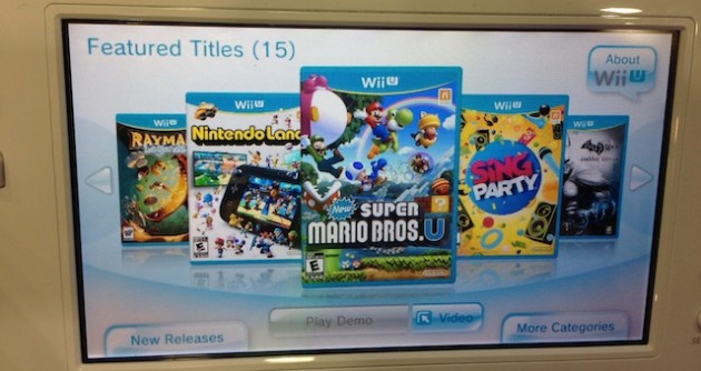
Offiicial Wii U demo kiosk GUI, I always thought a launcher for Wii U would look like this on gamepad
About what I said on my previous post :Just curious but when will the voting of the mockups start? Or was it decided in the last videos that's what's being used for loadiine?
Dimok started working on the "game icon" automatic generation to looks like the ones in the "2D GUI" video, working on that will benefit any other design.
Icon creation code is done (to generate rounded corners, make it looks inside a glass), but not automatic generation from SD card's meta folder yet. it's done on PC only, not on wiiU side.

I love it!About what I said on my previous post :
To illustrate what can be done now that we have the "generated icons", here is another possible mockup, will be very easy to create
that looks like the official WiiU gamepad interface, but it's easy to use for everyone (kids, etc.)
My suggestion goes into displaying the game's cover and info on the TV and just the cover with the Options below it on the Gamepad.yes, we still have to decide the interface too.
either the game info on the other display (TV) which can be swapped to gamepad anytime, either a popup window when selecting a game with option to start/option/close
About what I said on my previous post :
To illustrate what can be done now that we have the "generated icons", here is another possible mockup, will be very easy to create
one icon is a single 3D object which can be placed anywhere. So there's no need to have a 2D layer to cover the icon corners and make then round.
having the icons auto-generated allows the mirror effect around them which couldn't be done if we used a flat design.
that looks like the official WiiU gamepad interface, but it's easy to use for everyone (kids, etc.)
I'm personally a huge fan of this idea. And that way the "screen switch" icon could be used to bring the coverflow to the gamepad screen so you could mess around with the boxes if you want (think MK8 trophies), as well as making the start/options buttons more touch friendlyI love it!
After selection an Icon on the Gamepad, then the Game Cover could come up along with two options below it saying "Start" and "Settings" (like that of Wii apps when you select them), and at the right side of the cover just the game's info, to make it as simplistic as possible.
If it was like the Wii U menu, it would be whatever is currently on the gamepad screenthat will be back to my previous concern :
if we display two different design at the same time (grid on the pad, flow on tv), then what will dpad control ? the flow or the grid?
That's a pretty good idea, actuallyI think we should limit button to TV and touch to gamepad, whatever the design is currently displayed.
flow on TV : dpad
flow on gamepad : touch
if you have the flow+grid at the same time, the highlighted game icon should match both displays, so clicking on the grid should scroll the flow.
Yeah, I can certainly appreciate thatswappable "interface+interface" is possible, but can be harder to code than "interface+info".
)


