

- Joined
- Apr 7, 2009
- Messages
- 75
- Reaction score
- 26
- Trophies
- 1
- Age
- 31
- Website
- Visit site
- XP
- 292
- Country

Something metro-like would be very easy on the gpu and touch-screen friendly.
Having the homebrew app screen setup similar to this would be pretty easy to program and implement.
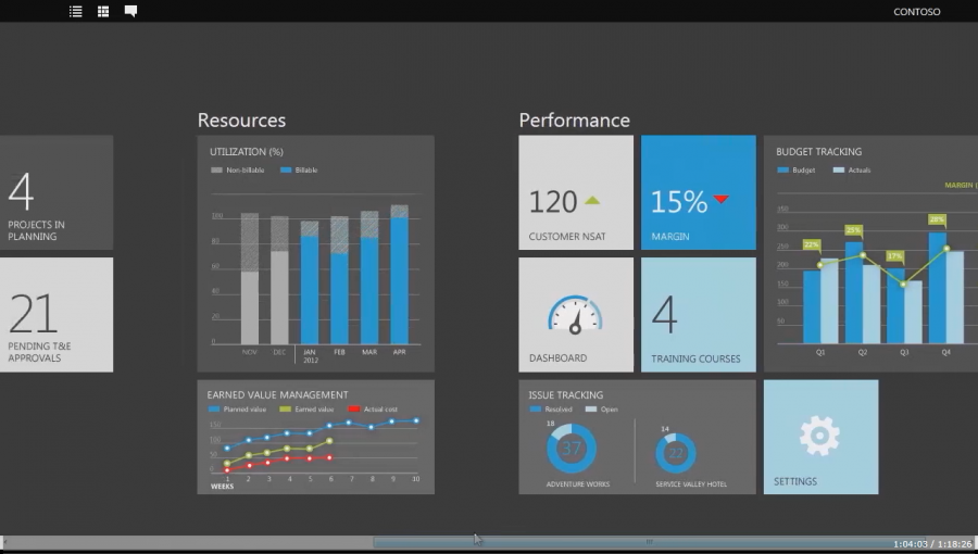
Conveys info quick and easy and organizes it well.
Having the homebrew app screen setup similar to this would be pretty easy to program and implement.
Conveys info quick and easy and organizes it well.


") Maybe with some faint fading lights (like christmas lights!) in the background, along with the bubbly movement?
Maybe with some faint fading lights (like christmas lights!) in the background, along with the bubbly movement?


 ,with the third logo of
  , and the logo animation of


