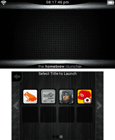
Homebrew [Release] Homebrew Launcher with grid layout

fmkid

Just another GBATemp's random guy
Member
Joined
Apr 23, 2015
Messages
1,911
Trophies
0
XP
1,424
Country
Colombia
@mashers: I found some bugs and have some suggestions :lol:

Bug report
: On "Settings (with 3 rows, specifically)", "Titles" and "Help" screens, cursor allows to select blank/empty spaces/items and finally HBL freezes. Also, notice that icons on second page of "Settings" remains on that page, even with 3 rows activated. Big problem with that!
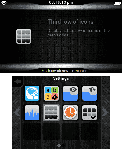
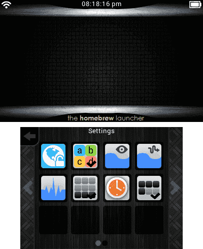
hbl-grid-screenshot-3654274690.png
hbl-grid-screenshot-3654274697.png
hbl-grid-screenshot-3654274660.png
hbl-grid-screenshot-3654274666.png

Suggestions: Feel free to do those you want or agree..
  • Remove, or put as optional, feature that allows to select corner icons/options with D-Pad. In return, allow selection of folder boxes with that.
  • Would be better if you put a folder onto "gridlauncher" path to store screenshots files. Also, put the log text files onto "gridlauncher" path.
  • An option (like a box or something) to view current color selected/modified on scheme options (even better if there's an option to select color like "Paint", but maybe in a future). Because for many of those options is not possible to see what color was formed.
  • Try to integrate some related options in only one (i.e. Water options), to make all "Options" screen more minimalistic and easier.
Thanks, and keep up the good work! :grog:
 
Last edited by fmkid,

link6155

Well-Known Member
Member
Joined
Aug 14, 2013
Messages
313
Trophies
1
Age
33
XP
696
Country
United States
When making a commit to the project, you should be descriptive about what you have changed. Right now all the comments are things like "Beta 41 of the homebrew grid launcher" or just "beta 41". It helps people keep track of what has change, makes it a lot easier to contribute.
 

bunny365

Well-Known Member
Member
Joined
Aug 26, 2013
Messages
241
Trophies
0
XP
217
Country
United States
When making a commit to the project, you should be descriptive about what you have changed. Right now all the comments are things like "Beta 41 of the homebrew grid launcher" or just "beta 41". It helps people keep track of what has change, makes it a lot easier to contribute.
That, and you should post different changes for commits, then each release of the beta is composed of several commits, so we can track when things happened and stuff.
EDIT: That, and you can rollback your local changes if something you tried COMPLETELY failed, but you're not losing everything since last release.
 
Last edited by bunny365,
  • Like
Reactions: fmkid

Arseface_TM

Board Game Dev
Member
Joined
Sep 16, 2015
Messages
331
Trophies
0
Age
32
XP
306
Country
United States
Saw that there's now sound effect files added. However I have no idea where to put them. I wish that the builds was still uploaded here since everything was laid out in the correct locations.
There's a releases tab, it just doesn't have anything in it right now. @mashers should probably just use that for "stable" releases.
 

mashers

Stubborn ape
OP
Member
Joined
Jun 10, 2015
Messages
3,837
Trophies
0
Age
40
Location
Kongo Jungle
XP
5,084
Country
@mashers I've noticed a little bug. Here's how to reproduce it.
Go to any folder with the region free loader disabled make sure you are over the first app from the top left corner and while selecting the first app touch the settings button.
Go to settings and enable the region free loader and go back to the apps.
Now you''l be on the second app and you can't move to the left row of apps.
It can be fixed by changing folders.
Oh, that's a Bug Classic(TM) ;) It's crept back in somehow, and I think I know how. I'll get it sorted. Thanks for letting me know!


Also here I'll leave a little concept of how the theme seletor screen would look if it displayed the info.smdh
That looks great! It could display the first letter of the name of the theme if there is no icon.


Also would this be possible? It would be great for some themes that could get better readability. I know they can be edited but it would be great having a universal fix alternative. :lol:
It's already possible - go to the panel settings and increase the slider for the top panel.

@mashers: I found some bugs and have some suggestions :lol:

Bug report
: On "Settings (with 3 rows, specifically)", "Titles" and "Help" screens, cursor allows to select blank/empty spaces/items and finally HBL freezes. Also, notice that icons on second page of "Settings" remains on that page, even with 3 rows activated. Big problem with that!
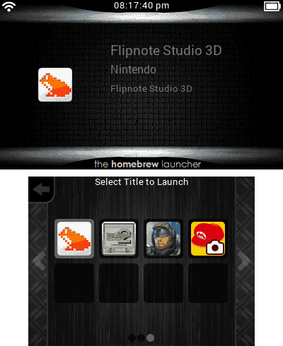
Both very weird problems! I'll add them to the todo list to sort out, thanks (I hadn't noticed them).

Suggestions: Feel free to do those you want or agree..
  • Remove, or put as optional, feature that allows to select corner icons/options with D-Pad. In return, allow selection of folder boxes with that.
  • Would be better if you put a folder onto "gridlauncher" path to store screenshots files. Also, put the log text files onto "gridlauncher" path.
  • An option (like a box or something) to view current color selected/modified on scheme options (even better if there's an option to select color like "Paint", but maybe in a future). Because for many of those options is not possible to see what color was formed.
  • Try to integrate some related options in only one (i.e. Water options), to make all "Options" screen more minimalistic and easier.
Thanks, and keep up the good work! :grog:
Fantastic ideas, thank you! I'll add them to the todo list.

Thanks, will do that from now on.

When making a commit to the project, you should be descriptive about what you have changed. Right now all the comments are things like "Beta 41 of the homebrew grid launcher" or just "beta 41". It helps people keep track of what has change, makes it a lot easier to contribute.
I did add a description to the commit so people could see what was changed.

Saw that there's now sound effect files added. However I have no idea where to put them. I wish that the builds was still uploaded here since everything was laid out in the correct locations.
They don't do anything yet. They were just in the folder on my Mac for future use.
 
  • Like
Reactions: SomeGamer and fmkid

JJTapia19

I fight for my friends.
Member
Joined
May 31, 2015
Messages
2,171
Trophies
1
Age
32
XP
2,438
Country
Puerto Rico
BTW, would be possible to add a translucent background to the app's description?
Something like this:

Now:
5wijgm.jpg


With this feature:
2ryq4yd.jpg


Just an example, so you can read the text more easily.

The theme was made by @VaiCorunthians
It's already possible - go to the panel settings and increase the slider for the top panel.
Oh I know about the panels but It would be more convinient if the top panel only appeared behind where the text goes. That way we would have more room to edit the top wallpaper. :lol:
 
  • Like
Reactions: fmkid

mashers

Stubborn ape
OP
Member
Joined
Jun 10, 2015
Messages
3,837
Trophies
0
Age
40
Location
Kongo Jungle
XP
5,084
Country
Oh I know about the panels but It would be more convinient if the top panel only appeared behind where the text goes. That way we would have more room to edit the top wallpaper. :lol:
Oh I see! Hmm, ok how about a setting to adjust the origin of the top panel from the left edge of the screen? A slider going from 20 (where it starts now) to however-many-pixels-the-text-is-at so it can be adjusted towards the text. How's that?
 

JJTapia19

I fight for my friends.
Member
Joined
May 31, 2015
Messages
2,171
Trophies
1
Age
32
XP
2,438
Country
Puerto Rico
Oh I see! Hmm, ok how about a setting to adjust the origin of the top panel from the left edge of the screen? A slider going from 20 (where it starts now) to however-many-pixels-the-text-is-at so it can be adjusted towards the text. How's that?
That sounds great! Even better that having a default location.
 

link6155

Well-Known Member
Member
Joined
Aug 14, 2013
Messages
313
Trophies
1
Age
33
XP
696
Country
United States
Oh I know about the panels but It would be more convinient if the top panel only appeared behind where the text goes. That way we would have more room to edit the top wallpaper. :lol:
I would like this to be turned off by default if it was implemented, would not look good on some themes (e.g. my themes).
 

mashers

Stubborn ape
OP
Member
Joined
Jun 10, 2015
Messages
3,837
Trophies
0
Age
40
Location
Kongo Jungle
XP
5,084
Country
Would it be possible to switch between icon and list view?

75tzrpA.png
Yes this shouldn't be too difficult, it would just mean changing the way the menu entries are drawn. I won't be implementing this, but others are welcome to look into it now the source code is on GH.

I would like this to be turned off by default if it was implemented, would not look good on some themes (e.g. my themes).
The panels are off by default anyway :)
 
  • Like
Reactions: Shaker78

mashers

Stubborn ape
OP
Member
Joined
Jun 10, 2015
Messages
3,837
Trophies
0
Age
40
Location
Kongo Jungle
XP
5,084
Country
Ok guys, I've just attached beta 43 to the first post. I will once again be keeping the latest binary version here for easier downloading. The beta 43 binary incorporates the following commits to GitHub:
  • Fixes an issue where it was not possible to select the first column of icons after enabling the region free loader
  • Screenshots are now saved in /gridlauncher/screenshots/. This folder will be created automatically when the launcher boots
  • Added an option to adjust the offset of the top panel from the left edge of the screen

I will continue to make individual commits to GitHub as and when things are fixed, and release daily beta updates to the binary which will be attached to the first post, and will have the commits summarised in the post and the changelog.
 

Shaker78

Well-Known Member
Member
Joined
Jan 17, 2007
Messages
121
Trophies
1
XP
561
Country
Gambia, The
If it's not too much work it would be nice if we could choose how the screenshots are created.

7YYc5Mh.png


Yes this shouldn't be too difficult, it would just mean changing the way the menu entries are drawn. I won't be implementing this, but others are welcome to look into it now the source code is on GH.

Thank you for taking the time to reply to my question :) (hope someone adds this feature)
 
Last edited by Shaker78,

BurningDesire

Well-Known Member
Member
Joined
Jan 27, 2015
Messages
4,999
Trophies
1
Location
Behind a screen reading news
XP
4,885
Country
United States
Yes this shouldn't be too difficult, it would just mean changing the way the menu entries are drawn. I won't be implementing this, but others are welcome to look into it now the source code is on GH.


The panels are off by default anyway :)
What file in the code is that menu drawn? I'd be happy to give it a shot.
 
  • Like
Reactions: Shaker78

mashers

Stubborn ape
OP
Member
Joined
Jun 10, 2015
Messages
3,837
Trophies
0
Age
40
Location
Kongo Jungle
XP
5,084
Country
I've just attached beta 44, which includes the following GitHub commits:
  • Folders and themes now draw in grids instead of the ugly button lists. They will show default icons with the first letter of the folder/theme on top, or if folder.smdh or theme.smdh is placed inside the folder/theme directory then the image inside this smdh will be used as the icon for the grid. This change also removes the 8 folder/theme limit, as the folder/theme grids inherit the paging ability of the other grids so can show as many themes/folders as are on the device.
  • In addition, the “Reboot” icon now changes its text to “Rebooting…” when it has been activated so the user will know the device is in the process of rebooting.
  • Finally, I have created a spinning progress wheel. This isn’t used anywhere yet but is included in this commit.
 

Site & Scene News

Popular threads in this forum

General chit-chat
Help Users
    Sicklyboy @ Sicklyboy: sup nerds