Limited edition Gold EDGE Kit give-away!

  • Thread starter Thread starter shaunj66
  • Start date Start date
  • Views Views 203,171
  • Replies Replies 983
Status
Not open for further replies.
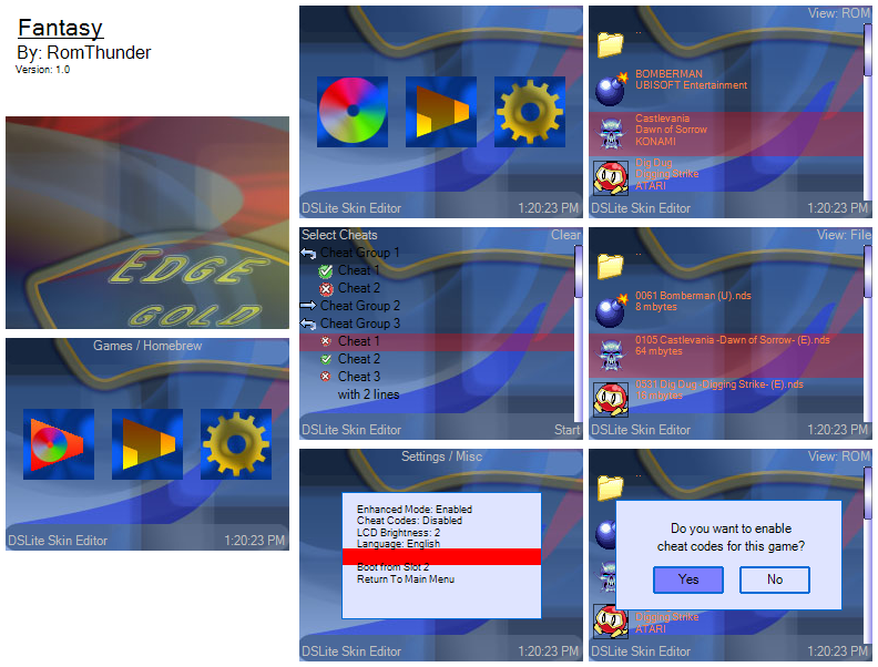
Here is mine. Is it OK that I used the Cyclo Skin tester to make the ScreenShot, because I think it looks better than the one the skin maker puts out.
Windows Edge
screenshot.png


Critique?
 
Covarr said:
Cema said:
Alright, well, I still don't feel entirely comfortable, but here is an image of my work thus far.

my.php


Thoughts?
No, no, you copied the wrong link from Imageshack. It should be "http://img370.imageshack.us/img370/1179/screenshotcollagesg6.png"

It's a bit boring, not much more than a gradient, but at least it's not too busy or unreadable, like quite a few of the skins posted have been. Also, I like that it's not a random insert of your favorite anime or videogame, as seems to be popular.

When using Imageshack, they supply a few different addresses to copy. The one you posted is acceptable as a link, but it's a page with an image on it, not the image itself.

Thanks Covarr. I like yours a lot, but you didn't continue the design through. Your cheat icons went, for the most part, unchanged, and your background could have done well if you only put a boarder at top and bottom, not completely around.
 
Cema said:
Covarr said:
Cema said:
Alright, well, I still don't feel entirely comfortable, but here is an image of my work thus far.

my.php


Thoughts?
No, no, you copied the wrong link from Imageshack. It should be "http://img370.imageshack.us/img370/1179/screenshotcollagesg6.png"

It's a bit boring, not much more than a gradient, but at least it's not too busy or unreadable, like quite a few of the skins posted have been. Also, I like that it's not a random insert of your favorite anime or videogame, as seems to be popular.

When using Imageshack, they supply a few different addresses to copy. The one you posted is acceptable as a link, but it's a page with an image on it, not the image itself.

Thanks Covarr. I like yours a lot, but you didn't continue the design through. Your cheat icons went, for the most part, unchanged, and your background could have done well if you only put a boarder at top and bottom, not completely around.

Actually, the cheat icons were identical to the pushpin that I used on the top screen and on the main menu bottom, except smaller. I didn't change the arrows, because I was having trouble coming up with a good replacement.

My original idea for the borders was to have it everywhere except between the screens, so it looks like a single tall bulletin board/corkboard instead of two smaller ones, but I needed the top and bottom of the bottom screen to be the same color so that I could have readable text over it.
 
Does anyone know a simple way to turn an image into black-and-white? I Googled it, but I just found stuff that had to do with Adobe Photoshop, which I don't have.
 
Nin10doFan said:
Does anyone know a simple way to turn an image into black-and-white? I Googled it, but I just found stuff that had to do with Adobe Photoshop, which I don't have.

You can use an online image editor, such as http://www.lunapic.com/editor/

or download a free image editor, such as GIMP http://www.gimp.org/
 
I just gotta reconfirm. I know for the first few pages someone mentioned that the same background on the main page (page with the three icons) is used for the rom selection page as well? Is this confirmed..? I don't want to use the same background on rom selection page.
frown.gif
 
Anakir said:
I just gotta reconfirm. I know for the first few pages someone mentioned that the same background on the main page (page with the three icons) is used for the rom selection page as well? Is this confirmed..? I don't want to use the same background on rom selection page.
frown.gif
Unfortunately, this is the case. I could have gone a lot farther with my skin otherwise, but alas there is no other choice.
 
Ok, guess I'll join the fun too. Here's my entry, just made though and do give comments.
yaynds.gif


And for those who want to use it, here's the download link
 
Anakir said:
Ah, darn. That sucks. I don't want to rework my skin just for the sake of it being legible. Hmm. Whatever, I'll submit it and ask for feedback.

Edit: Here it is - clean and simple, but apparently it took me a while to do something like this. I have no idea why. At least it's done from scratch.
tongue.gif


Feedback please?
smile.gif
That's a nice skin!
Im guessing it would look MUCH better with a different rom screen. It really does suck. It limited what people could do.
I think your skin would work on the r4 better.

Also i think you should get a better name for it
tongue.gif

spash is sorta, well, generic.

Also to Jimbob7. that skin is awesome, but the rom selection screen almost kills it.
 
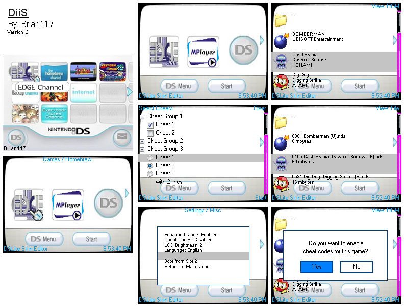
UPDATED EDGE GOLD ENTRY:

Name of skin/theme: DiiS V2.

Description: Basically a Wii like theme, I spent hours and hours designing it. Give feedback.

Link to download:
http://www.mediafire.com/?kmnyyddtmzv


Images:


screen_shot_collage-3.png


Don't worry guys, I deleted my other entry that was on page 15. This is still my first and only entry.
 
Nin10doFan said:
Does anyone know a simple way to turn an image into black-and-white? I Googled it, but I just found stuff that had to do with Adobe Photoshop, which I don't have.

Try the GIMP. http://www.gimp.org/

It's an open source image manipulation program, and is up to par with photoshop.

It's very useful
tongue.gif
 
Does anyone know how I can direct link my entry post?

I want to update my signature so when people click it, it takes them directly to my post.
 
Status
Not open for further replies.

Site & Scene News