Newbie

  • Thread starter Thread starter Jethro85
  • Start date Start date
  • Views Views 1,538
  • Replies Replies 11
Status
Not open for further replies.

Jethro85

Active Member
Newcomer
Joined
Jul 5, 2009
Messages
28
Reaction score
0
Trophies
1
Age
40
Location
Cedartown, GA
XP
213
Country
United States
I just started using Gimp this morning, I have used photoshop some in the past but only for editing minor stuff, I have never created anything before today. The first thing I did was create a sig for this forum, here it is :
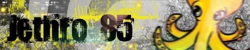
Sig2-Jethro85.jpg


then after that i made an avatar to match the sig:
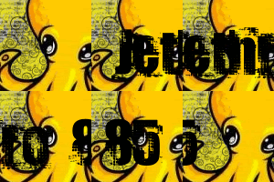
avatar1.gif


I am pretty proud of both of these since they are my very first creations.

I would like any feedback you have to offer.
 
nice work


little suggestions
try adding a black border around the sig and avatar
make the animated text little bit slower
and that thingy (mollusk, wht ever than yellow thing is) looks blurry on the sig
 
Woow nicee. Better than my first works. Just as Dark has said. Add a 1px Black Border around the siggy and avatar. The Mollusk/Octupus/Squid does look blurry. Maybe it was the effect you tried?
 
First: Welcome here, and welcome in the World of GIMP
smile.gif
. I'm also a Gimper, best App in my Opinion
wink.gif
.

Now: Everything was said...a nice black 1Px boarder for both, slower text, and maybe the octopus not that blured (a little too much...). Then it's realy 100% perfect. Realy nice done, I think the colors you've used match perfect, looks great
smile.gif
. For your first time, that's an awesome work!

Btw: What are the Brushes and Font you used?
 
QUOTE said:
Btw: What are the Brushes and Font you used?
Brushes from deviantart and font from dafont. i think the brushes came from grunge 3 and i THINK the font is called docteur atomic.

First of all: Thanks for the suggestions and the warm welcomes!

I will post the updated pics soon, I was in a hurry when I made the .gif so I forgot to blur it to match the sig, but you are all right that there is too much blur on the octopus. I will cut the speed in half on the animation.


Coming soon:
  • AceKard skin that matches my sig
  • Psyduck (for my gf)
  • Kadabra (for fun because he rocks)
 
new sig
muivqu.jpg


new avatar
2m2818x.jpg


i couldn't find the spiraly brush that i used in the sig for my avatar. i guess that doesn't matter.

i changed the motion blur from 5 to 3 and added it to the avatar as well.

lol i made the avatar and then forgot the border so i had to go back in and merge a border layer into each frame. it took FOREVER!
 
For some reason, I liked the old avatar better. Even though it was faster, this one looks a bit choppy. If you are making an AceKard skin, that must mean you own an AceKard. AceKard FTW!
 
Jethro85 said:
new sig
muivqu.jpg


new avatar
2m2818x.jpg


i couldn't find the spiraly brush that i used in the sig for my avatar. i guess that doesn't matter.

i changed the motion blur from 5 to 3 and added it to the avatar as well.

lol i made the avatar and then forgot the border so i had to go back in and merge a border layer into each frame. it took FOREVER!
well done
it does really look good now!!
like the border
 
Status
Not open for further replies.

Site & Scene News

Popular threads in this forum