I was bored...again.

  • Thread starter Thread starter Rock Raiyu
  • Start date Start date
  • Views Views 5,392
  • Replies Replies 14

Rock Raiyu

Clock Up
Member
Joined
Jul 14, 2007
Messages
5,066
Reaction score
40
Trophies
1
Age
34
Location
Walking the path of heaven
XP
2,449
Country
United States
animegirls.jpg

Summer Time Christmas
 
DUDE THEIR AWSUM!!!!!!!!!

I didnt see the top ones that much as I am not a person that looks at girls that are trying to be sexy.
smileipb2.png

I likes the avatar and the S4 Source for S4 League MMO sigs and the Megamn Sig (and render.)
yaynds.gif
 
Galacta said:
DUDE THEIR AWSUM!!!!!!!!!

I didnt see the top ones that much as I am not a person that looks at girls that are trying to be sexy.
smileipb2.png

I likes the avatar and the S4 Source for S4 League MMO sigs and the Megamn Sig (and render.)
yaynds.gif
But they are sexy!
wub.gif


Thanks for the comments!
 
Raiyu245,
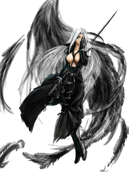
the first 3 pictures surely make me bleed~!
the megaman/rockman is so cool ..hehehe makes me feel like having a real megaman
smile.gif


this one is nice Ruu-chan from ToHeart 2
 
Raiyu245 said:
s4avatar.png

Show me your S4!!

s4leagueportablesig.png

A sig I made for S4 League MMO

s4sig.png

A sig I currently use at S4 Source for S4 League MMO
Stop using a framework(?) around your text.
It doesn't looks good, you should be using gradients or such.
Besides that it looks good.
Oh yeah, number 3, 5 and 7 looks overcontrasted.
This is purely for the sigs, i must say you've chosen your renders very good

rolleyes.gif
 
Egonny said:
Raiyu245 said:
s4avatar.png

Show me your S4!!

s4leagueportablesig.png

A sig I made for S4 League MMO

s4sig.png

A sig I currently use at S4 Source for S4 League MMO
Stop using a framework(?) around your text.
It doesn't looks good, you should be using gradients or such.
Besides that it looks good.
Oh yeah, number 3, 5 and 7 looks overcontrasted.
This is purely for the sigs, i must say you've chosen your renders very good
rolleyes.gif
They aren't over contrasted. That's just the design.
unsure.gif
 
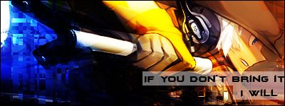
It's a good start. My only complaints are:

-You're making them WAY too bright. There's no lightning in there at all, it's more like just bright EVERYWHERE. You've got no light source or focal point, so you might wanna work on that.
-The text looks really ugly. I used to do the same thing with the white bar in overlay and putting text on top of it, but it just looks tacky and unorganized. Try the blend the text it a little more and work on your text placement.
 
War said:
It's a good start. My only complaints are:

-You're making them WAY too bright. There's no lightning in there at all, it's more like just bright EVERYWHERE. You've got no light source or focal point, so you might wanna work on that.
-The text looks really ugly. I used to do the same thing with the white bar in overlay and putting text on top of it, but it just looks tacky and unorganized. Try the blend the text it a little more and work on your text placement.
I thought the text and white bar overlay looked cool. I guess not..v_v

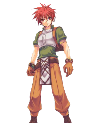
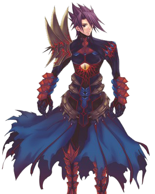
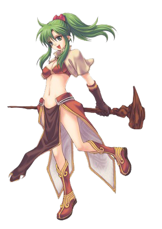
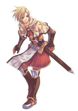
Renders from Ragnarok Online DS
maincharacter.png


darkknight.png


sorceress.png


swordsman.png
 

Site & Scene News

Popular threads in this forum