


This is just amazing! Really creative what you did with the icon overlays. 10/10After lot of hard work my new theme finished!
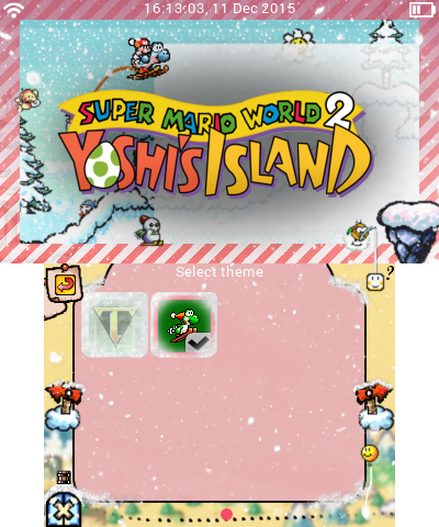
Yoshi's Christmas Island
(more at the end of this post)
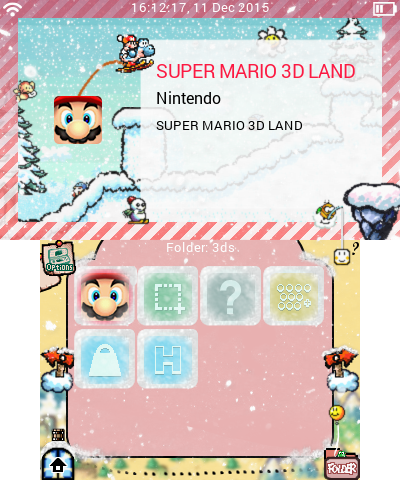
A few days left 'til christmas and what's better than celebrating it with our lovely Yoshi? I've edited every icon possible - expect for the folders ones. Also, thanks to the overlay images, you have a snow effect on your app icons!
What it also included:
- Boot screen, sound (thanks to JJTapia19 for allowing me to use it, check out his awesome themes!)
- Reboot screen
- Background music (Athletic theme)
- All sound effects (made by JJTapia19, thanks again)
- Top screen image for the information page
- Progress wheel (thanks to JJTapia19!)
.smdh included
Download:
http://www.file-upload.net/download-11114995/YoshisChristmasIsland.zip.html


Similar threads


Site & Scene News
New Hot Discussed
-
-
19K views
Pokemon Platinum PC port gets a surprise release
Seemingly out of nowhere a PC port for Pokemon Platinum has surfaced online, bundled alongside the source code for those interested in building and developing it for... -
13K views
Steam Deck gets a major price bump, more than 40% increase for US buyers
With very little in the way of announcement, Valve has today increased the price of the Steam Deck but some fairly considerable margins. Both of the available models... -
10K views
Sony announces PlayStation Plus price increase for new customers starting May 20
Earlier this year, Sony announced major price increases for the PS5, PS5 Pro, and PlayStation Portal. Now the company is raising prices again, this time for... -
9K views
Nintendo Direct June 9, 2026 roundup - Ocarina of Time remake announced, Kingdom Hearts IV trailer
Nintendo's expected Summer showcase is here, offering up plenty of new announcements and exciting reveals. Let's see what they have in store in the latest Nintendo... -
9K views
Pokémon Crystal gets a PC port titled "suiCune" based on C/C++ language
Continuing with the great news of Pokémon Platinum getting a native unofficial PC port just a few days ago, today, yet another classic title from the franchise has... -
9K views
Paper Mario PC recompilation "ReCut" gets its first pre-release build
The latest in a growing number of native PC ports, Paper Mario ReCut got its first pre-release build earlier this week. Based on the N64 recompilation toolchain, the... -
7K views
Low-level 3DS emulator 3Beans released alongside setup tutorial video
When you talk about 3DS emulation, most people would jump to Citra. As the defacto choice since its first release it's seen tremendous success, and even after its... -
6K views
PlayStation State of Play June 2, 2026 broadcast - new God of War announced
A whole hour of PlayStation content is on the way, thanks to the latest State of Play showcase. Headlining the stream will be Marvel's Wolverine, alongside a... -
5K views
Call of Duty: Modern Warfare 4 to launch on Nintendo Switch 2 in October
For the first time in 13 years, the Call of Duty series will again return to Nintendo's consoles. Set to launch on the 23rd of October, the latest release, Modern... -
5K views
RAManimator adds animated graphics to emulated games with no ROM editing
Back in April we covered the ROM hacking efforts to add fifth-generation animated sprites to third generation Pokemon games. It remains a thoroughly impressive...
-
-
-
171 replies
Steam Deck gets a major price bump, more than 40% increase for US buyers
With very little in the way of announcement, Valve has today increased the price of the Steam Deck but some fairly considerable margins. Both of the available models... -
141 replies
Nintendo Direct June 9, 2026 roundup - Ocarina of Time remake announced, Kingdom Hearts IV trailer
Nintendo's expected Summer showcase is here, offering up plenty of new announcements and exciting reveals. Let's see what they have in store in the latest Nintendo... -
103 replies
Pokemon Platinum PC port gets a surprise release
Seemingly out of nowhere a PC port for Pokemon Platinum has surfaced online, bundled alongside the source code for those interested in building and developing it for... -
92 replies
Sony announces PlayStation Plus price increase for new customers starting May 20
Earlier this year, Sony announced major price increases for the PS5, PS5 Pro, and PlayStation Portal. Now the company is raising prices again, this time for... -
91 replies
What do you want to see in the next Nintendo Direct?
With rumours circulating about a Nintendo Direct in the coming days and weeks, fans are left speculating and hoping as to what might be included. At the centre of all... -
78 replies
Paper Mario PC recompilation "ReCut" gets its first pre-release build
The latest in a growing number of native PC ports, Paper Mario ReCut got its first pre-release build earlier this week. Based on the N64 recompilation toolchain, the... -
71 replies
PlayStation State of Play June 2, 2026 broadcast - new God of War announced
A whole hour of PlayStation content is on the way, thanks to the latest State of Play showcase. Headlining the stream will be Marvel's Wolverine, alongside a... -
71 replies
Nintendo Direct to air on the 9th of June, set to feature 50 minutes of Switch and Switch 2 games launching this year
After much speculation and rumour, the fabled Nintendo Direct is upon us. Set to go live tomorrow, the 9th of June, at 3pm in the UK, it'll feature 50 minutes of... -
63 replies
Call of Duty: Modern Warfare 4 to launch on Nintendo Switch 2 in October
For the first time in 13 years, the Call of Duty series will again return to Nintendo's consoles. Set to launch on the 23rd of October, the latest release, Modern... -
55 replies
Nintendo fined 35 million euros by the French government due to Switch 1 Joycon malfunctions
Following an investigation over misleading commercial practices, today Nintendo has been imposed a fine of 35 million euros related to the controller malfunctions...
-


