- Joined
- Feb 20, 2012
- Messages
- 457
- Reaction score
- 162
- Trophies
- 1
- Location
- Off the Island
- XP
- 479
- Country


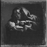
There is no way you intentionally made the quality crap. All the dots and random colors you see around the edges (zoom in if you don't notice them) are a result of compression. It's just like the compression in a jpg file:^ Actually, that's me trying to add 'lettering' to the cover - didn't really work. Static 'MOD' looks a lot nicer, thanks!


It happened to everyone else too.I've edited this at a pixel level using MSPaint - perhaps the artefacts are from rendering the font in MSPaint?
I can try. Give me a bit.Anyhoo, thanks for touching it up - much appreciated. Can i ask a favour - I can't do it in paint - can you make it 'nintendo' red, black out side the ring, white inside? The screen 'O' might look a bit pants in red, maybe leave that black, and the cover white?
I really need to get into gimp or PS.
Thanks!


I'm working on it...(really hard). i have one in mind. an the good part is i can do it any color to match a theme..IMHO those are highly pixelated and not very good, i.e colours don't go with WiiFlow as a whole, I.personally would stick with white/blue or shades of blue/white.
Also please don't use that horrible uLoader/Nintendo style border, its really ugly aswel as the font.
You guys need a nice HQ, crisp, clean, simple to look at animation. Most things that have been posted are highly busy, sluggish(choppy animation) and franky just not that nice to look at, don't get me wrong I haven't done much better but to me WiiFlow needa a nice modern loading screen(as well as a new default theme facelift).
I just see old skool Win 95 styles at the moment compared to a nice Win7/8 upgrade we need.
Just my 2 cents no offence intended, just friendly advice.


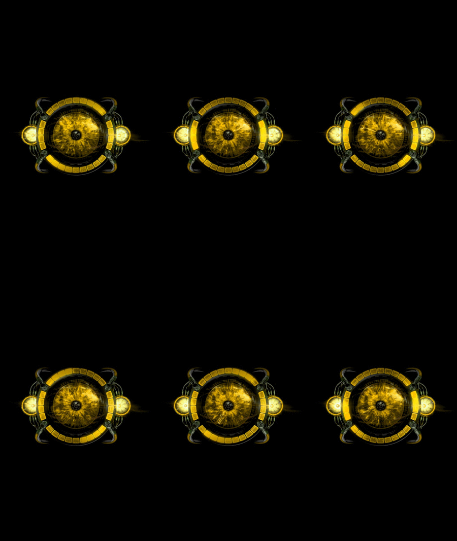
Thanks man, all good points. Given that we've got 10 frames of 200 x 100 pixels to play with - I can't see a windows 7 level animation anytime soon. I look forward to seeing your attempts prove me wrong!IMHO those are highly pixelated and not very good, i.e colours don't go with WiiFlow as a whole, I.personally would stick with white/blue or shades of blue/white.
Also please don't use that horrible uLoader/Nintendo style border, its really ugly aswel as the font.
You guys need a nice HQ, crisp, clean, simple to look at animation. Most things that have been posted are highly busy, sluggish(choppy animation) and franky just not that nice to look at, don't get me wrong I haven't done much better but to me WiiFlow needa a nice modern loading screen(as well as a new default theme facelift).
I just see old skool Win 95 styles at the moment compared to a nice Win7/8 upgrade we need.
Just my 2 cents no offence intended, just friendly advice.

if it's a loop style then the answer is yes. you can add any sound you like.Can we have a boot sound to accompany this? "Saaaaaaaaaaayyyyy gaaaaaaaaaaaaaaaah!" (read: SEGA)


you guys need to remember WiiFlow reverses .png flow after the last frame until it loads, so..
1, 2, 3, 4, 5, 6, 7, 8, 9,10,10,9, 8, 7, 6, 5, 4, 3, 2, 1, 1, 2, 3, 4, 5, 6, 7, 8, 9,10, 10,9, 8, 7, 6, 5, 4, 3, 2, 1

gif maker