FIXED! Notification box icons: help us find better ones

  • Thread starter Thread starter Costello
  • Start date Start date
  • Views Views 8,392
  • Replies Replies 55
  • Likes Likes 1

Costello

Headmaster
Administrator
Joined
Oct 24, 2002
Messages
14,445
Solutions
15
Reaction score
16,474
Trophies
5
XP
23,130
DISCLAIMER: this thread is not about whether you like the notification box or not, or about you wanting it removed. The notification box will be discussed in a separate thread, this thread focuses on the icons only. Thank you for respecting that :)

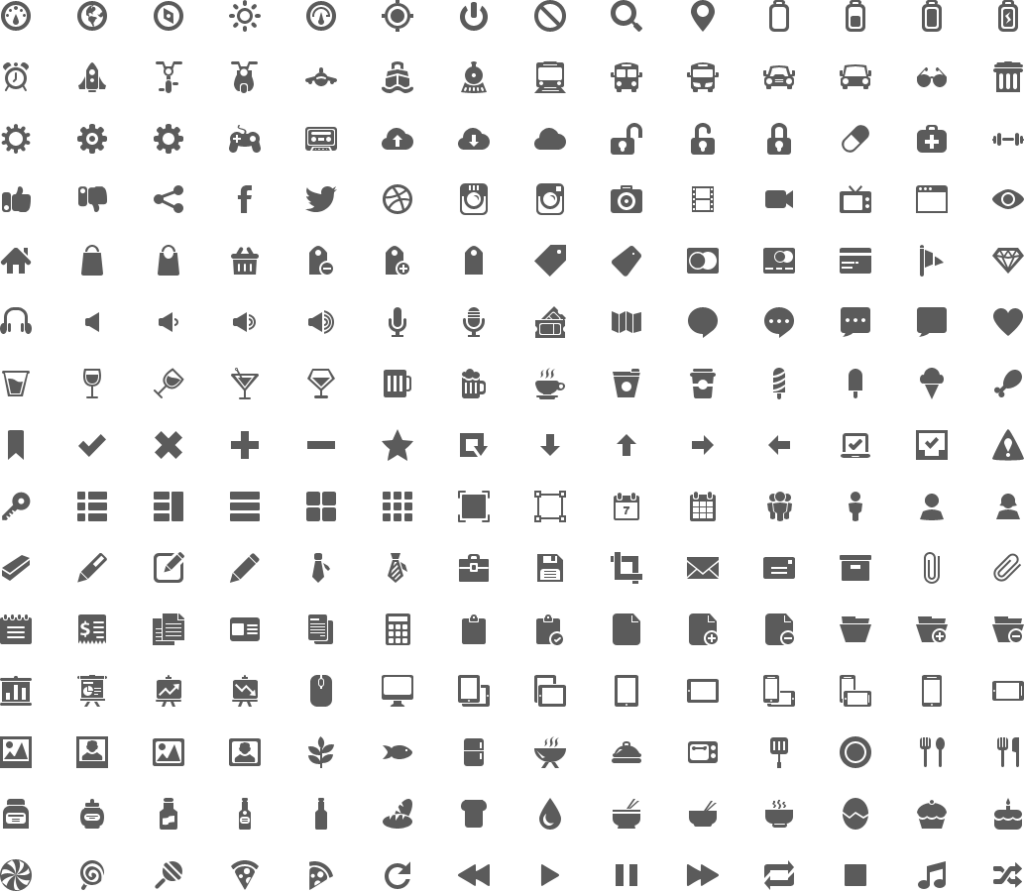
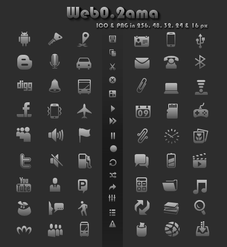
The icons of the notification box are from an old copyright free icon set.
We couldn't produce better ones (due to the lack of a graphic designer in the team) so we had to resort to these:

upload_2015-5-31_11-39-52.png


Individual icons:
visitor.png


Feel free to suggest better ones, designing them yourselves or selecting them from a commercial-free & copyright-free source.

Thanks for your help!
 
  • Like
Reactions: Margen67
Reports, presumably.

Yep, reports.

@Costello http://www.flaticon.com/packs/ has a ton of icons (even Google's Android pack) that are open-source, or public domain, or allowed for commercial use, etc. Most are CreativeCommons BY 3.0 attributed. Attribution would be able to be placed in the footer like the XenForo bit for the licensed ones. For fully public domain, I'd have to look.
 
  • Like
Reactions: JoostinOnline
thanks for linking to icon sets, but could you just actually post icons that you would like us to use? There are just thousands, it's impossible for a single person to go through them all :P
 
  • Like
Reactions: Sicklyboy
@Costello, looking at flat icons...

Google Material Design: (actually not as crazy about these as I thought)
PM - http://www.flaticon.com/free-icon/chat-bubbles_60527
Alert - http://www.flaticon.com/free-icon/notifications-bell-button_61073 OR http://www.flaticon.com/free-icon/waving-flag_61142
Report - http://www.flaticon.com/free-icon/report-symbol_61114 OR http://www.flaticon.com/free-icon/failed-sms_61153
Filetrip - http://www.flaticon.com/free-icon/folder-symbol_61118


Bryn Taylor's "Essential Icons": (almost 1:1 flat replacements for ours)
PM - http://www.flaticon.com/free-icon/new-message-envelope_77745
Alert - http://www.flaticon.com/free-icon/inclined-bell_77749
Report - http://www.flaticon.com/free-icon/triangular-warning-sign_77848
Filetrip - http://www.flaticon.com/free-icon/computing-folder_78029

The downside is that they will have to include "designed by Freepik" somewhere on the page (presumably the footer).

To be fair we'd have to do that for almost any non-public domain icons (even then it'd be courteous to do so)
 
Whoops, never did see that disclaimer. I'll save that suggestion for when that thread is made.

To be somewhat productive though, the Font Awesome set is a really nice set to use. It's also under MIT license as well.
 
Out of the two sets, I think this would be the best replacement. I like these ones too, so seeing as I'm too lazy to go hunting, my vote goes to this simple yet effective set. Plus, assuming the box is eventually darkened up for the dark theme, these symbols would be dark enough to show through, though it's hard to say if darker or lighter would be better. I guess it would depend on the color chosen for the box.
 
you'd use black icons? or should they be recolored?

can someone make a spritesheet like this
visitor.png

with the exact icons and colors that you'd suggest (I doubt anyone was going to suggest black, right?)
 
I don't think that black is a particularly terrible idea... fine, I'll out and say it - yes, I was going to suggest black.

Granted, I still don't know what your thoughts are on needing to include attribution for icons on the page. These ARE commercially usable, you just need to attribute it (like I said, footer by the XenForo bit is good)(and you have to commercial or not). If an attribution string isn't desired then that's going to significantly limit what can be used and things will probably lean more towards designing our own.
 
I don't think that black is a particularly terrible idea... fine, I'll out and say it - yes, I was going to suggest black.

Granted, I still don't know what your thoughts are on needing to include attribution for icons on the page. These ARE commercially usable, you just need to attribute it (like I said, footer by the XenForo bit is good)(and you have to commercial or not). If an attribution string isn't desired then that's going to significantly limit what can be used and things will probably lean more towards designing our own.
yes we want to avoid icons that require attribution. Otherwise our footer will soon be cluttered with attribution mentions. It could work once, but what happens when we open a new site feature that requires more icons? I think it's best to stay on one unique path

as for black I do believe it would look out of place considering we don't use black anywhere else on the site, not even for fonts
 
  • Like
Reactions: Sicklyboy
ok, I tested those icons in the dark and light themes.. and that light grey color looked good in both of them. So, I'm done for now.
I still can change it up, if it's pointed to be needed for some reason though..
 
I just looked at the readme for that and commercial use isn't allowed :( (and attribution is needed)
ugh..

well, this is no commercial use though.
All that would be needed is: "You must give appropriate credit, provide a link to the license (Creative Commons 3.0). You may do so in any reasonable manner"

Couldn't we do so here: http://wiki.gbatemp.net/wiki/Category:GBAtemp.net ? ...seems like a reasonable manner to do it...


Edit: thanks for the heads up btw.

I'll post new ones that need no credit at all

just a sec ....I'm doing a thing...
 
Last edited by Walker D,

Site & Scene News