ROM Hack Game Center CX : Arino no Chosenjo 2 (New Start?)

Aaron Chmielowiec

Wielder of the 4 sacred cheeses
OP
Member
Joined
Aug 24, 2013
Messages
479
Trophies
0
Age
47
Location
Wako-shi, Saitama, Japan
Website
aaronin.jp
XP
1,287
Country
Actually, I usually write out the URL base and copy/paste and them add in the picture filename after that. I forgot to remove that base link. Pay it no mind.

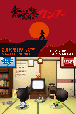
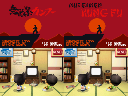
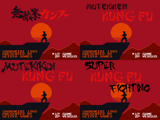
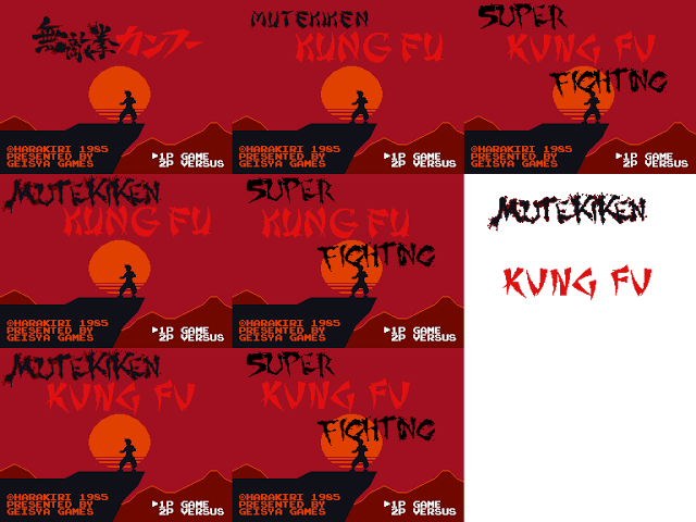
Okay, now that I got through the main game and fixed up the main dialogue I have the following to do in whatever order I want, I guess:

* fix the magazines and manual text
* check/fix the actual challenge text
* check and fix the text (again) for the Adventure
* proofread the rest of the RPG
* add in the Triotos DX taunts

At that point I think all there is left to do is hack in the remaining graphics. Some of it is already done and a bunch is in progress. I'll edit this post later with some random screenshots just to add some more color to this page.

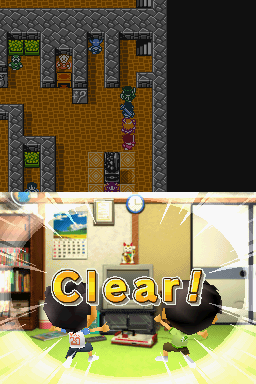
Clearing the 4th challengs of Guadia Quest Saga:
gqclear.png


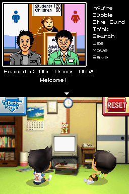
Testing some of the new redone backgrounds in Arino : Ace Detective
advnewbg.png


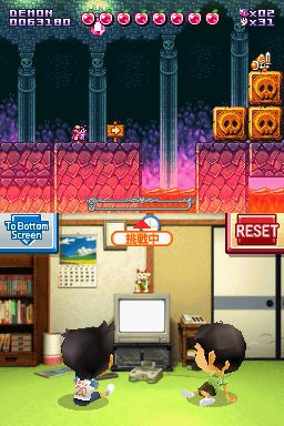
Super Demon Returns is looking good even if there wasn't much to translate with this one:
sdr.png


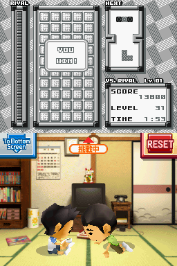
Triotos works fine, demo messages and all. Other than the global "Now Playing" in the bottom screen, when you win in VS mode, the background fills with 勝 tiles. 勝ち means "to win" but it says "You win!" right there so I'm not sure if I really have to do anything to those background tiles. Westerners can just see it as a pretty pattern.
youwin.png


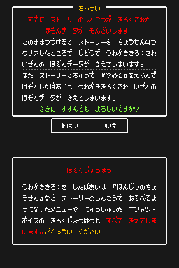
And here is a screen you don't normally see. This is a special warning saying that since you already have a saved game, it will be overwritten if you start a new game and clear an entire chapter of challenges or you save when quitting. "Do you wish to continue?" This is a minor issue since you have to go out of your way to see it but it should be done, even if this is one giant messy tiled graphic.
bigwarning.png
 

AnotherGamer

Well-Known Member
Newcomer
Joined
Oct 9, 2008
Messages
61
Trophies
0
XP
200
Country
Finland
I think I kinda prefer the translated version, the pseudo-Chinese script kinda fits the era of the game.

As for the Triotos "win" tiles, maybe you could try editing those into a hand showing the V sign.
 

Freqman

Well-Known Member
Newcomer
Joined
Mar 22, 2007
Messages
86
Trophies
1
XP
521
Country
Canada
heh i like the 'chinese' title graphics better, the english one looks like a 1980 Chinese delivery menu pamphlet (no offense)
 

Celice

Well-Known Member
Member
Joined
Jan 1, 2008
Messages
1,920
Trophies
1
XP
628
Country
United States
The english screen feels very bland, and has no character to it. Probably because all the letters are in uniform order. The Japanese screen has some velocity to the black characters, as an example.
 

Pix3l

Active Member
Newcomer
Joined
Sep 12, 2013
Messages
25
Trophies
1
Age
37
XP
111
Country
Italy
Well, I'm agree with you guys about the black text, but it's difficult to find something that look like that...
I can try to mimic the character by hand or you can tell me what font is more suitable to your taste:
http://www.dafont.com/it/theme.php?cat=201

What about this little test for Triotos?
youwin.png

From up to down, a star, a crown, a cup and 2 fingers in sign of victory.
Your the choice!
 

Pix3l

Active Member
Newcomer
Joined
Sep 12, 2013
Messages
25
Trophies
1
Age
37
XP
111
Country
Italy
On the subject of the title, I found that the first Retro Game Challenge used "Super Kung-Fu Fighting" as the name when the magazines mentioned this game.

If it was written that, I think it's can be good to use that title instead of a literally translation of it...
Anyway, I made some more 2 variants for the title screen, what do you think about?

kungfutitle.png


The last 2 variants are work in progress, they need some more work on it, this is just a proof of concept before I continue the work.
Let me know your thoughts ;)
 

Arras

Well-Known Member
Member
Joined
Sep 14, 2010
Messages
6,318
Trophies
2
XP
5,441
Country
Netherlands
If it was written that, I think it's can be good to use that title instead of a literally translation of it...
Anyway, I made some more 2 variants for the title screen, what do you think about?

kungfutitle.png


The last 2 variants are work in progress, they need some more work on it, this is just a proof of concept before I continue the work.
Let me know your thoughts ;)
Ooh, I rather like the fourth one. Maybe change the KUNG FU font to be a bit more angular and a bit less rounded/curved? The original font seems to use almost straight lines.
 

Aaron Chmielowiec

Wielder of the 4 sacred cheeses
OP
Member
Joined
Aug 24, 2013
Messages
479
Trophies
0
Age
47
Location
Wako-shi, Saitama, Japan
Website
aaronin.jp
XP
1,287
Country
Just a quick note:

For Mutekiken, I know the title needs "Mutekiken" in roman characters. When I said background characters I meant the random characters on walls during the game.

For Triotos, I can't have those blocks be different in the victory screen. All must be the same.

That's about it. I have the manuals and magazines set up ready to edit now so I'll get to that (just the text contents)
 
  • Like
Reactions: Calitar and Pix3l

Aaron Chmielowiec

Wielder of the 4 sacred cheeses
OP
Member
Joined
Aug 24, 2013
Messages
479
Trophies
0
Age
47
Location
Wako-shi, Saitama, Japan
Website
aaronin.jp
XP
1,287
Country
Ah, okay. Of those Triotos ones if I had to pick I guess the star looks best if we absolutely had to change it.

I'm at a loss for Mitekiken, though. One thing to note is the game elsewhere refers to this "game" as Mutekiken Kung Fu so if we change it to something else there is a lot to change in the rest of the game's script and I'm not too fond of that idea.

Where in the original RGC does it refer to this game? I'm curious what the Japanese version called it.
 
  • Like
Reactions: Calitar and Pix3l

Celice

Well-Known Member
Member
Joined
Jan 1, 2008
Messages
1,920
Trophies
1
XP
628
Country
United States
I don't like any of the Super Kung Fu Fighting choices, as they bleed down into the setting sun and actually the head of the silhouette figure. The Mutekiken screens maintain good space composure by filling the empty parts up top without feeling like they're taking up too much space.

Bottom-left is my choice, but KUNG FU still feels like it's being typed out in Note Pad instead of being a title screen :< It just feels very... office-document like.
 
  • Like
Reactions: Pix3l

Lazermutt4

New Member
Newbie
Joined
Apr 30, 2014
Messages
4
Trophies
0
Age
29
XP
56
Country
United States
Ah, okay. Of those Triotos ones if I had to pick I guess the star looks best if we absolutely had to change it.

I'm at a loss for Mitekiken, though. One thing to note is the game elsewhere refers to this "game" as Mutekiken Kung Fu so if we change it to something else there is a lot to change in the rest of the game's script and I'm not too fond of that idea.

Where in the original RGC does it refer to this game? I'm curious what the Japanese version called it.
In the first magazine (December 1984), it's at the top of the sales charts in the back. I checked the Japanese version to make sure and in the same spot was
無敵拳カンフー, the exact title of this game.
 

Pix3l

Active Member
Newcomer
Joined
Sep 12, 2013
Messages
25
Trophies
1
Age
37
XP
111
Country
Italy
I don't like any of the Super Kung Fu Fighting choices, as they bleed down into the setting sun and actually the head of the silhouette figure. The Mutekiken screens maintain good space composure by filling the empty parts up top without feeling like they're taking up too much space.

Bottom-left is my choice, but KUNG FU still feels like it's being typed out in Note Pad instead of being a title screen :< It just feels very... office-document like.

Kung Fu text now has the same line style of the original one, the traits are the same, and the pure pixelated lines maybe doesn't help to make it more enjoyable to eyes...
I think the new text in the recent sketches is a good compromise... or not?
 

Arras

Well-Known Member
Member
Joined
Sep 14, 2010
Messages
6,318
Trophies
2
XP
5,441
Country
Netherlands
Kung Fu text now has the same line style of the original one, the traits are the same, and the pure pixelated lines maybe doesn't help to make it more enjoyable to eyes...
I think the new text in the recent sketches is a good compromise... or not?
I rather like the new text myself. He is right about the FIGHTING text overlapping the silhouette though.
 

Site & Scene News

Popular threads in this forum

General chit-chat
Help Users
  • No one is chatting at the moment.
  • K3Nv2 @ K3Nv2:
    why
  • Xdqwerty @ Xdqwerty:
    @K3Nv2, it's not funny
  • K3Nv2 @ K3Nv2:
    ok
  • BigOnYa @ BigOnYa:
    Wut?
  • K3Nv2 @ K3Nv2:
    That's not funny
    +2
  • Psionic Roshambo @ Psionic Roshambo:
    So two cannibals where eating a clown and one says to the other. Hey does this taste funny to you?
    +2
  • K3Nv2 @ K3Nv2:
    What do you call a slow car? Retired
    +1
  • Psionic Roshambo @ Psionic Roshambo:
    Did you hear about the police car that someone stole the wheels off of? The police are working tirelessly to find the thieves.
    +2
  • K3Nv2 @ K3Nv2:
    A firefighter got arrested for assault his main claim was what I was told he was on fire
    +2
  • BigOnYa @ BigOnYa:
    What do you call a hooker with a runny nose? Full
    +2
  • Psionic Roshambo @ Psionic Roshambo:
    What do you tell a woman with two black eyes? Nothing you already told her twice!
  • K3Nv2 @ K3Nv2:
    Diddy also works
  • K3Nv2 @ K3Nv2:
    A scientist heard the word batman so he put a naked lady in a cage with a bat
  • Psionic Roshambo @ Psionic Roshambo:
    Chuck Norris won a staring contest, with the sun.
  • K3Nv2 @ K3Nv2:
    A vampires favorite thing to do is moon you
  • BigOnYa @ BigOnYa:
    What's the difference between an airplane, and Ken's mom? Not everyone has been in an airplane.
  • K3Nv2 @ K3Nv2:
    What's the difference between @BigOnYa and his wife? Nothing both want to bone me
    +3
  • RedColoredStars @ RedColoredStars:
    How much wood could a wood chuck chuck if a wood chuck could chuck norris
    +1
  • BakerMan @ BakerMan:
    how do i know? you're a guy, and he wants to bone every guy on this site (maybe, idk)
    +1
  • K3Nv2 @ K3Nv2:
    He wants to bone anything with a dick
    +1
  • Xdqwerty @ Xdqwerty:
    Good night
    +1
  • BigOnYa @ BigOnYa:
    Nighty night, big day tomorrow. Congrats.
    K3Nv2 @ K3Nv2: https://www.instagram.com/reel/C7iLZ35NrQt/?igsh=MWd2Z3U0dmNlMmNxcw==