- Joined
- Feb 2, 2008
- Messages
- 88
- Reaction score
- 0
- Trophies
- 1
- Age
- 35
- Location
- Sydney
- Website
- Visit site
- XP
- 176
- Country

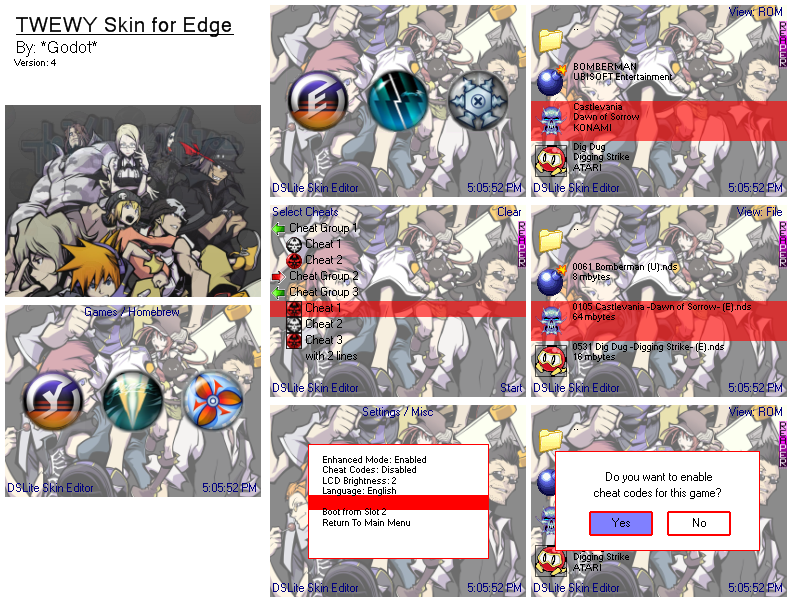
Godot: Your skin is looking pretty solid, it seems you have fixed up all the little gripes with it. Although, if I may mention one thing that may/may not ruin your whole skin - and this applies to most skins of your kind using one image over the two screens: you have to remember that there is an 'invisible' pixel gap between the screens. What I mean is, looking at it on the ds, it will seem as if an extra 90 pixels (roughly) worth of image are hidden between the sceens. If you can - just try and cut out about 90 (i'm pretty sure it's about 90 - 91 to be exact if my memory serves me correctly) pixels from the middle of the original image for use on top and bottom screens. For example, look at this graphic rip from GS3:

The image looks ugly there, but on screen it looks normal. Now, this is a good lead in to my own skin:

Everything was hand drawn by me, with the coffee stains added in with photoshop - please don't steal my pictures! Feedback is welcome. And could someone please test it - everything is either a 16bit or 8bit bmp (because I scanned in monochrome)
Test it please
The image looks ugly there, but on screen it looks normal. Now, this is a good lead in to my own skin:
Everything was hand drawn by me, with the coffee stains added in with photoshop - please don't steal my pictures! Feedback is welcome. And could someone please test it - everything is either a 16bit or 8bit bmp (because I scanned in monochrome)
Test it please