- Joined
- Apr 24, 2009
- Messages
- 2,941
- Solutions
- 1
- Reaction score
- 110
- Trophies
- 1
- Age
- 29
- Location
- In Vulpes' Fur
- Website
- meekpicture.blogspot.com
- XP
- 658
- Country

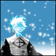
Okay, my first sig that actually looks decent (unlike my first one). The one I'm using right now was only gotten from a website, so here:

Now, I'm asking, is it okay? Border maybe? Before I use it.
EDIT: Forgot to mention. I only did this in 30 minutes, so there is not that much effort into it.
EDIT: I just made a Scribblenauts one:

Now, I'm asking, is it okay? Border maybe? Before I use it.
EDIT: Forgot to mention. I only did this in 30 minutes, so there is not that much effort into it.
EDIT: I just made a Scribblenauts one: