Lighting And Shading Sprites.

  • Thread starter Thread starter SSJ Zac
  • Start date Start date
  • Views Views 2,615
  • Replies Replies 13

SSJ Zac

Well-Known Member
Member
Joined
Apr 8, 2004
Messages
207
Reaction score
0
Trophies
2
XP
184
Country
United States
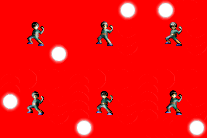
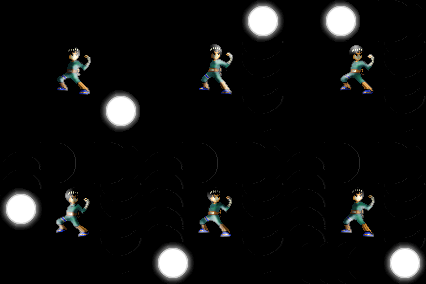
Here are my newest animations. Attempts on Shading and Lighting.

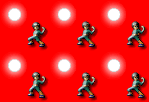
1st Attempt:
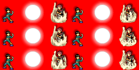
ShadowLighting.gif


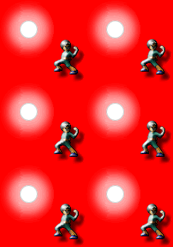
2nd Attempt:
Lighting.gif


Brighter:
Lighting2.gif


3rd Attempt:
Lighting3.gif


Darker Background:
Lighting4.gif


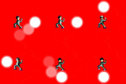
Final Attempt:
Lighting5.gif


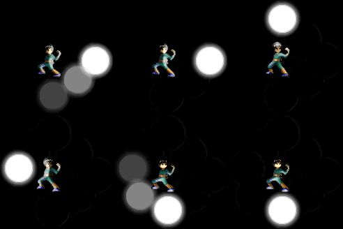
Darker Background:
Lighting6.gif


It only took me a few tries to perfect it
happy.gif
 
What about the final attempts? I edited those sprites and made them brighter/darker according to where the light was. I thought I did a pretty good job.
 
The final attemps look great. I just like Gaara a lot, so I guess that's why I commented on him first.
Anyway, keep it up.

Happy trails.
 
I actually think that effect looks pretty neat. It's just a matter of applying the bevel and shadow filter onto the sprite in photoshop, but it looks neat animated.
 
I didn't use photoshop. What is the Bevel and Shadow Filter?
It's a Layer Style thing in Photoshop, but I suspect most other programs have a beveling option that works like any other filter. What tshu is talking about are the "Drop Shadow" (and perhaps Inner Shadow, not sure) and "Bevel and Emboss" Layer Styles, and I too think your sprite lighting looks a lot like it was done using those "filters".
Like I said, if you used a different program, then it's still likely the options are named in a very similar, if not the same, way.
What program do you use then?


...In any case, it's still not pixel by pixel artwork, hence I cannot give you any of the respect I have for artists who work their way to a final product by changing the colour of individual pixels and making those into a whole image (and make it look good, of course
laugh.gif
).
 
It's close; the "light /dark" line down the middle of the body could do with being blended a little. Also the bright white highlights look a bit off; maybe switch the white for light versions of the colours underneath?
 
The lighting is awkward, they look like puffy stickers, different surface textures will reflect light in different ways, ie, hair, skin, fabric, etc. Clothes don't reflect light, they will only become brighter or darker based on the amount of light, unless they're made of some shiny material, like plastic or leather. That's why you only see the hotspots(white pixels) on his hair and tops of shoes, which by the way should be affected by your light. The shadows don't work, they are essentially stickers levitating off the page, they should be an outline of the body on the ground or at least ellipses, like in a Street Fighter game.
 

Site & Scene News

Popular threads in this forum