


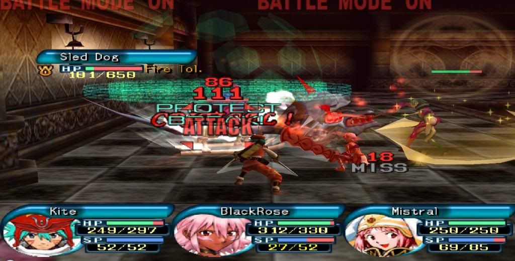
one question you will play a second playthrough before post the translate?if yes how much time you need?or the time is for the images and videos translate?i ask videos because you tell here have some videos only show on a second playthrough/thanksOhh no, that image right there is old... the game looks way better with the font we put some days ago...
Hacking Final Fantasy Type-0 RomHacking
- Thread starter SkyBladeCloud
- Start date
- Views 1,508,099
- Replies 4,653
- Likes 42

")


Similar threads

Site & Scene News
New Hot Discussed
-
-
24K views
Sony is moving away from physical discs, will soon only release PlayStation games digitally
Sony made a shocking announcement today, revealing that the company plans to move away from physical game releases in the future. Citing claims of how the industry is... -
16K views
Steam Machine waiting list goes live, starting at £879 with a 512GB SSD
After much speculation, a lot of which being caused by dbrand's unceremonious reveal of their Companion Cube casing, the Steam Machine is finally available to order... -
12K views
Xbox to increase in price again in August, Series S set to hit $500
Remember when you could get an Xbox Series S for $300? Those were the days. Microsoft has today announced the latest in their console price hikes, seeing their... -
11K views
Grand Theft Auto VI pre orders go live tomorrow, physical release limited to code in box
The delays may be behind us, but the news isn't all good for Grand Theft Auto VI. Rockstar have today announced that pre-orders for the game will go live tomorrow, on... -
8K views
Nintendo announces plans to discontinue Nintendo Switch line in Europe next year, outlines upcoming hardware changes for other devices
Last month we got confirmation of a new model of Switch 2 to better comply with upcoming EU regulations. With the legislation set to come into effect in February of... -
7K views
Sony announces shutdown of the PlayStation Store for the PS3 and Vita
The end has come for the PlayStation 3 and the PlayStation Vita. After supporting the PSN Store on the PS3 and PS Vita since 2006 and 2011 respectively, Sony has... -
5K views
Steam Summer Sale goes live, various titles discounted by varied amounts
In this time of economic uncertainty and rampant price hikes, the Steam sales stand as our final bastions of affordability for those opting to avoid the seas. The... -
5K views
A multi-platform port for Pokemon Emerald is in the works, supports Windows, Linux, and Android
Tired of waiting for Game Freak to bring Pokemon Emerald to modern platforms? We've got you covered with a brand new port in the works. Currently available on GitHub... -
5K views
Apple raises prices on MacBook and iPad lines, MacBook Neo starting price increased by $100
Apple have today announced price increases, primarily focused on their MacBook and iPad lines. These increases have already come into effect, with both prices and the... -
3K views
'Turok: Origins' gets gameplay trailer
Saber Interactive, in collaboration with Universal Products & Experiences, revealed a new gameplay trailer for Turok: Origins. This new entry to the dino-hunting...
-
-
-
391 replies
Sony is moving away from physical discs, will soon only release PlayStation games digitally
Sony made a shocking announcement today, revealing that the company plans to move away from physical game releases in the future. Citing claims of how the industry is... -
256 replies
Steam Machine waiting list goes live, starting at £879 with a 512GB SSD
After much speculation, a lot of which being caused by dbrand's unceremonious reveal of their Companion Cube casing, the Steam Machine is finally available to order... -
159 replies
Xbox to increase in price again in August, Series S set to hit $500
Remember when you could get an Xbox Series S for $300? Those were the days. Microsoft has today announced the latest in their console price hikes, seeing their... -
149 replies
Grand Theft Auto VI pre orders go live tomorrow, physical release limited to code in box
The delays may be behind us, but the news isn't all good for Grand Theft Auto VI. Rockstar have today announced that pre-orders for the game will go live tomorrow, on... -
75 replies
Nintendo announces plans to discontinue Nintendo Switch line in Europe next year, outlines upcoming hardware changes for other devices
Last month we got confirmation of a new model of Switch 2 to better comply with upcoming EU regulations. With the legislation set to come into effect in February of... -
62 replies
Sony announces shutdown of the PlayStation Store for the PS3 and Vita
The end has come for the PlayStation 3 and the PlayStation Vita. After supporting the PSN Store on the PS3 and PS Vita since 2006 and 2011 respectively, Sony has... -
55 replies
A multi-platform port for Pokemon Emerald is in the works, supports Windows, Linux, and Android
Tired of waiting for Game Freak to bring Pokemon Emerald to modern platforms? We've got you covered with a brand new port in the works. Currently available on GitHub... -
42 replies
Apple raises prices on MacBook and iPad lines, MacBook Neo starting price increased by $100
Apple have today announced price increases, primarily focused on their MacBook and iPad lines. These increases have already come into effect, with both prices and the... -
38 replies
Steam Summer Sale goes live, various titles discounted by varied amounts
In this time of economic uncertainty and rampant price hikes, the Steam sales stand as our final bastions of affordability for those opting to avoid the seas. The... -
36 replies
Octopath Traveler and Octopath Traveler II set to launch digitally on Switch 2 today, unclear as to whether an upgrade path will be available
Announced today during the Octopath Traveler 8th Anniversary live stream, it's been confirmed that both the first game and its sequel will be launching on the Switch...
-


