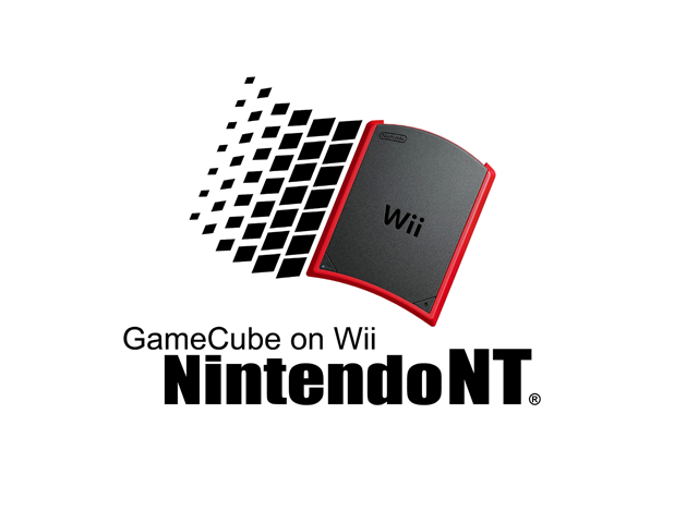
I cant draw but this is what I was talking about . Can I get partial credit for the the idea of using a capitol NT and it being a play on windows NT .
The backround needs some color here though. Maybe some flames or something.
I read the rules. You want me to post every frame of the animation as a PNG and we can pick a favorite one? If an animation is worth using it'll get used. Don't cut out options.
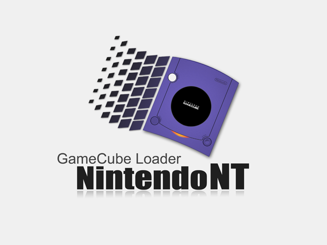
Since nobody likes mine, I might not be the best person for advice, but I'll give it anyway. I'd suggest making a second version (don't replace your first version) with "GameCube Loader" removed. I like it, but crediar might not, and it will likely take you one click to remove the text. You'll cover all your bases that way.
I gotta say, since this looks like you DID took time into making it, looks nicely done and clean, and no copyright material/object/trademark/ anything illegal/ bad, was used either, you definitely gotta be the winner here.
Sony made a shocking announcement today, revealing that the company plans to move away from physical game releases in the future. Citing claims of how the industry is...
Remember when you could get an Xbox Series S for $300? Those were the days. Microsoft has today announced the latest in their console price hikes, seeing their...
Last month we got confirmation of a new model of Switch 2 to better comply with upcoming EU regulations. With the legislation set to come into effect in February of...
The end has come for the PlayStation 3 and the PlayStation Vita. After supporting the PSN Store on the PS3 and PS Vita since 2006 and 2011 respectively, Sony has...
Tired of waiting for Game Freak to bring Pokemon Emerald to modern platforms? We've got you covered with a brand new port in the works. Currently available on GitHub...
In this time of economic uncertainty and rampant price hikes, the Steam sales stand as our final bastions of affordability for those opting to avoid the seas. The...
Apple have today announced price increases, primarily focused on their MacBook and iPad lines. These increases have already come into effect, with both prices and the...
For fans of Sinnoh, the pickings are slim. If you want the best experience you're left deciding between the updated region in Platinum, or the somewhat controversial...
The Switch 2 has been out for a year now, but you shouldn't count the original system out yet! Released a few days ago, popular PS2 emulator NetherSX2 has found its...
Ocarina of Time is back in style as the upcoming Switch 2 remake looms on the horizon. But what's a fan of the game to do over the next few months? If you've been...
Sony made a shocking announcement today, revealing that the company plans to move away from physical game releases in the future. Citing claims of how the industry is...
Remember when you could get an Xbox Series S for $300? Those were the days. Microsoft has today announced the latest in their console price hikes, seeing their...
Last month we got confirmation of a new model of Switch 2 to better comply with upcoming EU regulations. With the legislation set to come into effect in February of...
The end has come for the PlayStation 3 and the PlayStation Vita. After supporting the PSN Store on the PS3 and PS Vita since 2006 and 2011 respectively, Sony has...
Tired of waiting for Game Freak to bring Pokemon Emerald to modern platforms? We've got you covered with a brand new port in the works. Currently available on GitHub...
Ocarina of Time is back in style as the upcoming Switch 2 remake looms on the horizon. But what's a fan of the game to do over the next few months? If you've been...
Apple have today announced price increases, primarily focused on their MacBook and iPad lines. These increases have already come into effect, with both prices and the...
In this time of economic uncertainty and rampant price hikes, the Steam sales stand as our final bastions of affordability for those opting to avoid the seas. The...
Amidst news of layoffs and cancellations in the wake of Xbox's larger changes, Bethesda has today come out with a statement discussing their active projects. In this...
Announced today during the Octopath Traveler 8th Anniversary live stream, it's been confirmed that both the first game and its sequel will be launching on the Switch...


")