Pretty sure crediar said it had to be a PNG. Plus it has that weird effect of confusion with how the brain processes visual stimuli. When I look at the logo in the cube, my eyes perceive it as the cube rotates halfway, then bounces back and forth into place, but if I focus on the corners of the cube, it looks like it rotates all the way around. If you don't know what I mean by that, it's essentially an optical illusion. The same principle is demonstrated below in depth. It could be remedied if he drew lines on the edge of the cube or added gradients to each side of the cube, but that would ruin the effect.
Pretty sure crediar said it had to be a PNG. Plus it has that weird effect of confusion with how the brain processes visual stimuli. If you don't know what I mean by that, it's essentially an optical illusion. The same principle is demonstrated below in depth. It could be remedied if he drew lines on the edge of the cube or added gradients to each side of the cube, but that would ruin the effect.
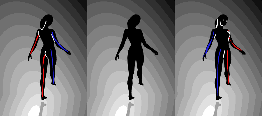
You're right, it would look weird if it was static. The shape is interpreted as a cube when it comes out of the animation, but it's really just a hexagon. If Crediar wanted to animate it, it shouldn't be too difficult for him, in which case I think the logo is probably the best one for the job. For a static logo, yours is probably my favourite so far.
Sony made a shocking announcement today, revealing that the company plans to move away from physical game releases in the future. Citing claims of how the industry is...
Remember when you could get an Xbox Series S for $300? Those were the days. Microsoft has today announced the latest in their console price hikes, seeing their...
Last month we got confirmation of a new model of Switch 2 to better comply with upcoming EU regulations. With the legislation set to come into effect in February of...
The end has come for the PlayStation 3 and the PlayStation Vita. After supporting the PSN Store on the PS3 and PS Vita since 2006 and 2011 respectively, Sony has...
Tired of waiting for Game Freak to bring Pokemon Emerald to modern platforms? We've got you covered with a brand new port in the works. Currently available on GitHub...
In this time of economic uncertainty and rampant price hikes, the Steam sales stand as our final bastions of affordability for those opting to avoid the seas. The...
Apple have today announced price increases, primarily focused on their MacBook and iPad lines. These increases have already come into effect, with both prices and the...
For fans of Sinnoh, the pickings are slim. If you want the best experience you're left deciding between the updated region in Platinum, or the somewhat controversial...
The Switch 2 has been out for a year now, but you shouldn't count the original system out yet! Released a few days ago, popular PS2 emulator NetherSX2 has found its...
Ocarina of Time is back in style as the upcoming Switch 2 remake looms on the horizon. But what's a fan of the game to do over the next few months? If you've been...
Sony made a shocking announcement today, revealing that the company plans to move away from physical game releases in the future. Citing claims of how the industry is...
Remember when you could get an Xbox Series S for $300? Those were the days. Microsoft has today announced the latest in their console price hikes, seeing their...
Last month we got confirmation of a new model of Switch 2 to better comply with upcoming EU regulations. With the legislation set to come into effect in February of...
The end has come for the PlayStation 3 and the PlayStation Vita. After supporting the PSN Store on the PS3 and PS Vita since 2006 and 2011 respectively, Sony has...
Tired of waiting for Game Freak to bring Pokemon Emerald to modern platforms? We've got you covered with a brand new port in the works. Currently available on GitHub...
Ocarina of Time is back in style as the upcoming Switch 2 remake looms on the horizon. But what's a fan of the game to do over the next few months? If you've been...
Apple have today announced price increases, primarily focused on their MacBook and iPad lines. These increases have already come into effect, with both prices and the...
In this time of economic uncertainty and rampant price hikes, the Steam sales stand as our final bastions of affordability for those opting to avoid the seas. The...
Amidst news of layoffs and cancellations in the wake of Xbox's larger changes, Bethesda has today come out with a statement discussing their active projects. In this...
Announced today during the Octopath Traveler 8th Anniversary live stream, it's been confirmed that both the first game and its sequel will be launching on the Switch...