What do you think?

  • Thread starter Thread starter strata8
  • Start date Start date
  • Views Views 1,562
  • Replies Replies 8

strata8

Look! A pointless distraction!
Member
Joined
Jun 18, 2007
Messages
616
Reaction score
1
Trophies
1
Age
32
Location
over there
Website
Visit site
XP
148
Country
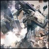
I looked at a few people sigs, and decided to make something a bit 'arty'.

Original image:
sonic_071010a-l.jpg


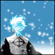
My result:
2pzzd43.jpg


Made entirely in Fireworks CS4, using nothing but the smudge tool and vector shapes... I think I've done pretty well for my first real attempt, but I'd like to see what you think of it.
yay.gif


EDIT: New version, I've tried to add a bit of depth to the lighting...
4kaceg.jpg
 
It's pretty cool.

The only problem that I can see with it is the light. There is multiple light sources which means that there isn't one focal point.

Apart from that I like it
smile.gif
 
Rheotron said:
It's pretty cool.

The only problem that I can see with it is the light. There is multiple light sources which means that there isn't one focal point.

Apart from that I like it
smile.gif
Thanks for the comment
happy.gif
. I guess I need to add a bit of shadowing (maybe mess around with the levels?).

I just realised that I completely screwed up the topic title xD. It was meant to be 'What do you think?'. I would appreciate if an admin or mod could change it.
 
Fixed title for ya'
wink.gif


I like it, even tho I'll miss your clouds theme!
wink.gif


Also, to make your sig better, maybe make it wider somehow (don't stretch it), to look better, and add some kind of border...But not plain black, it would stick out too much!
 
Toni Plutonij said:
Fixed title for ya'
wink.gif


I like it, even tho I'll miss your clouds theme!
wink.gif


Also, to make your sig better, maybe make it wider somehow (don't stretch it), to look better, and add some kind of border...But not plain black, it would stick out too much!
Nice to see you, Toni!
happy.gif


Well, it's not a sig, but thanks for the comment anyway
yay.gif
 
Toni Plutonij said:
Ahhh, I see, I misunderstood it
blush.gif
I figured you're creating a sig..

In that case, it's really great, no need for border or widening..
I like it as it is
smile.gif
I might add a black border at the top and bottom, though, as that's what people seem to be doing at the moment
laugh.gif
 

Site & Scene News

Popular threads in this forum