NSMBW will receive red packaging

EnigmaXtreme

Well-Known Member
Member
Joined
Jan 1, 2009
Messages
1,343
Reaction score
24
Trophies
1
Age
37
Location
Tasmania, Australia
Website
Visit site
XP
829
Country
Europeans, you better like red because Nintendo’s got a bargain on red ink and it’s gone a little mad .

Nintendo is going to every length possible to make New Super Mario Bros Wii stand out. Retailer Amazon has uploaded an image of the upcoming game and it’s adorned in red, even where the Wii logo and swish at the top go. We don’t yet know if any other regions in the world will get this design (hell we don’t even have an official date) but Germany will for sure. Let take a look;
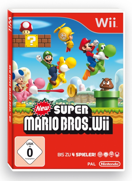
nsmbwii_redbox.jpg


What does everyone think?

http://www.vooks.net/story-18533-New-Super...-packaging.html

 
I'd like the whatsit to be red (you know the thing you see when its in the DVD case...for those who actually buy games) but the rest should be like the NA release.

As for the game, I had no interest in it, it seemed like something that should have been an extra in Mario Galaxy 2 but I was wrong and it seems to have more going for it, a proper game that is. Might buy, depends.
 
What the fuck is this shit? I better hope that the UK cover will be white, otherwise I have to print a new one ..
 
Maybe I'm a guy who likes to see things uniform and without change, but I think this is just cringe worthy. Way too much dead space in the red areas, and just generally bland cover art.

As for the game, it's nice to see some much needed love to traditional, 2(.5)-D console platformers, but the genre isn't too bad on the DS. Not to mention many Mario fans will notice how dumbed down NSMB was on the DS compared to older SMB games. And I agree with Hadrian on the fact that it would have much better been suited as an extra. Not to mention the game just doesn't seem like a good co-op game compared to other ones, let alone the lack of Wi-Fi/WiiSpeak support.
 
It will definitely stand out in the shop, among the many white Wii games.
And red is my favorite color, so I kinda like this box.
Also red is a color of winners and a color that makes you want to take action, so you can be sure Nintendo thought of that too while making this box.
 
Even though red isn't a bad colour to use, it's been used too much here. There's WAY too much empty red space on the cover, which makes it look like shit IMO.
 
Dr. Canuck said:
IGN posted the NA box a few days ago. Not as much red.

*snip

Now that's a little better!

Although it looks odd having half white, half red. Just do the damn thing all white, Nintendo.

On second thought...you have billions of dollars, add a little blue and green in there.
smile.gif
 
If Nintendo wanted the box to stand out why not just cover it in some glitter paper and give the box a rainbow color and wrap it in gold foil?
sleep.gif
 

Site & Scene News

Popular threads in this forum