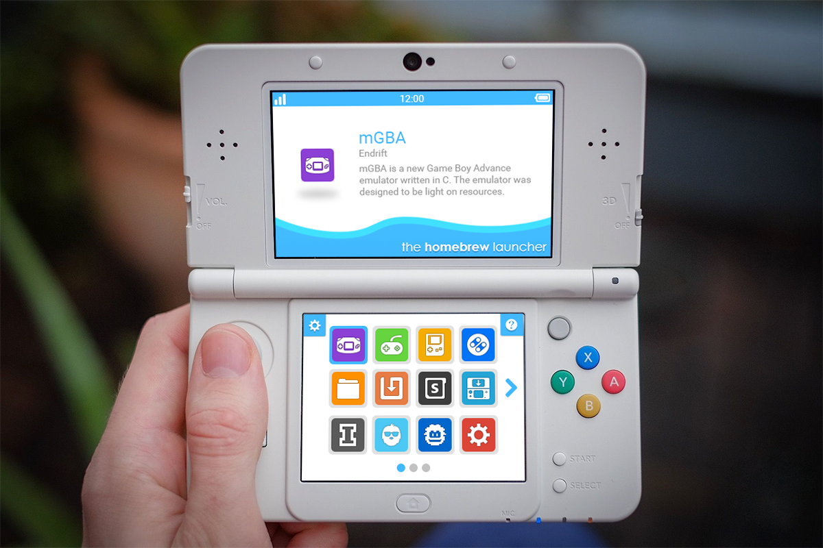
I know it's currently in an early build, but I'm just a little bit concern on how it would turn out in the end. Based on past experience, concepts sometimes don't translate very well into products (not all programmers are necessarily graphic designers).
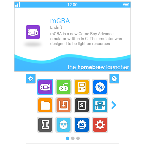
So I decided to whip up a concept of how I think it should look.
I tried to keep the concept as realistic as possible based on how the homebrew launcher currently handle things. I thought the waves from the official homebrew launcher looked great, so I've added them here. I've also changed the font to Robot since Segoe UI is the property of Microsoft. Lastly, I've changed some things to blue as I think accent colors are important for providing characteristics to the launcher.



if you need help with github I'm sure there are more experienced users than I am, who are willing to assist you in setting it up in any way we can be it simple or complex, for this project of yours to be a long term one. Not sure if someone has mentioned it but github desktop is fairly easy to use and set up, even better as the commits done are easily checked for errors so makes it easier to compile. Looking forward to it mate.