Inking Test

  • Thread starter Thread starter Ethevion
  • Start date Start date
  • Views Views 1,429
  • Replies Replies 10
  • Likes Likes 2

Ethevion

Wannabe Artist
Member
Joined
Sep 23, 2010
Messages
1,827
Reaction score
838
Trophies
0
Age
37
Website
www.lvlupart.com
XP
1,249
Country
Canada
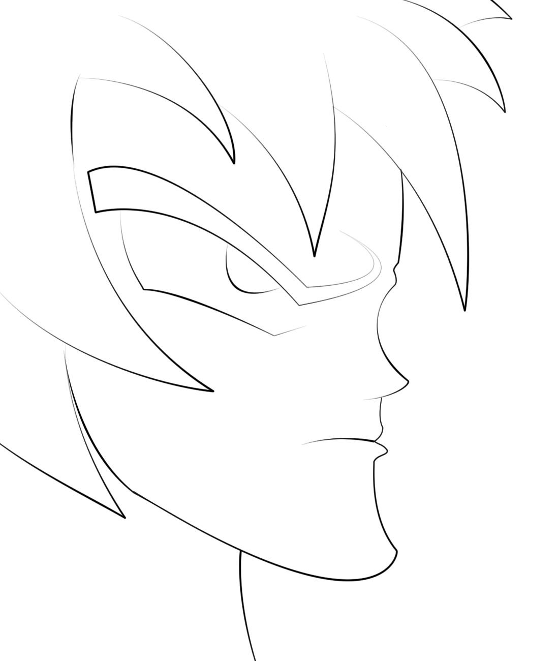
I've been playing around in Photoshop with brush settings and the pen tool. I'm aiming for an inking pen look. I think I'm getting close.
inking_test_in_photoshop_by_arpeejajo-d5jshkk.png
 
If you want impeccably clean and precise lines, the pen tool is your only choice. Having said that, most (all?) people who actually* ink can't do so with that level of precision. If you want that 'inked' look, I think you best bet is a tablet and anywhere between 300 and 600 dpi for your intended medium. Oh, and custom brushes. At any rate, this is looking good, though I would recommend repathing some of your lines rather than adding extra ones, or playing around with your brushes and using different ones to best fit the direction of each stroke's path. Keep working at it!

*By this I mean on traditional media.

 
  • Like
Reactions: Sagat
A tablet would definitely help me for a true inked look. The dpi is something I didn't know, I think mine is set to 200. I'll definitely change that and compare. I'll continue to play around with settings and when I get better, I'll be sure to post an update. Thanks for the tips. :)
 
I've been trying to taper with the brush settings but I can't seem to get it. Fading gives the tapered look but unfortunately fades out. Still, I wont give up until I get something close.
 
I've been trying to taper with the brush settings but I can't seem to get it. Fading gives the tapered look but unfortunately fades out. Still, I wont give up until I get something close.


that's because you also have opacity control on under Transfer. how are you drawing this anyway? are you making paths and applying strokes to them? this looks like a very painful process, you are definitely using the wrong tools for the job. you should use illustrator or another vector based drawing application.
 
that's because you also have opacity control on under Transfer. how are you drawing this anyway? are you making paths and applying strokes to them? this looks like a very painful process, you are definitely using the wrong tools for the job. you should use illustrator or another vector based drawing application.
I'm going to check that out. That's exactly how I'm doing this. Pen path, followed by brush stroke. It's not as painful as you might think since I've gotten used to it.
 
I'm going to check that out. That's exactly how I'm doing this. Pen path, followed by brush stroke. It's not as painful as you might think since I've gotten used to it.


i guess it is relative. i can complete what you have so far in less than 10 minutes plus it would be completely editable. so it does look painful :P
 
i guess it is relative. i can complete what you have so far in less than 10 minutes plus it would be completely editable. so it does look painful :P
Without me looking into brush setup this was done in far less than 10 minutes. :) You're right though, it definitely looks painful.
 
The best way to go about that is using a Cintque lol But those are balls tons on money. Thats the way i got my "Norma Jean drawing to look like it did though.
 
  • Like
Reactions: Sagat
A little over a grand for the "cheap" one and over 2 grand for the expensive one. One day I will get one of them, just not now. :)
For now I'm happy with the solid straight lines I've gotten, without the fade though. Check my Plushie Ryu if you want to see.
 

Site & Scene News

Popular threads in this forum