Hacking TraumaHound's CycloDS Themes

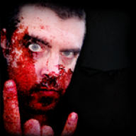
The Joker - Batman: The Dark Knight

Looks good, downloading now to see how that text looks against the background. Might be the one thing that prevents me from using it
frown.gif


edit: Nope, definitely don't like the white text. Hurts my eyes
hate2.gif
Hmm, not sure which colour would be best though.
 
leiger said:
edit: Nope, definitely don't like the white text. Hurts my eyes
hate2.gif
Hmm, not sure which colour would be best though.

Hmmm...I initially had it as flat-white (#FFFFFF) but it's currently set at a dimmer blueish-white (#DDEBF8) that I think I picked up from the Joker's skin tone.
unsure.gif
 
TraumaHoundNDS said:
leiger said:
edit: Nope, definitely don't like the white text. Hurts my eyes
hate2.gif
Hmm, not sure which colour would be best though.

Hmmm...I initially had it as flat-white (#FFFFFF) but it's currently set at a dimmer blueish-white (#DDEBF8) that I think I picked up from the Joker's skin tone.
unsure.gif

This is the main problem with cyclo skins - making something look great in the main menu often makes it impossible to read the rest of the menu properly.

Should be solved if/when the new GUI is released. It's meant to support existing skins.
 
leiger said:
Should be solved if/when the new GUI is released. It's meant to support existing skins.

Even if something so simple as a fullscreen overlay could be implemented; have it with it's own opacity so it could effectively dim the background. As it is, I've taken to dropping an overlay over the busier lower screens to help improve readablilty where I can.
 
im REALLY amazed with the metroid one, it is very well done, i like the little statues you put on the bottom corners, and how for the title screen it resembles a little stage. i love it, i might download it and put it on my card if im not too lazy.
tongue.gif
 
kevenka said:
nice work with the chinese dragon, looks really pretty =]
Thanks! It took me a bit of time trying to get all the pieces in the right places and still have it look similar to the original firecracker wrapper I sourced for the theme.

QUOTE(Balrogs.Pain @ May 30 2009, 07:54 PM) im REALLY amazed with the metroid one, it is very well done, i like the little statues you put on the bottom corners, and how for the title screen it resembles a little stage. i love it, i might download it and put it on my card if im not too lazy.
tongue.gif
Thanks! The top screen was hand-built using an existing background shot then rebuilding it using sprite bits from the game. Metroid was my favorite NES game (with Bionic Commando a very close 2nd) so I just had to try to build a theme for it.
 
TraumaHoundNDS said:
Added my newest theme, "Blood Bowl", to the top of the list. I'd wager to say it was easier to put together than the damned game is to play.
wtf.gif

I like the level of detail. Very nice!
biggrin.gif


Are the menu icons & cheat icons made from scratch?
 
leiger said:
I like the level of detail. Very nice!
biggrin.gif


Are the menu icons & cheat icons made from scratch?
Thanks!

The frames of the menu icons (as well as the status bar framing on the bottom screen) were built from some bits I found on the Blood Bowl game's site. I then dropped some parchment behind them, dirtied it up a bit, and found an "unofficial" Blood Bowl font for the lettering (the checkerboard design came from a lot of Games Workshop's art having checkerboard patterns in it.) The cheats and scrollbar were scratch-built using an actual football's texture (from a nice hi-res photo) that I shrank down a lot for the scrollbar (and hand-did the laces) and left a bit larger for the cheat icons (which are the bumps you can see on them.)

As a side-note, the group "photo" on the top screen is a composite of 4 base images that I was able to cut out and arrange the characters together differently than the image that was used on the game's site. And I "hand-bloodied" the background parchment for that personalized bit of brutality.
 

Site & Scene News

Popular threads in this forum