I finally decided to download this homebrew project, and I'm highly impressed with your work. The gameplay is precise and interesting; I can't say that I've had as much fun playing a bullet-hell shooter on a DS than now.
Gameplay aside, however, I found a couple of issues that make the game feel less polished than it should be. Sure, maybe only the gameplay should count as necessary for a homebrew title, but I feel that presentation is almost as important; it provides the essential element of legitimacy. If it feels legit, it'll lower any entry boundaries that people new to playing/downloading homebrew games may have. Why would someone download a game that has menus that look like they've been made by a ten-year-old, for instance (I'm not alluding to your game, by the way, that's just an example xD)? Such decisions can turn off would-be players of your game, and since I'm presuming that a homebrew developer would like as many people enjoy their game as possible, it's necessary to polish their games to the shine expected in a retail title.
Here are some of my thoughts:
-I'm not sure if you're well-versed in graphic arts, but the very first screen (with the homebrew and GBATemp logos) is rather ugly, design-wise; I might fix that (sorry if that sounded harsh, but I'm just providing criticism!)
-In the title screen, the drum track stutters. I'm not sure if that's something wrong with the playback or with the music track itself, but it sounds buggy nonetheless. If it's a problem with the audio that you can't fix, then there's not much you can do; if you wrote the song, however, and intended for it sound that way, then I would consider making the drums sound less choppy. Also, I don't like how it doesn't loop perfectly.
-The menu options are a little hard to read in front of the cockpit animation thing. Not sure how I would personally fix this, but perhaps a color change would help? Also, I feel that the title of the game should feature prominently on the top screen; maybe put the menu on the touch screen and the title information on the top?
-Speaking of the title "logo" on the title screen, I feel that it should be larger, emphasizing the name of the game. Additionally, I feel that it should match the same design as the bottom screen displays during gameplay; it looks nicer and it's more impressive-looking. A logo should be universal; stick with one design!
-As someone mentioned, the music in the first stage stutters quite frequently. Despite not hearing it stutter in any of the other stages, hearing it do that in the
first stage left me with a bad first-impression. I would work to fix that, if anything.
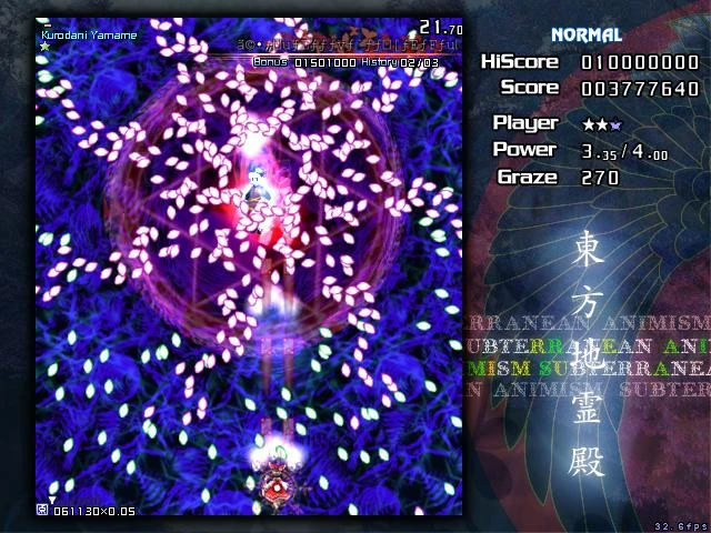
-Speaking of the first stage, I realize that you probably had a lot of fun modeling those 3D polygons that float in like globs in the upper part of the screen, but I would seriously think of removing them. When I first tried the game I thought it was enemy fire; it's a bad thing to mislead your players by tricking them into thinking that
background elements are hazards. If anything, I would move them further into the background, maybe floating in the black space in the center.
-I found a glitch where when you beat a boss and press start, you're unable to continue the game since it creates a never-ending loop of pausing and fading away.
-This is a personal gripe, but perhaps you could incorporate another ship type/color into the game? The red and blue ships, to me, play rather similarly as it is, and adding another ship type would add a little more variety to the experience. I realize that doing this would require a ton of work, but hey, it's food for thought.
Sorry for that extremely long post, but I felt that this game had some major presentational issues that should be resolved. However, I feel that you're on the right track for making an awesome homebrew shooter. Keep up the good work!