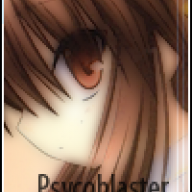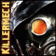
Some sigs I made while I was bored.

Undercover Flip

Well-Known Member
Member
Joined
Nov 5, 2002
Messages
301
Reaction score
2
Trophies
2
Age
39
Website
joners.net
XP
343
Country
United States
Updated: August 28, 2008

=OLD=

1.jpg


5.jpg


=NEW=

a.gif


b.gif


d.jpg


e.jpg


f.gif


What should I do next? A photoshop spell finally hit me and I feel like making a new one. >_< I only get this urge once every blue moon! Need suggestions, pronto! Also, how are the new ones? Could I get some critique going?
 
Well you have some potential. I would like you to blend the main pictures with the backgrounds some more though.
Like you tried with the purple one. Instead of having a background and a picture on top of it,
try to make it like the whole picture is just one. Making the main character picture look like it belongs together with the background.

As for the text, the text is nearly perfect in the first sig. Feels right at home.
On the others it's less better or worse. In like the purple one, the text is really ugly on it and feels really out of place with the sig.

Also, try to experiment with different filters. Just go nuts and apply little of everything on the characters.
If it looks crap, then try different combinations, once you find that special combo. You'll be surprised over how much better an
image can look.

I suggest you look up different tutorials and try them randomly. It will help you evolve and understand more of the features.
Good luck
smile.gif
 
They're good!
Still... could be improved a bit, for example, some are just backgrounds. Add something Metroidy/haloy to the Red one, then you can say its "original"!
 

Site & Scene News

Popular threads in this forum