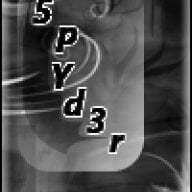
Like My New Sig??

  • Thread starter Thread starter .::5pYd3r::.
  • Start date Start date
  • Views Views 1,734
  • Replies Replies 10
it looks really nice IMO (although you didn't make that much of a change to the original - from what I can see...)
 
well, i really dislike the text
why would you use a pixel that big? pixel text is made to be small, like 8pt average
also, text borders for pixel text only work at 1 px

edit: It is a bit plain aswell, all you did was add diagonal blinds, then add text
 
I like it a lot, except the font used for your name doesn't quite match up well. Cool background though.
Oh, and it's too big on the vertical axis, should be no more than 100 pixels high.

As long as you still have all your layers separate you could squish and/or crop the background to the correct size and rearrange the logo, figure, and username to fit.
 
I like it a lot, except the font used for your name doesn't quite match up well. Cool background though.
Oh, and it's too big on the vertical axis, should be no more than 100 pixels high.

As long as you still have all your layers separate you could squish and/or crop the background to the correct size and rearrange the logo, figure, and username to fit.
I thought it matched the "scribbling words" theme of the game personally...
 

Site & Scene News

Popular threads in this forum