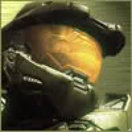
Conduit 2 Boxart

  • Thread starter Thread starter Deleted_171835
  • Start date Start date
  • Views Views 3,053
  • Replies Replies 24
D

Deleted_171835

Guest

What game is this? It's a shooter. It's a Wii game. It's a sequel. And the previous game's box art doesn't look anything like this.

It's not Vanquish. Remember, this is a Wii game. And it's not a Halo game, despite the heavily armored super soldiers featured so prominently on the cover. It supports Wii MotionPlus, sports online and split-screen multiplayer.

It's also not Crysis. If you have StarCraft on the brain, it's not that either.

The title of the game does not start with the word "The."

Do you know it? Have you already looked down?

Yes, it's High Voltage Software's Conduit 2. Here it is in all its sci-fi shoot 'em up glory.

A very different pitch than the last Conduit game. For example, in The Conduit, the main character's gun is pointed to the right. On Conduit 2's box art, the biggest gun is pointed to the left. It's proof that visors are cooler than sunglasses. Heavy metal armor is clearly cooler than glowing skin tight super suits. Sega is shaking things up.[/p]
It looks much better! I'm so hyped for this game
500x_conduit_2_box_art.jpg
icon11.gif
Source
 
Is it me or do all the logos for nintendo wifi, motion plus, sega ect ruin the feel of the boxart? I mean it looks great but then the blue logos just look out of place...

Anyways, it looks awsome and hopefully this one will get more of the lime light than the first one.
 
Supersonicmonk said:
Is it me or do all the logos for nintendo wifi, motion plus, sega ect ruin the feel of the boxart? I mean it looks great but then the blue logos just look out of place...

Anyways, it looks awsome and hopefully this one will get more of the lime light than the first one.
Yeah they should of kept those logos on the back.
 
The first one had horrible cover art unless you have the limited edition one they sold at Gamestop (which I have). This one isn't too bad. I do hate the "adverting features" on the front thing in cover art but it's no biggy.

This game is really starting to look good, although with HVS I'm always cautious.
 
Reminds me of this
ratchet_clank_deadlocked.jpg
IDk why but the big gun reminds me of Ratchet with the normal "Huge weapon of destruction that can be carried inside of his backpack". And the two people in the back reminds me of the bots.

Ontopic: Looks like a mixture of Ratchet's huge weapons but with Spartan armor. And it looks a lot better than the first game, I hope it is better though, i didn't really like the first.
 
I still think it's a good attempt in copying good games like halo and others allthough, the conduit wasn't that epic as UT3:
ut3cov21.jpg
 
It seems like anyone assumes that anyone in any type of futuristic armor is a Master Chief ripoff. Sigh... As my dad says, people are stupid.

Fuck it, it looks like a Space Marine so this game is clearly a RTS. Can anyone just accept the fact that it's just a cover art of a heavily armored futuristic soldier, not a ripoff of any other game that has heavily armored futuristic soldiers on the covers? People just love to hate.
 
Mehh, I'll wait until I see some in-game screenies or videos before I decide whether I should give this game a chance or not. :/
 
Look like another crappy game like the other one was. I don't see why ONM and Ngamer hype this up.
tl;dr,
6pqaae.png
 

Site & Scene News

Popular threads in this forum