The media is creating mass hysteria over the Coronavirus.

  • Thread starter Thread starter Deleted User
  • Start date Start date
  • Views Views 53,441
  • Replies Replies 504
  • Likes Likes 9
  • Friendly reminder: The politics section is a place where a lot of differing opinions are raised. You may not like what you read here but it is someone's opinion. As long as the debate is respectful you are free to debate freely. Also, the views and opinions expressed by forum members may not necessarily reflect those of GBAtemp. Messages that the staff consider offensive or inflammatory may be removed in line with existing forum terms and conditions. Saying NO to fascists/nazis - if you are one of those, you are not welcome here
We have an estimation on what the european deathtoll would have been without a lockdown. (But assuming, that hospitals still would have remained operational.)

Again from the Imperial College London:
https://www.bbc.com/news/health-52968523

If I correlate that with european population figures, it comes down to a fatalityrate of 0.65%

(100/518)*3.385 = 0.65%

3.385 derived from 3.2 mio 'additional deaths' plus 185.000 actual deaths on record.

Meaning two things, deathrate would have been 17 times higher if no measures were taken. (Second wave potential not included.)

And that actual death rate (for european population, not 'infected populations') should be even well below 0.375% in europe, with the lockdown in place. (The real one, not the one derived from 'tested' figures.)

Or I made a logic error.. ;)

edit: Made and corrected one logic error, replaced 'population of europe' with 'population of europe minus 30%' (point of herd immunity).

edit: But still, the more interesting calculation to look at is probably:

(100/741)*3.385 = 0.45%

(Looking at it from the perspective of the entire european population and not 'potentially infected people'.)

Meaning, without a lockdown it is estimated that 0.45% of people in europe would have died. With the lockdown in place 0.024% of europeans died (You can double that number, if you want to add a margin for unreported cases.).

edit: Yearly flu deaths in europe are 72.000. So with the curfews in place (and presuming there is no second wave), Covid-19 was 2.5x worse than seasonal flue.

But without the curfews in place, it would have been 45 times worse than a seasonal flu. :)
But thats also not the entire story either. :)

So how likely would that 45x times the flu scenario have been - if some countries acted (like most of them did currently) but others did not.

Not very likely.

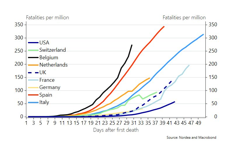
Here you see the 'worst' countries (in terms of how they handled the crisis), (Baseline (in all images) is a country that acted with some delay, but pretty well.):

2i2aBwj.png


What you see here is (edit: first and foremost, numbers of infected people ;) ), that either - lack of testing makes those graphs useless, because the curve always curbs well before 2/3s of population size ( ;) ), or that peoples behavior had an impact that would have almost always reduced the fatality number well before 45x that of seasonal flu. ;)

45x in the Imperial College London case is the number, if peoples behavior wouldnt have changed. And hospitals still stayed operational.

(That masks where available, also helped.)

In the graphs, the y axis (where the curve lands in absolute terms) is almost entirely useless for a direct comparison (different population sizes), its the relative shape of the curve thats interesting.

So this posting is your 'control' as to how much of an impact your governments behavior actually had.

If you dont know, Brasil is 'geographically challenged, and economically challenged (gini coefficient)), United Kingdom, switched their stratefy too late, Sweden went for herd immunity (but the public voluntarily changed their behavior on their own), and Italy had a very high case count early on.


edit: On second thought - if you compare the baseline in all the graphs with the one in Sweden, it suggests that Sweden could have had about 9(- 45)x less fatalities, if they acted like everyone else did. When they did. (Or earlier.) High margin of error. ;) (Tried to get a feel for what 'no behavioral changes' means in the Imperial Colledge London model.)

So ultimately you just see how hard it is, to predict outcomes that are on an exponential growth curve, where you don't know when and how fast exponential growth can be stifled. ;)
 
Last edited by notimp,
Also interesting, if the US had acted 'better', they could have saved about 5000 people? (Only?) High margin of error.

(Looking at the shape of the curve, if the US had curbed it at the same rate as baseline country did, they presumably would have stayed at around 700.000 infections, so 1.260.000 less people infected, which at 0.375% fatality rate meanst 5000 people would have died less.

That said, baseline country (where 0.375% death rate is applicable) had good testing distribution. The US had not. (So 5000 maybe also needs to be scaled by at least a significant factor. ;) )

edit: Uh, we can guess that factor, by looking at US Covid death rate vs known infection rate. Stand by. :)

edit2: 14x

So US could have potentially saved 70.000 people, by acting 'better' (not necessarily earlier). High margin of error.

(edit: For comparison, around 40.000 people are killed in car accidents in the US every year.

edit: And 0.375% couldnt be applied to the graph of baseline country either. But that has no impact on the guesses above. ;) )

End of napkin math. ;)

edit: Also, thats presuming, that the crisis (problematic growth) is almost over - which in europe it maybe is, but in the US it may be less so. :)

See:
WPHEeo7.png

src: https://www.worldometers.info/coronavirus/country/france/

vs.
LKvtoGx.png

src: https://www.worldometers.info/coronavirus/country/us/
 
Last edited by notimp,
Interesting numbers.

Do we get to treat the US as a big block for this as there were rather disparate policies across the place there?

Car crashes are good stats but I am also interested in long term economics of this one. We could do decent estimations based on past data for that one, and if we are doing economics then while dead peeps produce no GDP I also wonder at how many were old people (pensioners contribute but not that much) or those likely to die anyway as a part of this.

We also get to play "what are acceptable numbers?".
 
  • Like
Reactions: Subtle Demise
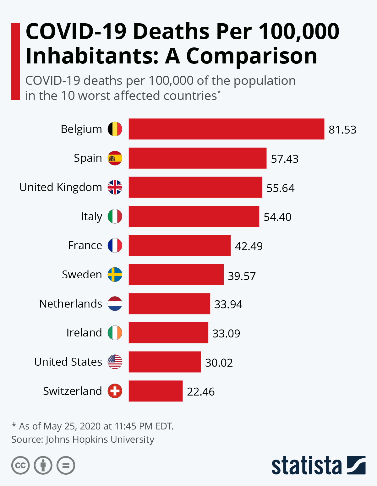
@Ultrasuper: sources pls? The picture doesnt even indicate if its Covid 19 related or not. You cant fail more obviously.

USA also has - by far a lower testing rate per capita than all the countries listed in the graph.

Meaning you are praising systemic failure, not an actual achievement, meaning you are a flipping drone.

Proof to follow.

edit:
Notice something?
(src: https://www.worldometers.info/coronavirus/country/us and similar)

KiWq1tf.png

qRGeMeF.png

6MfRozf.png

k7WMcx5.png

CO7IOZ7.png

IXuI0GA.png

oGNZbOS.png

HGxYIEs.png


And finally - the US:
5UXbUEp.png


Notice something? The US is the only one of those countries that doesnt have enough testing and is lying about their absolute numbers.

That - or one other possible explanation, that doesnt explain the anomality in daily new cases in the US, namely that the US has a 'geographical' advantage (lower population density).

So if you post such a graph, please understand, that in the US only about a third (if at all) of all the people in those other countries are even tested. This also could extend to Covid-19 deaths.

We know, that the propagation in the US is far larger than in any of the european countries at this point. We know that the pandemic is uncontrolable (source control) in the US at this point, via conventional means (curfews still work, mask if populations wear them work as well - but in the US thats not working either). And we have absolutely no idea, what would explain the lower death rate per capita, if it werent for the factors I just talked about. (Either fake numbers, or abysmally low testing, or the country being able to handle it better in parts, because population density is far lower, and thereby spread is less fast (thats 'god on your side' if you so want, if thats the case, you lucked out).

Everything I've read indicates, that the third factor should not be very important as far as spread control is concerned. So its back to lies and missrepresentation.

And drones like you championing a graph where I can tell you right here and now, that it is wrong. Also without naming a source.


Also, what your graph does, is to take a value of something thats in high demand and not widely available, and then correlated that with the highest number possible (total population), which is a great way to increase statistical uncertainty. (Your initial number of tested cases was small, you extrapolated that to the largest possible number available for your nation, then you celebrated that your ratio was so best. (As a result of you being a big country.))

I bet, that the US in general has the lowest ratio of anything 'negative', to what was tested, because in the US science based decision making is optional, an apparently you have next to no testing facilities.

edit: To find out, you in the US have to watch 'excess mortality' numbers. (Meaning, how many more people have died during the Covid-19 pandemic, compared to the average (quarter of a) year.) You get your real numbers that way. If you cant distribute enough testing.

In my country (dealt with Covid-19 'well' (harsh measures)) there is no higher excess mortality in those periods. (Higher Covid-19 deaths would have f.e. been counted against lower numbers of mortality in car accidents.).

edit:

According to those numbers:
https://web.archive.org/web/2020061...ive/2020/06/10/world/coronavirus-history.html

Excess mortality rate in the US also is still 'pretty low', even relative to other countries - outside its cities. That still indicates, that some other factor like population density is in play here as well.

Maybe in the end the US did luck out. (Its harder to fudge mortality numbers over a period of time.. ;) )

edit: this (see link above) is the important graph for the US (and versions of it going into the future).

j7cCcoi.png


Baseline (x axis) is (normalized) normal death rate over time. y axis is 'higher than normal deathrate' during the period.

Oh, and I forget, that the US was scheduled to have its peak outbreak right around june or july, so ideally you'd find that graph extended for the next two months as well. (Probably available two months from now.. ;) )
 
Last edited by notimp,
Oh, and I forgot to mention that @UltraSUPRA is a freaking double dip drone, because what he represented for the US was data "up to 43 days after the first Covid-19 death".

Which for the US was around early february. So all data in his graph, for the US ends in march. Which was when the US really hadn't had any extensive testing yet.

*horray*

So please, know what you are posting, and know what you are looking at.
 
Last edited by notimp,
Oh, and I forgot to mention that @UltraSUPRA is a freaking double dip drone, because what he represented for the US was data "up to 43 days after the first Covid-19 death".

Which for the US was around early february. So all data in his graph, for the US ends in march. Which was when the US really hadn't had any extensive testing yet.

*horray*

So please, know what you are posting, and know what you are looking at.
21170.png
 
  • Like
Reactions: notimp
Thank you for the update. :)

My response would be something like this, probably.. ;)
[Compared to the other four largest countries] The number of deaths is rising faster in the US, but individual statistics don't tell the full story.

For comparisons to be useful, says Rowland Kao, professor of data science at the University of Edinburgh, there are two broad issues to consider.

"Does the underlying data mean the same thing? And does it make sense to compare two sets of numbers if the epidemiology [all the other factors surrounding the spread of the disease] is different?"
src: https://www.bbc.com/news/52311014

One such factor would be population density, f.e. :)
 
Last edited by notimp,
Also - and this is why UltraSUPRA is a dumbell three times around - total population number in all the other 9 listed countries combined comes out at

(absolute death figures in brackets)

11,4 (9650)
47 (27136)
66 (41481)
60 (34223)
65 (29374)
10 (4874)
17,3 (6057)
6,6 (1705)
8,6 (1938)
=
292 mio people (156438 covid deaths combined)

which comes out to an average covid death rate per 100,000 of all the other 9 "highest effected" countries combined of 53.

Then you look at the current US death rate per capita of 100.000, and it is 35. Up from 30 a month ago.

(100/328000000)*117000 = 0.035
100000*0.035% = 35

Conclusion:

Lets just wait a little.. ;)


Picking out an entire list of smaller countries with populations mostly in cities (faster spread), again, heavily distorts the listing here, because the uncertainty factor with a larger population size in the US gets larger and larger (relative to testing capability), and if you are listing Switzerland, you could as well list New York, witch had about 5x the average US deathrate. ;) (at the peak).

Also you have a peak outbreak mismatch, which means, that the US is still picking up more deaths. ;) But the deathrate is declining in the US as well, so compared to all other 9 countries with the biggest outbreaks (as per cases tested, other countries may not be testing as much or not releasing the same numbers), the US - in the end may be 20% 'better'.

But per capita it has done about 1/3 of the tests of any european country. So what is the chance, that those 20% difference can be explained away by 'US underreporting covid death numbers'? ;)


Again - its best to wait for the excess mortality numbers here in any case - those will be more definite. :) Then you can do good 'my country is better than yours' comparisons.. ;)
 
Last edited by notimp,
Lets use this as a teaching moment.

Everyone who reads this, can never complain about media being sensationalistic again.

Any news that doesnt come with 'suspense, worry or outrage' could as well not have happened and Interests no one in todays social media economy.

Who cares that a partial cure is found that will save hundreds of thousands.

*crickets*

Its just not sexy enough.

Now you hopefully understand, why media crafts headlines the way it does.
 
Dont just layer in RT links, without comment, when not needed. ;) I presume people come for the pictures with the easy to read oneliners, and stay for the anti western propaganda. ;) (Mainstreaming RT in general isnt the smartest choice. ;) If they have an interesting factoid from time to time sure, but for a 'matter of fact' story like this...)

RT basically is the russian equivalent to what radio liberty was in eastern europe 70 years ago.. ;)
 
Last edited by notimp,

That´s why I also provided the Reuters link. I can also look for Chinese or Arabic sources if people want to accuse Reuters of bias as well.
I have no problem with you even providing the RT link, but give context. ;)

Otherwise people might just pick the one with the better pictures. ;) (Reuters has no pictures. ;) ) Not knowing what they are reading.
 
Last edited by notimp,
Why do I need to provide context? I also don´t provide context about the ownership and ideological direction of other sources.

Ok, hear hear:
-RT is funded by the Russian Federation. RT reports from all over the world.
-Reuters is a news agency which operates world-wide as well. It used to receive funds by the United Kingdom and is named after its founder, a British gentleman of German-Jewish descent.

Do I need to do this every time?
 
Only with RT (am I missing one.. ;) ) imho, because its production qualities are just high enough, that it really has popular appeal. ;) And its still 'kind of new'?

The thing I'm after is, that if you read that primarily, you'd get a "everything I know is so different from what the government is telling my countries other media outlets - drift", which kind of puts you on the edge of society (discussions) by default.

If you are interested in a broad spectrum of news consuption, you might read and watch it as well (Allthough why? The only catch they got is Hedges.. ;) Sometimes... ;)), but as your only news source - I wouldnt recommend. Especialy, because they are actively playing with a PR angle, not just taking the one from the respective government press releases.. ;) (and then playing with that less actively ;) )

When looking at your links, I just thought to myself - Reuters has no pictures, but RT has - and somehow I didn't like that.. ;) Thought of people new to 'reading the news'.

Discussing this in public also has an effect, so no - you dont have to do it all the time.

But using RT to underline a Covid Story? Why... Cant you just discriminate? ;) (Ok, thats bad - but I personally dont link sources that are known to have a pretty obvious PR drift on straight laced stories. I link them on stories, only they bring.. ;) And yes this is bias.)
 
Last edited by notimp,
I personally dont link sources that are known to have a pretty obvious PR drift on straight laced stories.
Same is true for many western media sources, though I would exclude Reuters. They often mix reporting with propaganda, e.g. when they speak of "regimes" instead of governments. Therefore I now call their governments "regimes" as well. Just an example.
 
  • Like
Reactions: ghostbit

Site & Scene News

Popular threads in this forum