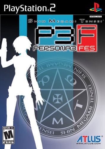
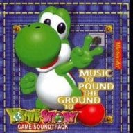
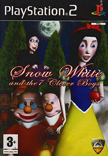
Honestly : when I read your 'it's not an adventure game' I assumed it must have been some corny xxx-rated game (wicked 18...what where they smoking when they came up with that name? ... And box art, obviously).
Edit: oh, man... If I hadn't played this game through illegal means, I'd never have known this is a pretty great game :
with the bad mega man box art, it makes you wonder if the artist only got a description of the character rather than seeing the real thing in the game. lol
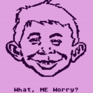
Eh, that's not that bad. It's just the title screen of the show. Which was pretty mediocre, so it's only fitting that a mediocre game based on a mediocre show gets a mediocre boxart.
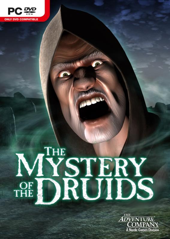
Ahem...how do I explain this one? Okay...when you posted it, it shows in full size. But for some reason, I was browsing from newest to oldest. As such, I saw Thod's quote first. Which had the box art auto-cropped (same as with this post, I presume).
Then I clicked on that box-art. I knew it was supposed to enlargened, but I anticipated it to happen immediately. Instead, the image popped out of @ThoD's post.
...and for a second it startled me, because that gave the impression that that guy on the cover was coming straight for me. I immediately envisioned a "RRRRRRRRRAAAAAAAARRRRRR" scream as he came for me.
(TL;DR: just click the cropped image in this post for some mild after-Halloween fun )
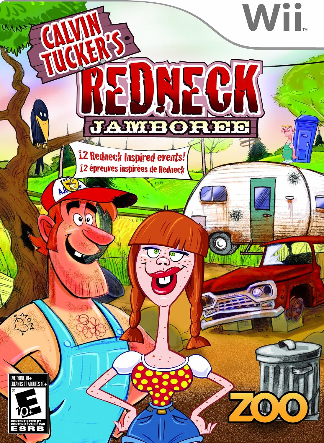
I watched a playthrough of the game in question, didn't look like a great game (ambitious flash game really, and themed minigame collections are tricky at the best of times) but art style seems to match the boxart (which in turn is a bit of a send up of some known art styles from those sorts of circles -- you see some of it in Li'l Abner but if you do a search for hillbilly comic or hillbilly clip art then you will see better examples, even more so if you chuck in caricature as a search term), and said boxart sets up the general theme of the game (you are probably not expecting an RTS having seen that, granted it does have text telling you what it is).
Dude by the outhouse seems like a bit of an afterthought (or at least a step down from an already suspect composition job) but compared to some of the other things on this list... it has perspective and everything. The black splotches on the trailer also scream "no effort with the spray tool in [insert image editor of choice]" but forgivable as well.
Ocarina of Time is back in style as the upcoming Switch 2 remake looms on the horizon. But what's a fan of the game to do over the next few months? If you've been...
It's a good time to be a first generation Pokemon fan. But when was it not a good time to be one? In recent weeks we've seen a native LOVE2D recreation of Pokemon Red...
If you've been waiting for an excuse to replay Super Mario Sunshine and happen to have up to nine friends, do I have some good news for you. Released earlier today...
For fans of Sinnoh, the pickings are slim. If you want the best experience you're left deciding between the updated region in Platinum, or the somewhat controversial...
Hoenn to the ROM hacking scene is like Kanto to the official games. It's everywhere. At this point you've probably played through Pokemon Emerald with a party of...
Hot on the heels of their NetherSX2 port, @Nagaa is back with another hugely anticipated release: a Switch port of the popular Wii U emulator Cemu. We've got more...
Images for the rumoured Zelda-themed limited edition Switch 2 for The Legend of Zelda's 40th Anniversary have started to leak online.
The leak shows only the...
The golden age of emulation on the Switch continues as a native Dolphin port was released by @Nagaa earlier today. Included in this port, we're looking at cover art...
The Pokemon series is known for its vast assortment of spin off titles, with the majority being well-received. We've had an assortment of Mystery Dungeon titles, a...
With the latest entry to the Fire Emblem series, Fortune's Weave, set to launch in September, Nintendo have today announced a new Nintendo Direct to put it soundly in...
Images for the rumoured Zelda-themed limited edition Switch 2 for The Legend of Zelda's 40th Anniversary have started to leak online.
The leak shows only the...
Ocarina of Time is back in style as the upcoming Switch 2 remake looms on the horizon. But what's a fan of the game to do over the next few months? If you've been...
With the latest entry to the Fire Emblem series, Fortune's Weave, set to launch in September, Nintendo have today announced a new Nintendo Direct to put it soundly in...
It's a good time to be a first generation Pokemon fan. But when was it not a good time to be one? In recent weeks we've seen a native LOVE2D recreation of Pokemon Red...
After being announced last year, the fan-made remake Gamma Emerald has finally gotten its first early access release. A complete rebuild of fan-favourite Pokemon...
Over the past week, rumors have started swirling as Redditors (probably correctly) deduced the title of the upcoming Elder Scrolls game, which will apparently be...
So I got pretty lucky on this one. Having ordered the physical version of Oblivion Remastered on Switch 2, I had it delivered earlier today, beating out the official...
Amidst news of layoffs and cancellations in the wake of Xbox's larger changes, Bethesda has today come out with a statement discussing their active projects. In this...
For fans of Sinnoh, the pickings are slim. If you want the best experience you're left deciding between the updated region in Platinum, or the somewhat controversial...
Hoenn to the ROM hacking scene is like Kanto to the official games. It's everywhere. At this point you've probably played through Pokemon Emerald with a party of...
















 )
)