ROM Hack Game Center CX : Arino no Chosenjo 2 (New Start?)

RadioShadow

Well-Known Member
Member
Joined
Aug 30, 2007
Messages
550
Trophies
1
Age
35
Location
UK
XP
634
Country
Edit> RadioShadow> Like this?

newwizman.png


I'm actually open to changing the font used in the Adventure and RPG but more out of curiosity than anything. It was designed to display kana for use in the original Japanese games but the English font always seemed odd, not that it was ever used anyway (except for Capital letters)

Perfect! Speaking of the font used in the RPG and Adventure, I suspect there was plans to use two separate fonts (which would have made this 10 times easier). Let me explain what I been playing around with.

In the Retro Game Challenge rom, in the font file, there is a file called "rpgfnt.NFTR". This is actually compatible with RGC2 and loads perfectly in the game (replacing the "adv_font.NFTR" file). Also, I can actually open the rpg font in the NFTR editor. Opening the adv one just crashes on me.

Anyway, we want to make the game two separate font files. First, I placed the "rpgfnt.NFTR" in the "font" folder. Renaming it to: rpg_font.NFTR

Now, in the arm9.bin file, at hex location 52070, we have this:


What I have highlighted is two pointers. These are pointers leading to data in the RAM (location 0205209C). This basically tells the game to load the file: font/adv_font.NFTR

Simply put, I added more text to the bottom (it looks like data that doesn't get used, I think) to include the text: font/rpg_font.NFTR
[URL=http://s80.photobucket.com/user/RadioSonic/media/RGC24.png.html][/URL]

Now the new RAM pointer to lead that text would be 020520B0. Changing the first pointer did nothing. Changing the second point however, did switch the font (for both the RPG and adventure game)! In fact, changing this in the RAM while the game is running, you can switch between them. :)

What we need to figure is to get the RPG game to load that first pointer. Then it should make things a whole lot easier.

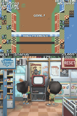
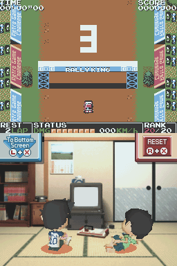
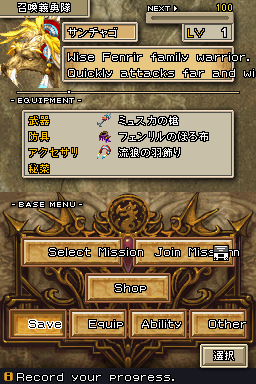
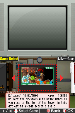
Just to show the RPG font does work in RGC2:
 
  • Like
Reactions: AndrewRoks1998

Aaron Chmielowiec

Wielder of the 4 sacred cheeses
OP
Member
Joined
Aug 24, 2013
Messages
479
Trophies
0
Age
47
Location
Wako-shi, Saitama, Japan
Website
aaronin.jp
XP
1,287
Country
oji> Very true. With the RPG I drew up all the menus myself by hand which is why the look is so erratic. There will undoubtedly be text positioning issues with the Adventure or random inconsistancies/typos elsewhere but since the main game already works from beginning to end (no crashes I hope), I would guess I might only want to put out batches of changes at a time. I don't mind supporting this title since it is still fresh in my memory but I suppose I should think about where to draw the line.

Very nice.

if it turns out to be a hassle to offer two fonts for the RPG and Adventure, maybe we can just use a more eye-appealing font for the both of them? The RPG font from the first is okay, it fits the era. Something about me just wonders if there are any other font choices we could make. Editing a font is surprisingly easy, I found. I just never had any good font ideas.

Of course, for obvious reasons, after a change in font, everything in the Adventure(s) and RPG will have to be re-tested to make sure it all fits on screen and there aren't any other surprises.

/me goes back to try and fit the rest of the menu mockups from Kobalos into the game in the meantime.
 

Kobalos

Member
Newcomer
Joined
Jun 11, 2014
Messages
11
Trophies
0
XP
58
Country
Edit> if I change Guadia to pact I also have to change the header in the other window. That's fine, right?
In the original Guadia Quest that window is also labeled 'Pact' so that's fine. That was an oversight on my part.

In any case, I've started on putting those new fonts in for the menus. What do you think, Kobalos?
Edit> RadioShadow> Like this?
Very nice! I like the new game select as well.

Yeah, that "pact/Guadia" has been a thorn in my side from the beginning. If anything, it's your party's NPC and you can only have one at a time. In the original Japanese I believe it was "Guadia" but that was confusing for the same reasons AnotherGamer lists.
In the XSEED translation it was 'Pact' (as mentioned above), which I took over in the font. The functionality in Saga is virtually identical to that in the GQ1, only instead of pacting a Guadia directly you pact an NPC who has their own Guadia.

...when they just join you out of their own will and one of them just flat out refuses even after you beat them.
As far as I understand a pact is a mutual agreement, no? If a Meister refuses to become your ally then there's no agreement and no pact; which is consistent with the terminology.
 

Aaron Chmielowiec

Wielder of the 4 sacred cheeses
OP
Member
Joined
Aug 24, 2013
Messages
479
Trophies
0
Age
47
Location
Wako-shi, Saitama, Japan
Website
aaronin.jp
XP
1,287
Country
Okay, in that case I'm still on the right track.

All right, I went through your messages of corrections from earlier and then put in about half of the graphics for the menus from your last post. I'll have to finish the rest over the weekend. I did most of the main ones but there are other menus in battle and some things like the Buy/Sell and Yes/No windows.
 

Kobalos

Member
Newcomer
Joined
Jun 11, 2014
Messages
11
Trophies
0
XP
58
Country
Okay, in that case I'm still on the right track.

All right, I went through your messages of corrections from earlier and then put in about half of the graphics for the menus from your last post. I'll have to finish the rest over the weekend. I did most of the main ones but there are other menus in battle and some things like the Buy/Sell and Yes/No windows.
Aren't those in text, instead of graphics?

Also: I noticed that 'Talk' was slightly lower and to the left. Did I overshoot the size limit?
 

Aaron Chmielowiec

Wielder of the 4 sacred cheeses
OP
Member
Joined
Aug 24, 2013
Messages
479
Trophies
0
Age
47
Location
Wako-shi, Saitama, Japan
Website
aaronin.jp
XP
1,287
Country
Buy/Sell and Yes/No in those windows are actually graphics. Confusing, isn't it?

About positioning, I do have pixel level control over the position so that isn't an issue.

I'll try to get some more of this done later today or tomorrow. I have a list of other things to touch up with the RPG as well.
 

Clippit

New Member
Newbie
Joined
Jun 15, 2014
Messages
3
Trophies
0
Age
30
Location
Microsoft Office 2003
XP
57
Country
Argentina
Hello! I'm a new member in here, and I'd like to thank every person involved in this wonderful project. The work done on this translation is truly impressive. The game itself is amazing, it's a huge improvement over its prequel.

I'd also like to report some untranslated graphics I've found on the game. They could've been overlooked, as they're just minor details, but I think they weren't reported before. Just take a look at them and do as you please with them.

First, there's a "Game Center CX 2" sign in Rally King that's still in Japanese:
pic1.png


Maybe a slightly modified version from the first game's one could be used:
pic2.png


Second, when you choose to fail a challenge, a cross and some japanese symbols will appear:
pic3.png


I don't know what it says, but it could be translated or it could be just replaced by a cross.

Third, I've found out that when you enter the store, the logo and some game posters are in English:
pic4.png~original


But when you get to the Game Select screen, they'll appear in Japanese in the background:
pic5.png


And last but not least, I think Haggle Man's characters in Triotos DX could use their localized names from the first game:
Karakuri Ken = Cyborg K9
Hoozuki Hime = Princess (she has no localized name other than "Princess" or "The Princess")
Zenmai Chan = Little Zenmai

Well, that's all. Thanks once again for the translation. I reeeeally love it. Greetings from Argentina. ;)
 

Densetsu

Pubic Ninja
Former Staff
Joined
Feb 2, 2008
Messages
3,434
Trophies
0
Location
Wouldn't YOU like to know?
Website
gbatemp.net
XP
2,707
Country
United States
God forbid I lift a completely different project out of the ashes...
loadscreen.png
bbfirsttest.png
That project was handled apparently by Densetsu and is merely on hiatus, not dropped.
I'm sure (on second thought, I hope :ph34r: )he would appreciate someone lending him a hand on the text translation part (since I think he handled most of the direct technical issues).
I've already contacted him about it, actually. Although I don't know much about the technical details/tools used thus far, there hasn't been any testing of anything in the actual game so I went on a mad rush to jam random things into the game and see what happens. I actually sent him a message with a bunch of random tests and reports.

If most of the text there is already translated and there is some handy tool for putting the text back into the game (and I can either adjust the positioning of the text and/or size of the font) then other than a few small graphic changes it might not take too long to get the whole game in a playable state (fingers crossed).
GHANMI: I didn't handle any of the technical aspects of dissecting the ROM; I strictly handled translations.

Aaron Chmielowiec: I will send you a PM with more details. Now that you mention it, we do have a tool to insert the text, but I'll put you in contact with Phoenix Goddess because she can tell you more about it.

At any rate, we'll continue this conversation over PM since it has no place in the Game Center CX: Arino no Chousenjou 2 thread :P
 

Aaron Chmielowiec

Wielder of the 4 sacred cheeses
OP
Member
Joined
Aug 24, 2013
Messages
479
Trophies
0
Age
47
Location
Wako-shi, Saitama, Japan
Website
aaronin.jp
XP
1,287
Country
Clippit> You're awesome. I'll pass this along to the graphics guys if they don't see this post and I'll see about putting it in the next patch, whenever that happens. There is a lot changing with the RPG right now, too.

Densetsu> Thanks for getting back to me on that. I'm so relieved there already appears to be a tool and most of the main game has some kind of translation. I'll take a look at those docs you sent me and get back to you.

That's about it. I'm out with my family in this scorching hit weather in Tokyo. When I stop melting I'll get back to work.
 
  • Like
Reactions: MarkDarkness

Armane

New Member
Newbie
Joined
Mar 1, 2013
Messages
1
Trophies
0
Age
38
XP
77
Country
I'm not sure if this has been fixed in recent revisions, but when you clear a Daily Challenge and quit to the main menu, upon re-entering Daily Challenge, the last text message Arino will say is "You haven't cleared today's challenge yet, but don't worry! Just a bit more and I'm sure you can", even though you already have a gold stamp.

Anyway, great work everyone. I'm glad I can finally play this great sequel.
 
  • Like
Reactions: Aaron Chmielowiec

Aaron Chmielowiec

Wielder of the 4 sacred cheeses
OP
Member
Joined
Aug 24, 2013
Messages
479
Trophies
0
Age
47
Location
Wako-shi, Saitama, Japan
Website
aaronin.jp
XP
1,287
Country
Armane> Thanks for the feedback. That has come up before, actually. I'm going to take a look at it after some of the RPG menu graphics and naming conventions are out of the way. At first I thought it was something about the emulator going haywire with the system clock on my PC but it looks like it is more than that.
 

HumbertHumbert

Member
Newcomer
Joined
Jun 5, 2008
Messages
22
Trophies
0
XP
165
Country
United States
Hey, I am doing my playthrough on a real system, so sorry that these are not direct-cap shots, but:

"Coelacanth" is spelled wrong as "Coalcanth"? in Guadia Quest Saga manual.
VqGS1YD.jpg


Very minor, but comma usually is before end-quotation mark: "Items," not "Items", in Guadia Quest Saga manual.
B7bZ9Zx.jpg


"BanNam" sign is in Japanese on the Adventure world map.
RWCMAOa.jpg


Cutoff "Mysteries" in first set of Adventure challenges.
KUZHhUz.jpg


The whole game has been excellent so far, by the way. Just passing along whatever I can.
 
  • Like
Reactions: Aaron Chmielowiec

Aaron Chmielowiec

Wielder of the 4 sacred cheeses
OP
Member
Joined
Aug 24, 2013
Messages
479
Trophies
0
Age
47
Location
Wako-shi, Saitama, Japan
Website
aaronin.jp
XP
1,287
Country
Thanks for that.

Okay, I think I have most of the fixes in the game now (text-wise) from everyone. I've just generated a new patch and will try it out first a bit. The graphics are still "under construction", so to speak. The RPG changed quite a lot in keeping consistent with the Guadia Quest universe.
 
  • Like
Reactions: Nightwish

Kobalos

Member
Newcomer
Joined
Jun 11, 2014
Messages
11
Trophies
0
XP
58
Country
Very minor, but comma usually is before end-quotation mark: "Items," not "Items", in Guadia Quest Saga manual.
That's more of a matter of preference. The comma outside the quotation is 'British' or 'logical' style; personally I prefer this style because you're copying the string as it appears in the game: "Items" and not "Items,".

Speaking of those names [Faim and Ainon], they look foreign and mean nothing to mean. Is it a pun for something? I'm aware you're trying to stick to the original, and that is fine, but something like "Flame" would be better (and something done back in the old days when old games got translated).
I thought the names sounded like 'Fame' and 'Anon', as in: famous and anonymous. But that probably doesn't make sense in Japanese and it doesn't have much to do with hot and cold, so it's probably a coincidence.
 
  • Like
Reactions: Calitar

RadioShadow

Well-Known Member
Member
Joined
Aug 30, 2007
Messages
550
Trophies
1
Age
35
Location
UK
XP
634
Country
If it turns out to be a hassle to offer two fonts for the RPG and Adventure, maybe we can just use a more eye-appealing font for the both of them? The RPG font from the first is okay, it fits the era. Something about me just wonders if there are any other font choices we could make. Editing a font is surprisingly easy, I found. I just never had any good font ideas.

Of course, for obvious reasons, after a change in font, everything in the Adventure(s) and RPG will have to be re-tested to make sure it all fits on screen and there aren't any other surprises.

I'm probably going to get a lot of hate for suggesting this, but I think you should reconsider the way you line the text in the Ace Detective games. I'm aware this is what is done in the original version, but keep in mind, they were using a fixed width font and since Japanese names usually use less characters than Roman names, they can get a way with it.

Doing that in this game, you are making a lot of work for yourself, and restricting the amount of text you can put in (due to the length of names being different lengths). I was trying to find a example of a better way to do it, and while it is not a official translation, the fan translation of "Famicom Detective: Part II" shows a good way to do it.
850screenshot1.png


Here is a mock up, the left being the original and the right being the mock up:
RGC26.png


While making that mock up, it looks like you are using the shift-jis ' and ! ,just to point out. Basically, for the second and third line, put 2 - 3 spaces in (depends on the width of the space. Also, if the person is speaking, it is important to use quotations.

I do agree we could put a better font. The default one is a bit meh. Trying to find one that isn't too small.
 

Fishaman P

Speedrunner
Member
Joined
Jan 2, 2010
Messages
3,323
Trophies
1
Location
Wisconsin
Website
twitch.tv
XP
2,203
Country
United States
I'm probably going to get a lot of hate for suggesting this, but I think you should reconsider the way you line the text in the Ace Detective games. I'm aware this is what is done in the original version, but keep in mind, they were using a fixed width font and since Japanese names usually use less characters than Roman names, they can get a way with it.

Doing that in this game, you are making a lot of work for yourself, and restricting the amount of text you can put in (due to the length of names being different lengths). I was trying to find a example of a better way to do it, and while it is not a official translation, the fan translation of "Famicom Detective: Part II" shows a good way to do it.
850screenshot1.png


Here is a mock up, the left being the original and the right being the mock up:
RGC26.png


While making that mock up, it looks like you are using the shift-jis ' and ! ,just to point out. Basically, for the second and third line, put 2 - 3 spaces in (depends on the width of the space. Also, if the person is speaking, it is important to use quotations.

I do agree we could put a better font. The default one is a bit meh. Trying to find one that isn't too small.
I have to disagree. Not only is the different alignment more unreadable to me, but the quotation marks are completely redundant when you're given the speaker's name, not to mention that there are WAY too many places to change for that.
 

Site & Scene News

Popular threads in this forum

General chit-chat
Help Users
    Psionic Roshambo @ Psionic Roshambo: Heheh