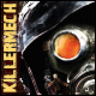
Hmm... it's definitely a start. It looks very simplistic though. Just a background, render, a random C4D, a splatter and text. I think you need to work on yur C4D placement... to me, that just looks like you stamped on a random C4D just to go with what's popular right now. (C4Ds eveywhere)
As for the text, I realize that it's modeled after the style of the game, but I think it's a bit too big. Not only does it stand out for not being properly blended, but it occupies about a third of the tag.
Don't take my comments too seriously, I'm just a very harsh critic.