ROM Hack Game Center CX : Arino no Chosenjo 2 (New Start?)

SubnetPie

Member
Newcomer
Joined
Jan 27, 2014
Messages
13
Trophies
0
Age
48
XP
116
Country
United States
The group effort on this project is very inspiring. Great work to everyone.

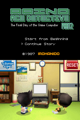
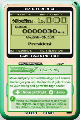
I spent more time on the trainer:

New logo is in place on the control panel, new logo is on the start screen, and I've started editing the ending (it is a bit rough at the moment).
controls.PNG
trainer_start1.PNG
trainer_ending1.png


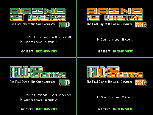
The ending page is presenting a real challenge as you can see if you follow this link.
https://dl.dropboxusercontent.com/u/1833969/GCCX2/ending_tiles.png

I've started to figure out the protocol of the hex formatting for the NSCR files to gain greater control over the graphic replacements. This article has planted some great seeds for moving ahead.
http://www.pokecommunity.com/showthread.php?t=285198

Hopefully I can learn enough to tame the ending tiles and achieve the results we want.
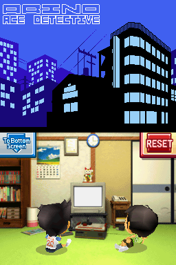
 
  • Like
Reactions: Pix3l

Sora de Eclaune

All our splendor...
Member
Joined
Feb 15, 2011
Messages
2,850
Trophies
1
Location
Home
Website
www.youtube.com
XP
1,192
Country
United States
I slightly modified Mars_x's Triotos grayscale logo he posted on the previous page...

5Gb2fza.png


I thought the shading at the bottom of each letter needed a bit more uniformity, and the top corners of the letters needed a bit more rounded green bits. Hope it's okay.

I'm only using official logos, even the translated ones
(The horizontal version of RGC logo is found in the box of the original game).

Having said that, I could make any version needed, as long as we reach a consensus.

I like it with the Game Center CX, since it does refer to the company instead of the game.
Yeah, you're right. I didn't even think of that.
 
  • Like
Reactions: Mars_x

Mars_x

♥♪!?
Member
Joined
Jun 25, 2009
Messages
268
Trophies
1
XP
403
Country
Mexico
I slightly modified Mars_x's Triotos grayscale logo he posted on the previous page...

5Gb2fza.png


I thought the shading at the bottom of each letter needed a bit more uniformity, and the top corners of the letters needed a bit more rounded green bits. Hope it's okay.


Yeah, you're right. I didn't even think of that.

Good effort, however I do think that a uniform shading is better!
I updated my version with slight changes here and there, closer to the original.

JTXvxVt.png


What do you think?
 

Aaron Chmielowiec

Wielder of the 4 sacred cheeses
OP
Member
Joined
Aug 24, 2013
Messages
479
Trophies
0
Age
47
Location
Wako-shi, Saitama, Japan
Website
aaronin.jp
XP
1,287
Country
Don't worry about the Gears logo(s), they are just part of the source image file. There are slight variations used for the intro animation, etc. It isn't anything to worry about as long as it doesn't get messed up adding in the title.

I'll try adding that in over the next day or so (unless SubnetPie wants to see it first). The big problem I can see is the colors overlayed in the same positions as they were with the Japanese title; the colors won't line up with the English letters, and I'm not sure if it is a pain or not to try and adjust that...

I think I'm going to do four letters at a time with the Triotos DX taunts. It is probably going to result in a larger source image file that way but not so much that it will affect anything with the game.

That is if I can import a changed source image without it messing up anything else...and the initial test worked, great! Hopefully I can bang out these files at a regular pace.

I think I can figure out the Adventure Game Title Screens/Logos as well now, but if SubnetPie is planning on touching those I may want to let his expertise handle that one.
 
  • Like
Reactions: Pix3l

Sora de Eclaune

All our splendor...
Member
Joined
Feb 15, 2011
Messages
2,850
Trophies
1
Location
Home
Website
www.youtube.com
XP
1,192
Country
United States
Ah! I just remembered yet another thing! There's a free font going around that's a fan remake of the font from Taiko no Tatsujin, and the rank title's font in Japanese looks just like the fan remake Taiko no Tatsujin font! The font even has English letters! I don't know if a free font that has been remade from the appearance of an actual game's font would be allowed to post here, but the font's internal name is DFPKanTeiRyu-XB Regular if you want to find it. I think it would be a cool font to use for the rank title, since the Japanese version looks like it was calligraphy-brushed, and the Taiko font also looks that way (even in English)!

Here's some random stuff I typed with the font in GIMP (it doesn't work in every program). I partially Google Translated the Japanese part (it was screwing up and putting commas everywhere and adding extra words for no reason, so I had to patch in what grammar I knew and arrange the sentences into as far a correct understanding as I could).

5nTIhni.png
 

Aaron Chmielowiec

Wielder of the 4 sacred cheeses
OP
Member
Joined
Aug 24, 2013
Messages
479
Trophies
0
Age
47
Location
Wako-shi, Saitama, Japan
Website
aaronin.jp
XP
1,287
Country
Hrm, I tried messing with the Adventure game mini-title as it appears in the intro. It didn't quite work out how I wanted (no "Part 1" or "The Final Day of the Game Computer" though I'm not completely appalled by the idea/feel of it. Somehow it gives off the atmosphere of the office grind as evening sets.) For some reason the palette got messed up totally...hrmf.

First the sort-of-good news. I managed to work in "Part 2" so the 2nd Adventure game title is almost right barring some palette issue I'll have to solve (should be orange with a green border):

arinoace2.png


I'd feel better if someone with more graphical skill did this.

arinoacedetective.png


Mars_x> If you want to try, I need an 8 color (preferably 4) image of the Arino:Ace Detective logo at 144x32 pixels. The "Part 1" and "Part 2" can be another 16x16 pixels, and the "The Final Day of the Game Computer" subtitle is 128x8 pixels I think. However, anything that will fit on the screen should be okay.

The top two images from this:

arinotitle1.png
 
  • Like
Reactions: Pix3l

Mars_x

♥♪!?
Member
Joined
Jun 25, 2009
Messages
268
Trophies
1
XP
403
Country
Mexico
Hhmm.. I don't understand.
You want me to split the image in various parts?
But only the logo for "Arino Ace Detective" is 190 x 43 px.
Part 1 and Part 2 are 39 x 22 px. And Final Day is 151 x 10 px.
None fit with the settings you gave me... unless I split each image.
 

Aaron Chmielowiec

Wielder of the 4 sacred cheeses
OP
Member
Joined
Aug 24, 2013
Messages
479
Trophies
0
Age
47
Location
Wako-shi, Saitama, Japan
Website
aaronin.jp
XP
1,287
Country
There are the title logos used on the title screen, and a smaller version of the title used in the intro sequence for each game, and an even smaller one used for the "loading" screen.

Basically I just wanted a resized smaller version of the title image that could fit into the game intro.

The default sizes for each of the parts of the logo are what I listed, but the scaling may not match the English titles. Each part of the title fades in separately which is why they are handled separately. The exact size actually may not matter but it should fit nicely over the background. If there was a mockup of the resulting screen, that may be good enough.

Both Adventure games pop up the title logo during the intro against the same backdrop; just a different color scheme.
 

cubeboy

Active Member
Newcomer
Joined
Nov 25, 2013
Messages
26
Trophies
0
Age
44
XP
76
Country
United States
So, instead of using

- Manager

I should use Chief

and instead of

- Deputy Manager

I should use Section Chief

Is that correct? I can make the changes later tonight.

With the little bit of Japanese I know (only from the GCCX show), I think that's correct. The example video I used is also the more widely "supported" fan subs of the show. A lot of the earlier seasons were subbed by a group that is probably rated the second worst of the fan subs.

I like it with the Game Center CX, since it does refer to the company instead of the game.

I kind of agree. If it was in reference to the game, I would think that using Retro Game Master might be more fitting?
 

Mars_x

♥♪!?
Member
Joined
Jun 25, 2009
Messages
268
Trophies
1
XP
403
Country
Mexico
With the little bit of Japanese I know (only from the GCCX show), I think that's correct. The example video I used is also the more widely "supported" fan subs of the show. A lot of the earlier seasons were subbed by a group that is probably rated the second worst of the fan subs.

I can change those, I will upload the proposals later today.

I kind of agree. If it was in reference to the game, I would think that using Retro Game Master might be more fitting?

I did thought about that, unfortunately the only logo I know of Retro Game Master is the horizontal one, which would make (as stated before) for a "pixelated mess".
If that one is chosen tho, I would also have to change Arino's title in the bottom of the letter (to Retro Game Master Arino) as well as the GCCX letters in the background (for RGM?).

I can do anything but we need to reach a consensus. I for one, am in favor of using GameCenter CX.
The reason is because I like it (ProOOOoooo0O0?), and because it's a letter from Arino himself (who calls his own show: GameCenter CX)

KACHO ON!!!
 

SubnetPie

Member
Newcomer
Joined
Jan 27, 2014
Messages
13
Trophies
0
Age
48
XP
116
Country
United States
I just spent the morning tearing apart the training tool.

I am very sad to report that the ranking on the trainer ending screen must be hard coded in the engine. I was unable to find a NSCR file (OAM) that addressed the tile layout for the rankings. I also discovered that the shared Japanese characters in the rankings only appear as a tile once and that tile will be used as needed. That means that if I alter a shared Japanses tile for an English ranking it will not be in context for the next time it is repeated.

The only improvement I can make at this point is to the "Game Center CX Rank" line which is fixed width. If someone wants to take the time to mockup a cleaner rendering of that line to the width that is shown. I believe this line is hard coded in the engine as well.

trainer_ending1.png


Unless someone can think of a better solution I guess the best we can do is to list the ranking conversions in an Read Me / FAQ to be distributed with the patch.

Moving on to another task.
 
  • Like
Reactions: Mars_x and Pix3l

Mars_x

♥♪!?
Member
Joined
Jun 25, 2009
Messages
268
Trophies
1
XP
403
Country
Mexico
I just spent the morning tearing apart the training tool.

I am very sad to report that the ranking on the trainer ending screen must be hard coded in the engine. I was unable to find a NSCR file (OAM) that addressed the tile layout for the rankings. I also discovered that the shared Japanese characters in the rankings only appear as a tile once and that tile will be used as needed. That means that if I alter a shared Japanses tile for an English ranking it will not be in context for the next time it is repeated.

The only improvement I can make at this point is to the "Game Center CX Rank" line which is fixed width. If someone wants to take the time to mockup a cleaner rendering of that line to the width that is shown. I believe this line is hard coded in the engine as well.

trainer_ending1.png


Unless someone can think of a better solution I guess the best we can do is to list the ranking conversions in an Read Me / FAQ to be distributed with the patch.

Moving on to another task.

Yo!
I can make the new mockup, but first a couple questions:
Does the width include the shadow or the shadow is placed automatically by the engine?
Another question, where do the tiles repeat? It's hard to imagine it would be out of context since that's what they mean.
 

SubnetPie

Member
Newcomer
Joined
Jan 27, 2014
Messages
13
Trophies
0
Age
48
XP
116
Country
United States
The width does not include the drop shadow. The drop shadow is a duplicate set of tiles of the parent text and is offset by the engine.

社長 級     →   President Class
専務 級     →   Executive Manager Class
常務 級     →   Executive Class
部長 級     →   Director Class
課長 級     →   Manager Class (Kacho Class)
課長代理 級  →   Deputy Manager Class (Deputy Kacho Class)
係長 級     →   Assistant Manager Class
主任 級     →   Senior Class
平社員 級    →  Lowly Employee Class

A prime example of the character issue is "社長" President vs "平社員" Lowly Employee. The "社" character is shared. "長" is used in president, director, manager, deputy manager, and assistant manager. "務" must mean executive. The repeated tile for class, "級", is very small and difficult to fit the word "Class" even in lower case and still look good.

From my understanding of the nitro file system and the files we are dealing with I believe it is an engine limitation we have to overcome. It's a challenge.
 

Aaron Chmielowiec

Wielder of the 4 sacred cheeses
OP
Member
Joined
Aug 24, 2013
Messages
479
Trophies
0
Age
47
Location
Wako-shi, Saitama, Japan
Website
aaronin.jp
XP
1,287
Country
If we really need a FAQ for just the ranks it's not the end of the world.

I'll try to see what I can do with the ranks when I get back from work today, but if I can't get anywhere I'll just go back to the Triotos taunts and the Adventure game logos if nobody else gets to them first.
 

Sora de Eclaune

All our splendor...
Member
Joined
Feb 15, 2011
Messages
2,850
Trophies
1
Location
Home
Website
www.youtube.com
XP
1,192
Country
United States
A prime example of the character issue is "社長" President vs "平社員" Lowly Employee. The "社" character is shared. "長" is used in president, director, manager, deputy manager, and assistant manager. "務" must mean executive. The repeated tile for class, "級", is very small and difficult to fit the word "Class" even in lower case and still look good.

From my understanding of the nitro file system and the files we are dealing with I believe it is an engine limitation we have to overcome. It's a challenge.


So while "Kacho" would be fine, all of the other ranks that share characters with "Kacho" would have "ka" and "cho" in them?
 

Aaron Chmielowiec

Wielder of the 4 sacred cheeses
OP
Member
Joined
Aug 24, 2013
Messages
479
Trophies
0
Age
47
Location
Wako-shi, Saitama, Japan
Website
aaronin.jp
XP
1,287
Country
Okay, I managed to get the Adventure Game main title screens fixed (will post later)
For the smaller logos in the intros of both Adventure games, I need the same logos to fit into this size: (These are the exact images used in the intro sequences (barring transparency around the text)

Sorry about the dead space around everything. I'm in a hurry and have to get back to work before my boss screams at me.
(Part 1 and Part 2 in this order)
finalday1.png

finalday.png
 

Aaron Chmielowiec

Wielder of the 4 sacred cheeses
OP
Member
Joined
Aug 24, 2013
Messages
479
Trophies
0
Age
47
Location
Wako-shi, Saitama, Japan
Website
aaronin.jp
XP
1,287
Country
Okay, I pulled a miracle out of my magical a$$ and figured out the rank images are used in the game. It is very similar to the way the Triotos demo messages work.

I purposely put the wrong title "President" in place of "Lowly Employee" just for a quick test. But I confirmed the other ranks are just fine. What I did was add to the source image all of the new rank titles and remapped each OAM table to use the new ones. It will take me a bit to finish them all but I have this one beat, I think. (Edit> I know in this shot I'm not using SubnetPie's most recent images for the Training Tool results screen; next update will have them)

workingresults.png


Also, here are both Adventure Game Titles:

adventurepart1.png
adventurepart2.png


And here is the very tiny "Loading" screen. I will need someone to make a tiny "Arino : Ace Detective" logo...

miniloading.png
 

Site & Scene News

Popular threads in this forum

General chit-chat
Help Users
    SylverReZ @ SylverReZ: @OctoAori20, Cool. Same here.