Hacking Two question about AKAIO skinning...

  • Thread starter Thread starter twiztidsinz
  • Start date Start date
  • Views Views 2,825
  • Replies Replies 15

twiztidsinz

Taiju Yamada Fan
Member
Joined
Dec 23, 2008
Messages
4,979
Solutions
8
Reaction score
18
Trophies
1
Website
Visit site
XP
232
Country
United States
1). Do you NEED to use 16 bit BMPs?
I noticed that when viewing them on my PC, they look VERY grainy/gritty and gradients don't transition as well.

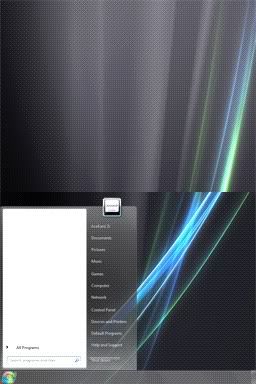
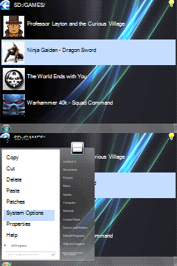
2). Does menu_bg.bmp (the 'Start Menu') need "padding" of black pixels at the top? If so, how much?
I made mine and it seems to push the image down in the AK Edit tool.
 
If you're using Dan's AK Edit tool, it will automatically convert the BMPs to the correct format, so you can use 24bpp while you're working on them, if you prefer. I've been using GIMP and haven't found the 16bpp images grainy, personally.

I haven't needed to pad the menu_bg.bmp, maybe there is an issue with the positioning?

Edited to add: Sometimes things in AK Edit aren't exactly as they appear on the hardware. I've found a few minor inconsistencies, but AK Edit gets it close, then some minor tweaks might be needed once you're looking at it on the DS.

-Atashi
 
AK Edit has some problems with text placement. Looking at the AceKard RPG skin, the Folder Text text is shoved to the top of the bottom screen. It looks like once you have your text where you want it, take off 6 from your "y" setting.
 
Now that I think about it... I believe it's AK Edit that's screwing with my pictures.
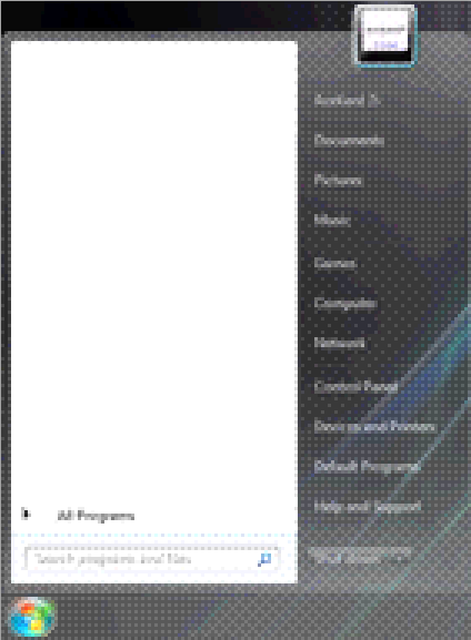
Here's what I mean by the images looking gritty/dirty:
akfuckup.png


Masked Ranger said:
AK Edit has some problems with text placement. Looking at the AceKard RPG skin, the Folder Text text is shoved to the top of the bottom screen. It looks like once you have your text where you want it, take off 6 from your "y" setting.
It's not the text I'm having an issue with.... it's that one of MY images (the start menu, menu_bg.bmp, shifts about 10px down in the preview, but other themes look perfect.
 
I see what you mean about the images - that looks like it's been really poorly dithered. Is that a screenshot, or did you enlarge it before uploading? What image software are you using? I've never had anything like that when using GIMP...

The skin images I've made include graduated screens and detailed backgrounds etc. and there's no dithering at all.

preview.jpg


start.jpg


I don't know why the start menu image would be off by 10px in the preview - have you checked to see if it's also off, on the hardware?

-Atashi
 
Thanks for the responses, btw....


Atashi said:
I see what you mean about the images - that looks like it's been really poorly dithered. Is that a screenshot, or did you enlarge it before uploading? What image software are you using? I've never had anything like that when using GIMP...The image above is 200% zoom, to show the detail of what I was talking about.


Here are three types of the actual images I'm using, 100% zoom.
First is 16bit BMP saved in Photoshop, next is 24bit BMP saved in Photoshop, and the last is 24bit BMP converted to 16bit BMP by AceKard Edit
16.jpg
24.jpg
AKE.jpg

Photoshop's 16bit BMP is smoother, but doesn't transition colors well.
AKEdit's looks a little gritty, and is also a bit lighter which will be more pronounced on the DS.


Atashi said:
I don't know why the start menu image would be off by 10px in the preview - have you checked to see if it's also off, on the hardware?

-AtashiI don't have an AceKard yet
tongue.gif
I'm pretty sure I'll be buying one though.
(I have a few questions/concerns about the quality of the AK2i and M3i0 that I'm looking into)

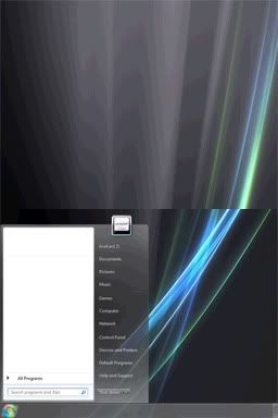
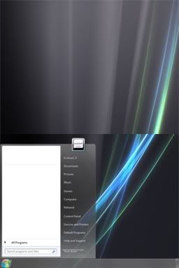
Anyway, here's an example of what it looks like in AKEdit (animated):
startmenu.gif

The Start Menu gets shifted down 8 pixels, moving part of the Start Orb off the screen and the Menu itself onto the 'Taskbar' Area.

If I PM'd you the files, could you test it out for me on the AceKard and let me know if it looks off?


Thanks again!


QUOTE(Dark^'^Knight @ Mar 17 2010, 09:52 AM)
http://gbatemp.net/index.php?showtopic=206342

Hopefully answers all your questions
wink2.gif
Thanks, but that doesn't really help though...
It doesn't address the gritty color issues, and the Start Menu images I make are the exact same size as the one I'm replacing, so it's not a difference of size.

Oh well, the image isn't THAT bad, and I don't think it'll be noticeable on the DS.
 
I have noticed this problem with AKedit when I made a skin for myself. AKedit would ask to convert to 16 bit even if all the images were already 16 bit.

When you are asked to convert to 16 bit, each time you click yes the program will apply its conversion filter to all the images, even those that are 16 bit. As a result, each time you click yes the images will become grainier.

You can either save your images as 16 bit in Photoshop and hit no to the conversion, or save images as 24-bit and convert one time only with your finished product.
 
while we're on the topic of skins, I have what's likely a real stupid question: I've been making my own skin right now (all I have left is to come up with a progress bar I'm happy with), and I've been using the default AKAIO skin as my template. I've been able to figure out what every image is for except one: The "note.bmp" image. Where the hey does that go?
 
AK edit does force your bitmaps to 16bit

Best way is to save them and edit them in 16bit yourself.

and do NOT press YES for the AK edit prompt EVEN IF IT DOES SAY "yer files, ARR nay 16 beet!" - since that scumbag is lying through it's teeth. Just save them yourself and you'll be fine.

And keep a copy of photoshop open all times - I usually make the ini edits right with AKedit and then in end look back and save all images once on the old ones so they look right.

Also, you do not need to "Pad" the start menu image - all elements are freely movable for Akaio - you need to move the menu image and start menu text around in editor. I'd advice to keep it small enough to fir inside the screen.
 
JereTHEend said:
Also, you do not need to "Pad" the start menu image - all elements are freely movable for Akaio - you need to move the menu image and start menu text around in editor. I'd advice to keep it small enough to fir inside the screen.
THANK YOU! THANK YOU! THANK YOU!!!

I didn't realize the Start Menu was positionable!
My ini had the y coord at.... *drumroll* 8! Which is why it was 8px off.


Also... I think AK Edit will -KEEP- converting the images to 16bit time and time again, which in the long run makes images look -EXTREMELY- grainy.
Now I just need to find a good way to convert 24bit to 16bit. I don't like the way Photoshop is handling it (by default?).
 
twiztidsinz said:
JereTHEend said:
Also, you do not need to "Pad" the start menu image - all elements are freely movable for Akaio - you need to move the menu image and start menu text around in editor. I'd advice to keep it small enough to fir inside the screen.
THANK YOU! THANK YOU! THANK YOU!!!

I didn't realize the Start Menu was positionable!
My ini had the y coord at.... *drumroll* 8! Which is why it was 8px off.


Also... I think AK Edit will -KEEP- converting the images to 16bit time and time again, which in the long run makes images look -EXTREMELY- grainy.
Now I just need to find a good way to convert 24bit to 16bit. I don't like the way Photoshop is handling it (by default?).
Have you tried GIMP - that save in 16-bit IIRC
 
CannonFoddr said:
Have you tried GIMP - that save in 16-bit IIRC
I'm not a big fan of Photoshop's retarded cousin...
tongue.gif

Whenever they get around to releasing GIMP 2.8, I might give it another shot.

But I think I still have Pain.NET installed, so I'll give that a try.
 
choconado said:
while we're on the topic of skins, I have what's likely a real stupid question: I've been making my own skin right now (all I have left is to come up with a progress bar I'm happy with), and I've been using the default AKAIO skin as my template. I've been able to figure out what every image is for except one: The "note.bmp" image. Where the hey does that go?

If I'm not mistaken, note.bmp is one of the tiny icons that are somehow displayed (or not) when browsing cheats. There are a couple of those tiny-size icons and I've never encountered them while using AKAIO but they seem to be related to the cheat database.

-Atashi
 
huh. Well, to be safe, I imported it anyway.

Some of the other images I had to hunt down. Like the arrows and scroll bars for viewing texts in-browser.
 
Kasihel said:
I have noticed this problem with AKedit when I made a skin for myself. AKedit would ask to convert to 16 bit even if all the images were already 16 bit.

When you are asked to convert to 16 bit, each time you click yes the program will apply its conversion filter to all the images, even those that are 16 bit. As a result, each time you click yes the images will become grainier.

You can either save your images as 16 bit in Photoshop and hit no to the conversion, or save images as 24-bit and convert one time only with your finished product.
Oooohh never knew that - I'll have to remember that next time (Shame PaintShopPro can't do 16-bit saves though) - when I get time I'll add that little tit-bit to my tutorial
 

Site & Scene News

Popular threads in this forum