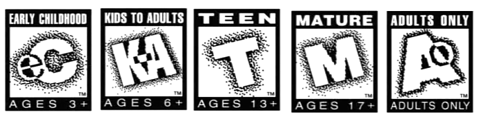
Aesthetically, which age rating certificate do you prefer?

  • Thread starter Thread starter Marc_LFD
  • Start date Start date
  • Views Views 3,606
  • Replies Replies 23
  • Likes Likes 1
I love the Japanese CERO followed by US ESRB.
I find black+white of both to be stealthy and do not clash with the aesthetics of the cover art.

Infact sometimes I buy Japanese version Playstation games from Play-Asia just to get the Japanese cover art and I find the cero logo to be small and unobtrusive, smaller than esrb.
 
  • Like
Reactions: Marc_LFD
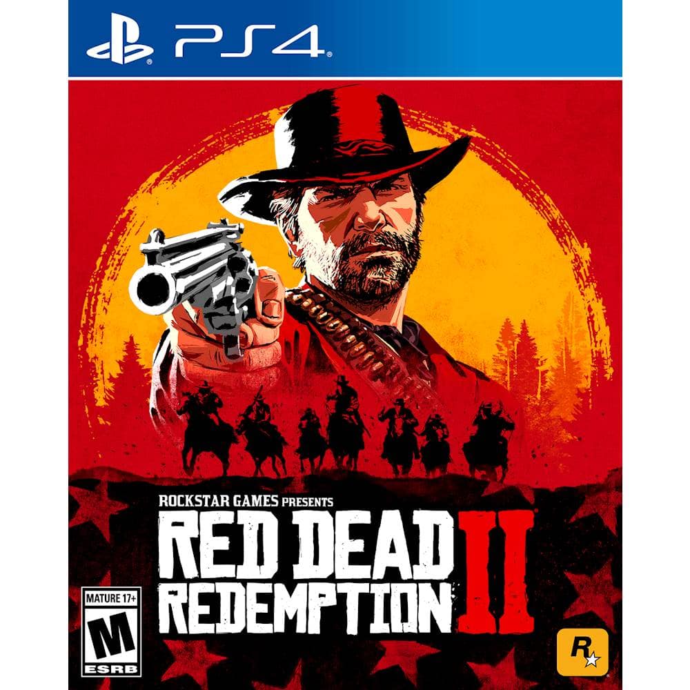
I've never minded the ESRB certifications. The black-and-white scheme sets it apart as distinct and recognizable (comparatively few games use black and white covers, helping the rating to stand out more) without drawing the eye away from the cover art itself. Using other colors (like green or orange) has the caveat of sometimes clashing with the cover art or, conversely, blending in, neither of which is ideal for a rating.
 
  • Like
Reactions: Marc_LFD
I've never minded the ESRB certifications. The black-and-white scheme sets it apart as distinct and recognizable (comparatively few games use black and white covers, helping the rating to stand out more) without drawing the eye away from the cover art itself. Using other colors (like green or orange) has the caveat of sometimes clashing with the cover art or, conversely, blending in, neither of which is ideal for a rating.
Indeed.

UK/EU

81xecpMd+ML._AC_SL1500_.jpg


US/CA

5352400_sa.jpg


In this instance the red colored certificate is suitable and fits the cover, but ultimately I still prefer ESRB's black and white as it's not too noticeable.
 

Site & Scene News

Popular threads in this forum