Hacking Skin Feedback

Killermech

Cookie Monster
OP
Member
Joined
Mar 5, 2004
Messages
1,809
Trophies
0
Website
Visit site
XP
274
Country
So I noticed alot of people wants opinions on their skins in the current competition, to know how to improve and so on. Some are getting it and some ain't.
To keep the original competition thread less cluttered while keeping people happy, I figured this would serve its purpose pretty good.

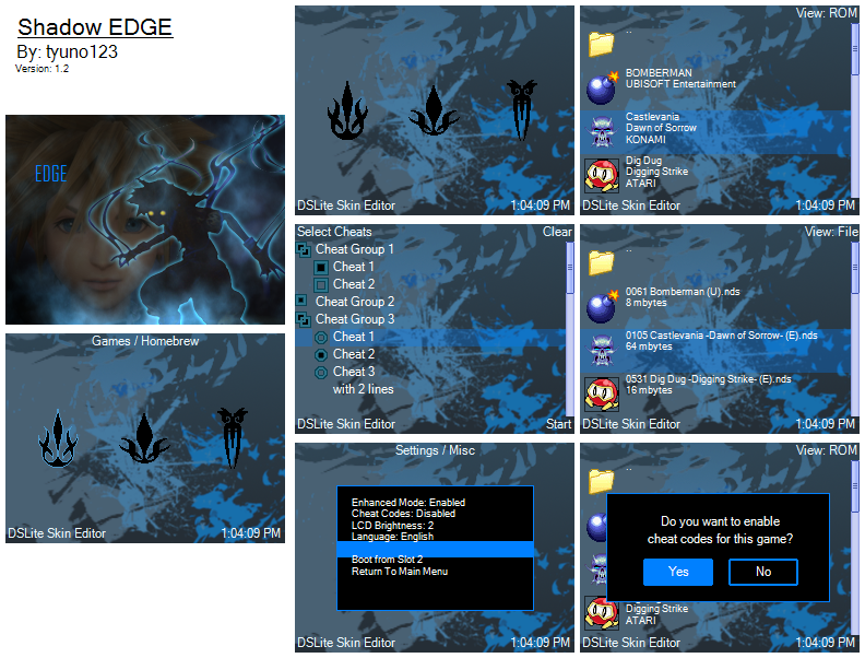
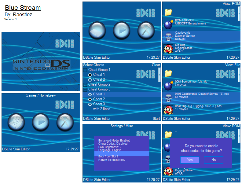
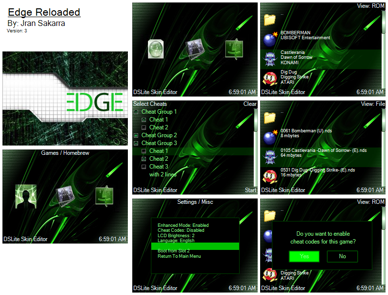
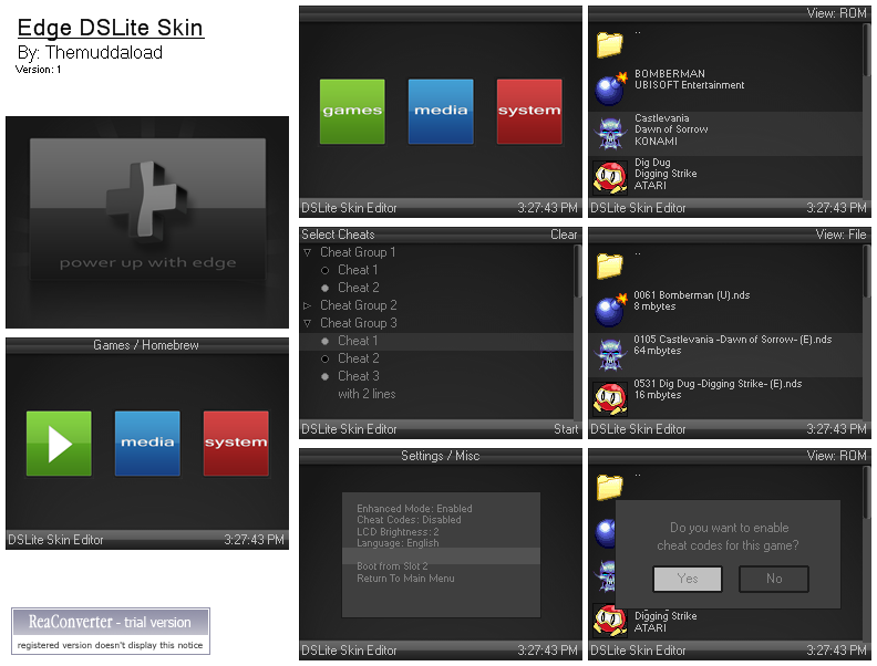
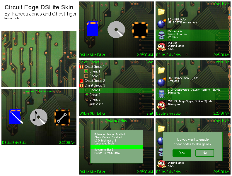
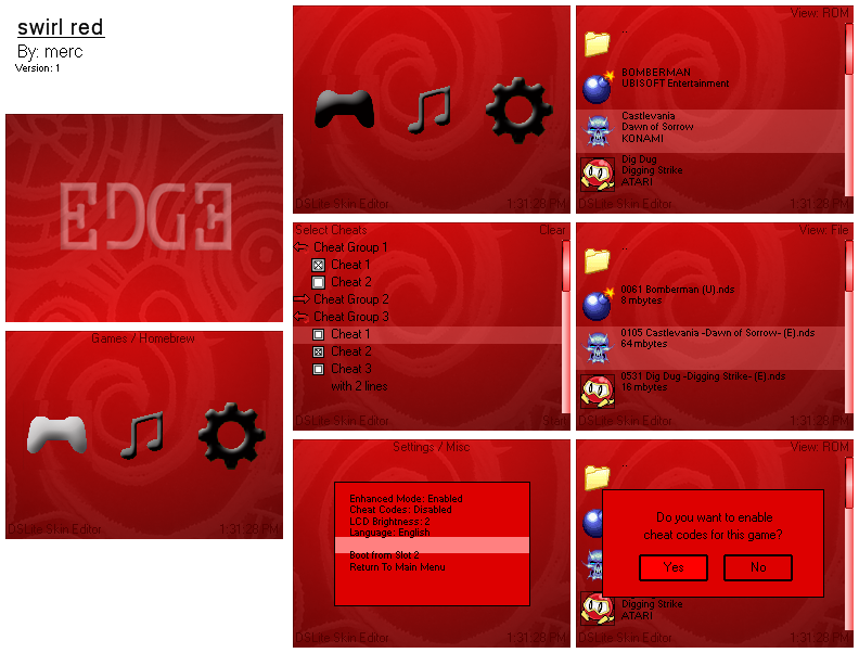
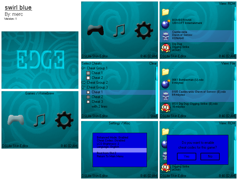
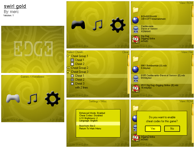
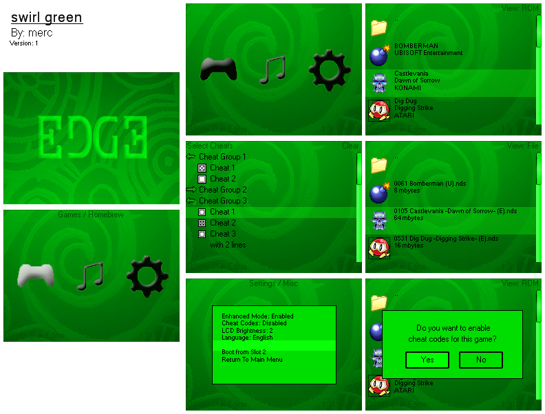
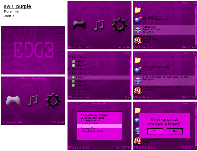
Rules are simple, post a picture of your skin, download link and if you want, a small description.
The next person gives feedback to the latest post containing a skin, while posting his own in the same post.
The next one does the same thing, gives feedback to the latest post and then posts his and so on.
Please do not post jump to give feedback on previous skins that isn't the latest post.

It's a fair trade off, you give as much feedback as you receive in return.
Just one other simple rule, try not to keep it too short. Like 'I like it!', 'It's good', 'Crap' etc.
In addition to that, do say something (or a few stuff) that you like or don't like about it. In a respectful manner.
Doesn't have to be several pages long, just something that could be of use to the creator of the skin in any way is enough.

Here's a simple Template:

@Name of the previous skin poster
Feedback: Blahblahblah

Name of your skin
[Preview Picture]

Description
Download link

To get this starting, here's mine.

@N/A
Feedback: N/A

Pipboy DS
Preview.jpg

Skin based off the Pipboy from Fallout.

[url=http://gbatemp.net/index.php?download=3652]http://gbatemp.net/index.php?download=3652[/url]
 
  • Like
Reactions: marcianito23

tyuno123

Well-Known Member
Member
Joined
Sep 27, 2008
Messages
472
Trophies
0
Location
Your Mind
Website
tyuno.blogspot.com
XP
175
Country
Malaysia
Heres my new and improved Shadow EDGE 1.2

screen_shot_collage.png


Fixes
--> fixed transparency of cheat icons
-->different highlight color of menu icons

Get yours now
MediaFire

Wow killermech I just dont know what to comment about your skin its just so..... good !
its colors match and the green isn't too harsh on the eyes

sorry killermech i guess i didnt really read the whole thing
 

Killermech

Cookie Monster
OP
Member
Joined
Mar 5, 2004
Messages
1,809
Trophies
0
Website
Visit site
XP
274
Country
Did you even read the first post before posting tyuno?
tongue.gif


Give feedback (say what you think of the skin previously posted) while posting yours.
You give feedback to receive feedback (or this won't be any different than the original thread).
 

Raestloz

GBATemp's Lone Wolf
Member
Joined
Feb 7, 2008
Messages
1,775
Trophies
0
Age
33
Location
The World of Illusion
XP
308
Country
Indonesia
@KillerMech: Wow! Your neon glow effect is astonishing! Fits perfectly with the BG, and so does the text, all green and bright but not too bright that my eyes might hurt, a great skin I say!
yaynds.gif
(I wrote this since tyuno didn't give you any comment)

@tyuno123: Like I said, fix the transparency with cheat buttons and you're ready for action!
wink.gif

BTW, where's your comment about KillerMech's?
blink.gif


Finally finished my work!
I'm not a Photoshopper, so this one took two good days to finish!

screen_shot_collage.png


Simple, and is proven that what you see here is what you'll see in your NDS, as the background (the most annoying part) is in .bmp 16 bit format

What's this?
This is a skin basically inspired from PSP's elegant wavy lines, problem is 16 bit .bmp can't display a gradation without pissing you off, so I removed the glow, added bits and stuff, and there you go!

Main menu buttons are homemade baby!
yaynds.gif


Download link:
Here
Hosted in our GBATemp.net

Now I can only hope somebody will come over, test mine, and tel me what can I do to improve it
smile.gif
 

Killermech

Cookie Monster
OP
Member
Joined
Mar 5, 2004
Messages
1,809
Trophies
0
Website
Visit site
XP
274
Country
I'll give a freebie since Raestloz was kind enough to give feedback to two.
Latest one is still Raestloz's.

@Raestloz
Very simple and I like it alot. The blue neon wave lines give a nice relaxed feeling without overtaking the simpleness of the skin.
The only thing that feels a bit out of place, is the yellow like glow you have on the text 'EDGE'. Just feels like it doesn't connect with the rest of the skin.
Maybe giving it a more blueish glow intead?
 

jagerstaffel

Well-Known Member
Member
Joined
Aug 20, 2008
Messages
533
Trophies
0
XP
312
Country
United States
Well raestloz, I'll say your skin is very bluey. One question I wonder if I can ask, how would your skin look on a DS Phat? It would seem the closed DS icon would be a bit hard to spot in the not so bright Phat. Just a thought.

And, here's my skin, although I won't enter it in the contest thread as I am unsure if this will work on an Edge card (I have no, ahem "Edge" to try it on
wink.gif


Portrait_of_edge_20.jpg


What I need to know is, I've read in the contest thread where somebody mentioned that the 24bit bmp's won't show up on the DS. I appreciate it if anyone can download and try my skin to see if it will work properly as I created it to be. I intend to submit this skin once I have confirmation it will display properly.

jagerstaffel's Edge skin

Silly mediafire won't accept any email I try to register with
wacko.gif


btw I nerfed the image collage because my connection is one from the stone ages and large stuff don't do well for me. Actual skin images are top notch.
 

Raestloz

GBATemp's Lone Wolf
Member
Joined
Feb 7, 2008
Messages
1,775
Trophies
0
Age
33
Location
The World of Illusion
XP
308
Country
Indonesia
Sorry, but I haven't updated my skin, but still, I think I need to reply
unsure.gif


@Killermech: IDK, I'm sure the glow is silver, I've checked the .psd and the glow is #C0C0C0, the color of silver, both for inner and outer glow... how come it looks yellow?
unsure.gif
Maybe I should remove the glow or make it even brighter?

@jagerstaffel: Well done mate! You skin is great! I love how you make the icon distorted like you're using magic onto the painting (icons). Works well on any brightness level. What astonished me is the On/Off button on the cheat selection screen! Flawless!
The white font color makes it easier to read on red backgorund.

But, your copyright sentence doesn't look good, it reads jegersteffel on the DS, maybe you should make it bigger?

EDIT: Oh and jaggerstaffel, yes EDGE can't display color more than 16 bit,you can use 24 or 32 bit colordepth, but still, the color shown is 16 bits. Tested.

Another P.S: with the lowest LCD brightness, the closed DS icon is still visible, and is pretty clear
smile.gif
 

Jran Sakarra

Well-Known Member
Member
Joined
May 24, 2008
Messages
202
Trophies
0
Location
Somewhere in Kanto
XP
330
Country
United States
Looks great!
I like the background for the menu.
Could use a better icon for the media.

My Contest Entry: EDGE Reloaded (Finished!)

By:Jran Sakarra
Download: CLICK HERE

screen_shot_collage.png


ICONS
menu-icons.jpg


Hey Skin Making is FUN!
I might be making more skins.
Well let me know what you think!
5&1/2 hours straight making this.
 

tokoshix

Member
Newcomer
Joined
Nov 4, 2008
Messages
12
Trophies
0
XP
54
Country
United States
@Jran
Looks good, but you should re-edit your scroll bar. You didn't do the transparency right for it and I can see the pink pixels in the corners. Also your media icon(selected) has a little black spot on top. I'm not sure if this is on purpose or not but I thought I should point it out. Other than that everything seems fine to me.


Well....here's mine. Enjoy!

I decided to change my entry due to some sudden inspiration. I gotta admit that my new entry is is much better than my old. I was pleased with how well it turned out, even though it only took a few hours to make.

Official Entry(using for contest)

33mspqg.png


Download Here

When you're talking "Gold" edition, one of the best kinds is definitely Rhythm Tengoku Gold. The text was a problem to work with, but the highlighter makes you see it clearly.


**I will keep my old entry posted for those interested and wanting to download, but it is not my official entry.

Old Entry(not entering)


Download


Its based on the upcoming Japanese RPG, Fragile, thats coming out on January 22, 2009 and is exclusive to the Wii. No word on an American release, but I'm just so stoked about this game and I made this skin in hope that it will come to America. This is my first skin ever made and I think I did pretty well.
 

Kaneda-Jones

Member
Newcomer
Joined
Nov 7, 2008
Messages
8
Trophies
0
Age
51
Location
Southern Ontario Canada
XP
72
Country
Canada
Hey Egonny I think I'm the one imediatly after you so here goes a review from a non-edge owner, maybe someone else who owns an edge can comment too..

Usualy sketched skins run the risk of looking too messy or not enough like a sketch, but yours excells at pulling off the sketch look, with your dark enough line work and lack of blurry confusion.

I like that the top bmp with the curling paper also crosses over into the bmp bellow but without a card to test it on I wonder if the seperation is enough to look good on the two DS screens.

so here is mine peoples.
3010194642_19e6f527c3_o_d.jpg

picture hosted at flickr with comments and everything at:
http://www.flickr.com/photos/kaneda-jones/3010194642/
(flickr hates people not mentioning them when you leech them)

and the zip file is at:
http://rapidshare.com/files/161427874/Circuit_v1a.zip
 

tokoshix

Member
Newcomer
Joined
Nov 4, 2008
Messages
12
Trophies
0
XP
54
Country
United States
Yeah thats why I asked... oh well, I tested it out many times and changed many things so I'm sure everything is fine, but I would appreciate any feedback.
 

Raestloz

GBATemp's Lone Wolf
Member
Joined
Feb 7, 2008
Messages
1,775
Trophies
0
Age
33
Location
The World of Illusion
XP
308
Country
Indonesia
LoL, okay, I'll provide you with one:

I'm glad to report that your image works well, 16 bit supports most of your image (there's a few lacks here and there like sudden color change and something) but it's nothing to worry about as it's not really visible. Go and save the pictures in 16 bit bitmap to see what I mean, no need to test it out

You icon choice is a very good one, I'm surprised to see the eyes open and close and the fingers playing with the ball
tongue.gif
the icons for cheats works well too, nothing to worry about, all the transparency works, and so does the scrollbar

However, the black window fill seems out of place, you might want to consider purple or blue, not too light, as the window text color is white, and a bright color might make it invisible, but black doesn't seem to work, a dark (not too dark, average) purple or blue should look pretty nice with your image, as it's dominated with purple and blue (and white, okay)

The white text stands out from the image and it's not hard to see it
smile.gif


Also, I like your image, they're not too busy, kinda relaxing, but the icon for games
tongue.gif
why does he close his eyes when I highlight him? Unlike the girl? for the settings, who opens her? eyes when I highlight her?

I think it's a good skin, and deserves a good place in my microSD
smile.gif
 

tokoshix

Member
Newcomer
Joined
Nov 4, 2008
Messages
12
Trophies
0
XP
54
Country
United States
Raestloz said:
LoL, okay, I'll provide you with one:

I'm glad to report that your image works well, 16 bit supports most of your image (there's a few lacks here and there like sudden color change and something) but it's nothing to worry about as it's not really visible. Go and save the pictures in 16 bit bitmap to see what I mean, no need to test it out

You icon choice is a very good one, I'm surprised to see the eyes open and close and the fingers playing with the ball
tongue.gif
the icons for cheats works well too, nothing to worry about, all the transparency works, and so does the scrollbar

However, the black window fill seems out of place, you might want to consider purple or blue, not too light, as the window text color is white, and a bright color might make it invisible, but black doesn't seem to work, a dark (not too dark, average) purple or blue should look pretty nice with your image, as it's dominated with purple and blue (and white, okay)

The white text stands out from the image and it's not hard to see it
smile.gif


Also, I like your image, they're not too busy, kinda relaxing, but the icon for games
tongue.gif
why does he close his eyes when I highlight him? Unlike the girl? for the settings, who opens her? eyes when I highlight her?

I think it's a good skin, and deserves a good place in my microSD
smile.gif

Thanks for the feedback, I'll definitely look into changing the black color into something else. I was also aware of the colors being a bit messed up for the background, but like you said its not entirely visible and I felt it didn't take away too much. As for the Icons, I did it based on the trailer, the picture I picked for Seto showed him closing his eyes, and for the picture of Ren it showed her opening her eyes. If you think I should make them both the same then I'll consider it.

Fragile Trailer:


tyuno123

Well-Known Member
Member
Joined
Sep 27, 2008
Messages
472
Trophies
0
Location
Your Mind
Website
tyuno.blogspot.com
XP
175
Country
Malaysia
@Raestloz
-nice job on your skin I like your menu icons especially the one with the NDSL on it .Your skin looks very blue and wavy. The EDGE emblem on the bottom screens top right looks like an ED with another reverse "D"and an "E"

@ Jagerstaffel
-great job on your skin ,nice , you renamed Dawn Of Sorrow to "Dawn Of EDGE"

@tokoshix
-nice Fragile skin but I your cheats icons can do some improvement

@themuddaload
-nice grey/black skin but your text color and highlight color for settings/misc screen seems to be the same I think it will turn out invisible in the DS

@Egonny
- great skin its clean and simple

checkout my newly updated skin Shadow EDGE 1.2 ,tell me what do you think of the new highlight color is it better or should I change it back to green ?
 

redact

‮҉
Member
Joined
Dec 2, 2007
Messages
3,161
Trophies
0
Location
-
XP
674
Country
Mauritania
UPDATE: fixed cheat icon issues that jagerstaffel mentioned and changed the text on the purple skin to a lighter color so that it's more readable. also edited the version numbers of purple and blue to reflect changes


@Kaneda-Jones, your skin looks very polished only thing i would consider changing is to maybe put an edge logo or a little resistor or ic or something on the top screen to make it look a bit more interesting, as a circut board with nothing on it is a little dull. other than that your skin looks awesome.

my one

Name: swirl

Info: nice swirly pattern, comes in five different colors


pics:

red:
red_collage.png

blue:
blue_collage-1.png

gold:
gold_collage.png

green:
green_collage.png

purple:
purple_collage-1.png

Download Link: http://www.mediafire.com/download.php?qy5knxziqm2
 

Site & Scene News

Popular threads in this forum

General chit-chat
Help Users
    Black_Manta_8bit @ Black_Manta_8bit: Oh @RedColoredStars yeah thats sad :sad: i feel it.