


Hey all, I know the dark design isn't completed but I have noticed one things that is bugging me to no end. That is the portal. The front/home page if you will http://gbatemp.net
This is how it looks, using the dark design
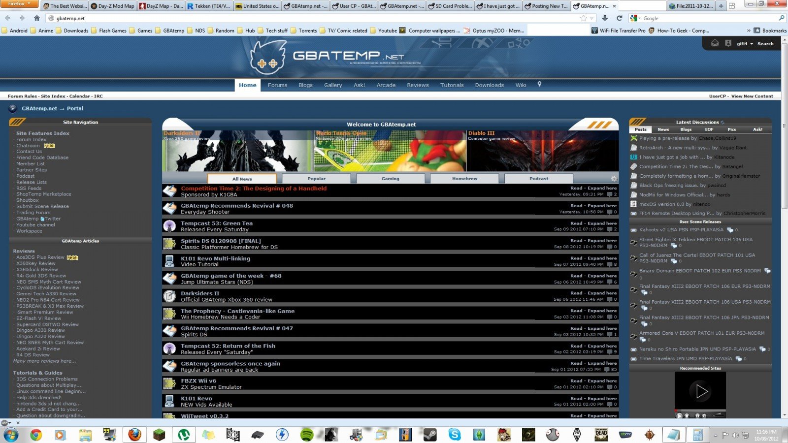 What really bothers me is all the grey on the sides and inbetween the 'headlines'. Some of it is alright but overall, there is too much of a difference between the black and the grey. Ofcourse this is just my opinion but I would greatly appreciate it if there wasn't such a contrast difference.
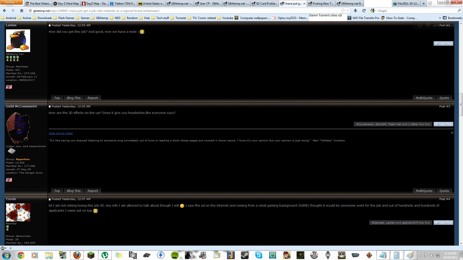 When viewing a thread, it looks absolutely incredible though. Would anyone consider making the portal more like the view of a thread?
This is how it looks, using the dark design


